
Monochromatic Wedding Color Ideas
Alternate Title: How to Pull Off a Gorgeous Wedding Using One Color (Without It Feeling Boring)
Monochromatic wedding color ideas give you a simple way to create a cohesive, elevated look that feels intentional and modern. When you commit to one color and explore its full range—light, dark, matte, shiny—you get depth without chaos, and your wedding photos will have that timeless, editorial feel you're probably dreaming of. If you love the idea of a focused palette that still allows for personality, you're in the right place.
If you want quick inspiration, browse our best sellers for real examples of personalized items that pair perfectly with a monochrome look.
Introduction: Why Monochrome Works So Well
You might think a single color would be limiting, but the opposite is true. Choosing one color simplifies decisions while letting you layer tones, textures, and finishes. That makes planning less stressful, and it creates a strong visual identity for your wedding. Monetized visuals, from your ceremony backdrop to small table accents, read as a single story rather than a patchwork of mismatched parts.
Monochromatic schemes are flexible: they work for city lofts, rustic barns, beachside elopements, and classic ballrooms. And the look is easy to personalize—add a custom napkin with an illustration of your dog, or a frosted plastic cup in the same hue, and the result feels curated and uniquely yours. You can find ideas and inspiration among our customer favorites if you want to see how others have made a color their own.
1. What Monochromatic Really Means (And What It Doesn't)
Monochrome doesn't mean flat. It means using one hue and combining a range of tones, tints, and shades. For example, if you pick dusty rose, you'll mix pale blush, warm rose, and deeper mauve. You can include neutrals like cream, ivory, or charcoal for balance, but the main visual thread will be that single color family.
- Hue: the base color, like navy or lavender.
- Tint: hue plus white, like powder blue.
- Shade: hue plus black, like midnight blue.
- Saturation: how vivid or muted the color appears.
Understanding these basics helps you mix elements confidently, so your wedding feels layered rather than monotonous.
2. Choosing Your Hue: How to Pick the Right Color
Start with the vibe you want. Do you want romantic and soft, bold and dramatic, or modern and minimal? Different hues convey different moods:
- Soft neutrals and blush, for romantic and timeless
- Cobalt, navy, or emerald, for richness and drama
- Pistachio, mint, or sage, for fresh and botanical
- Lavender and lilac, for whimsical and trendy
- Terracotta and rust, for warm and earthy
Practical tips for narrowing it down:
- Check your venue's permanent colors, and choose a hue that complements them.
- Look at seasonal light: cooler colors can feel icy in summer sunlight; warm tones glow in fall light.
- Pull inspiration from meaningful items—your favorite sweater, your fiance's favorite tie, or your dog's bandana.
If you need help visualizing, browse curated picks in our best sellers collection to see how a single color plays across different pieces.
3. Use Texture, Not More Colors: Secrets to Depth
Texture is your best tool. Combine matte linens with shiny chargers, lace with raw wood, satin with velvet. Those contrasts read like different "colors" even when you stick to one hue. Think of it like writing: tone, punctuation, and spacing add meaning beyond the words themselves.
- Linens: matte cotton vs. glossy satin
- Flowers: soft petals vs. structured branches
- Tableware: frosted cups, metallic flatware, painted chargers
- Signage: hand-lettered chalk vs. polished acrylic
For real-life product pairings that embrace texture, our frosted cups and illustrated napkins work beautifully in monochrome setups. See more in our customer favorites.
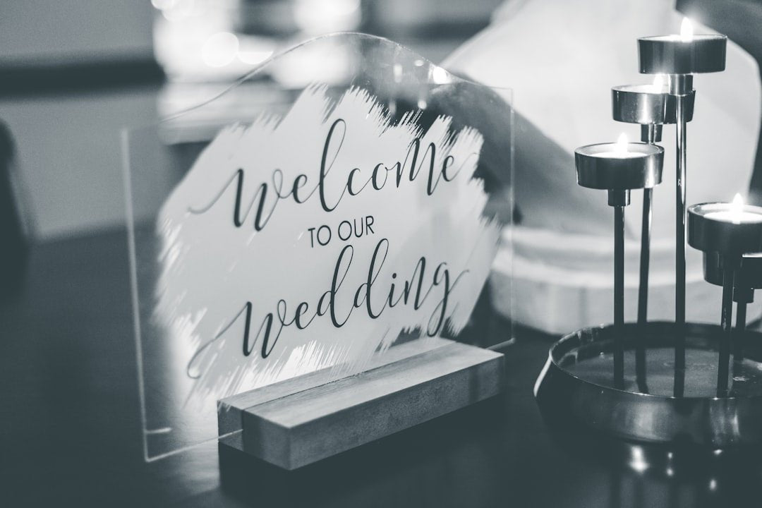
4. Ceremony Styling: Make the Moment Feel Intentional
Your ceremony is where the color theme will be most visible on camera, so plan it carefully. You can go subtle for a timeless look or bold for a statement entrance.
Backdrop and Altar
- Simple floral arch in tonal blooms, accented with greenery in the same color family
- Fabric draping in varied sheens of the same hue for a layered look
- Painted or paper decor—like large-scale monochrome panels—for modern ceremonies
Aisle and Seating
- Matching ribbon or runner down the aisle in a richer shade
- Monochrome seat cushions or ties on chairs
- Personalized ceremony programs with a single-color palette
Small touches, like custom napkins with a tonal monogram, will make the ceremony feel tailored. If you're curious how personalized details look together, our best sellers gallery is a helpful reference.
5. Reception Styling: Layers, Focal Points, and Flow
The reception gives you the most space to play. Aim for moments that pop and a consistent thread that ties everything together.
Tablescapes
- Start with a neutral base, like ivory linens, then add a runner or charger in your hue
- Vary plate finishes—matte, speckled, or glossy—in the same color tone
- Use napkins in the boldest shade and fold them simply; custom napkins are a subtle, high-impact detail
Centerpieces and Signage
- Group different vase heights in the same color family
- Use candles in corresponding values to add warmth and glow
- Keep signage consistent: fonts and colors that mirror your palette
Want to see how cohesive items look together? Check our customer favorites to see curated combinations that customers love.
6. Floral and Greenery: Tones That Read as One
Florals are often the trickiest part of a monochrome scheme because flowers naturally come in mixed tones. To keep everything cohesive, focus on:
- Choosing flowers in varying tints of your chosen hue
- Adding texture with same-hued foliage or neutral greens
- Using dyed or tinted blooms if you need a very specific color match
Examples by color:
- Blush: garden roses, ranunculus, peonies in blush, pale rose, and deep mauve
- Navy: delphinium, nigella, thistle, and blue-dyed accents
- Green: eucalyptus, olive branches, green hydrangea, succulents
- Lavender: lilac, lavender sprigs, purple stock, and dusty miller for contrast
If you're working with a florist, bring a fabric swatch, a sample napkin, or a printed invitation so they can match tones accurately.
7. Attire and Accessories: Keep the Look Polished
Monochrome goes beyond décor. Coordinate dresses, suits, bridesmaid dresses, and even accessories like shoes and ties for a pulled-together look.
- Mix formalities: let bridesmaids wear different dresses in the same color family
- Groomsmen can wear neutral suits with colored ties or pocket squares
- For bold looks, consider a colored wedding dress or suit accent like a sash, lining, or lapel
Style tip: include metallic accents—gold, silver, or rose gold—to break up the hue and add shine without diluting the color story.
8. Stationery, Signs, and Personalization
Stationery is one of the easiest ways to reinforce your theme. Use a single-color palette across invites, escort cards, menus, and place cards to tie pre-wedding elements to the event itself.
- Letterpress or single-ink printing gives a classic, tonal look
- Use envelopes, liners, or wax seals in your chosen color
- Keep fonts and paper textures consistent for cohesion
Signage—welcome signs, bar menus, and seating charts—should echo the same color palette and typography. For small touches, consider personalized items like custom napkins or cups that match your scheme; you can explore ideas in our best sellers.
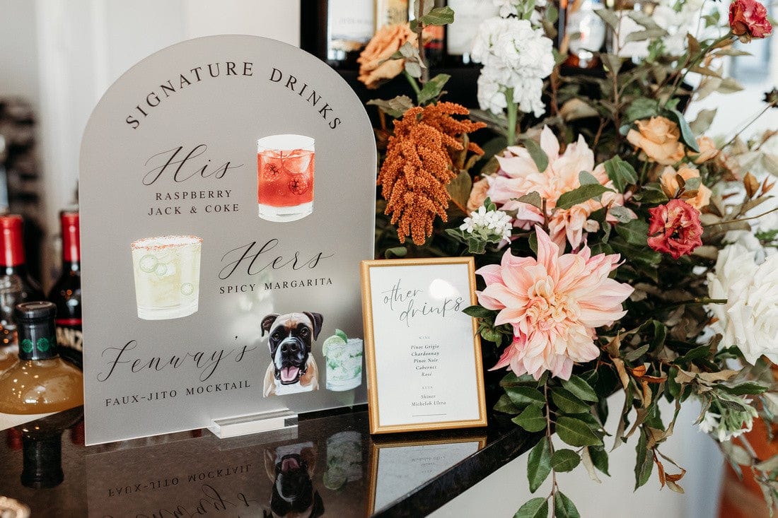
9. Bar, Cake, and Food Styling
Food and drinks are opportunities to surprise guests with unexpected monochrome details. Use color thoughtfully so it enhances the experience rather than overpowering it.
- Cocktails with colored syrups or garnishes that match your hue
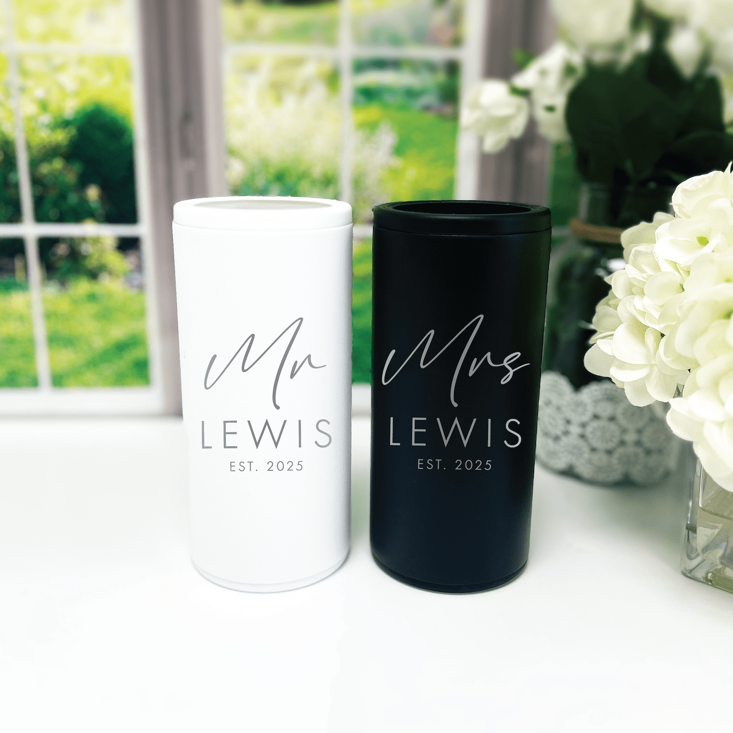
- Frosted cups or glassware in muted tones for signature drinks
- Cakes with single-hued icing, ombré layers, or monochrome florals
- Savory bites plated with accent sauces or microgreens in similar tones
Small branded touches—like printed napkins or custom cups—double as functional decor. See how customers use these elements in our customer favorites.
10. Lighting, Rentals, and Venue Considerations
Lighting can shift how colors read, so test your palette in the venue's light. Warm lighting will push colors warmer, cool LED lights will make them crisper, and candles will soften everything.
- Ask your venue about lighting options and do a lighting rehearsal if possible
- Choose rentals—chairs, linens, drapes—that complement rather than clash
- Consider painted props or panels if your venue has a lot of existing color that can't be changed
Rentals in matching or neutral tones help your color pop. If you're renting ceremony chairs or a dance-floor runner, look for tones within your palette and bring samples to the rental house.
11. Budgeting and Vendor Coordination Tips
Monochrome can be budget-friendly if you plan carefully, because you're not buying many different colors of items. Still, it's smart to plan where to splurge and where to save.
- Splurge: focal pieces like the floral arch, statement table, or a custom sign
- Save: smaller items in inexpensive materials, like paper place cards or printed napkins
- Coordinate: give vendors fabric swatches or digital color codes so everyone matches
Keep a color kit in your planner folder. Include fabric swatches, printed stationery, and photos of your chosen color under different lighting. Share that kit with your florist, rentals coordinator, and stationery designer so everyone's on the same page.
12. Monochromatic Color Palette Examples (With Practical Tips)
Below are seven on-trend palettes with concrete ways to use them across your wedding. Each palette includes a few items you could personalize to make the look yours.
Blush and Rose
Use blush table linens, rose napkins, pale centerpieces, and deeper mauve escort cards. Personalized napkins with a subtle rose illustration will read luxe and personal.
Dusty Blue
Dusty blue bridesmaid dresses, slate-blue linens, pewter chargers, and overdyed flowers work beautifully. Add a custom bar sign in the same tone to tie the whole room together.
Navy and Indigo
Deep, rich, and dramatic: emerald accents, navy linens, and pale blue flowers create depth. Use metallics like brass or copper-tinged flatware to brighten the palette.
Emerald and Forest Green
Green is refreshingly modern. Mix velvet linens in deep green with lighter green florals and olive foliage. Add subtle gold accents for warmth.
Lavender and Lilac
Lavender feels fresh and romantic. Use lilac napkins, pale lavender florals, and white linens to keep it airy. Consider a lavender-tinted signature cocktail as a surprise.
Terracotta and Rust
Earthy and warm, terracotta works great for outdoor receptions. Pair with cream linens, dried florals, and wooden chargers for a natural look.
Charcoal and Slate
For a modern, moody wedding, use charcoal linens, black flatware, and slate-gray signage. Add white flowers for contrast and soft candlelight for warmth.
Want to see how customers have combined these elements? Our customer favorites showcase real weddings that used these palettes to great effect.
Small Details That Make a Big Difference
It's the details that convince guests your look was intentional. Here are small, high-impact ideas you can incorporate without blowing your budget:
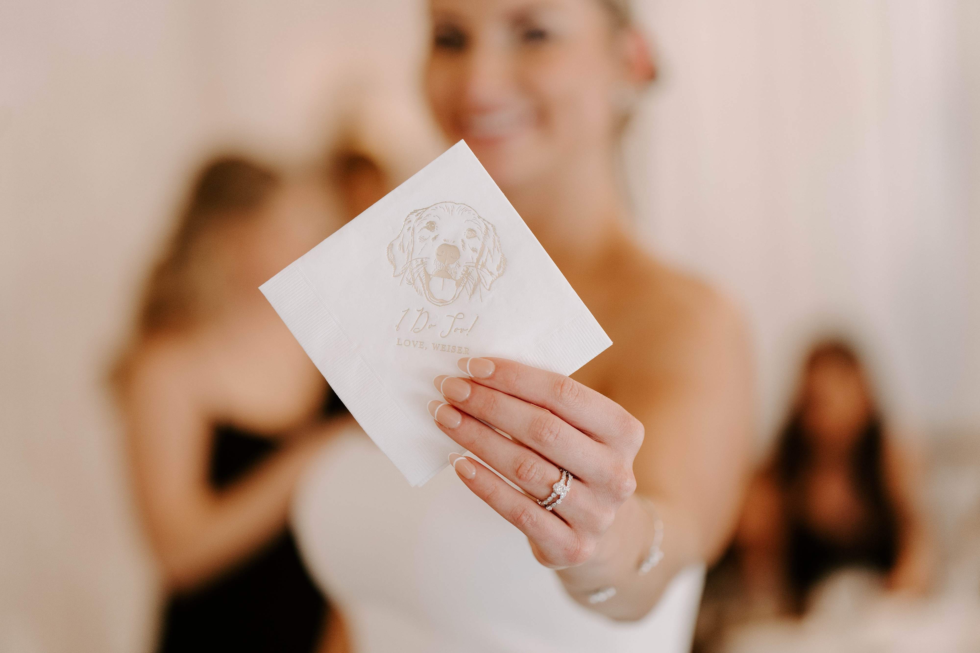
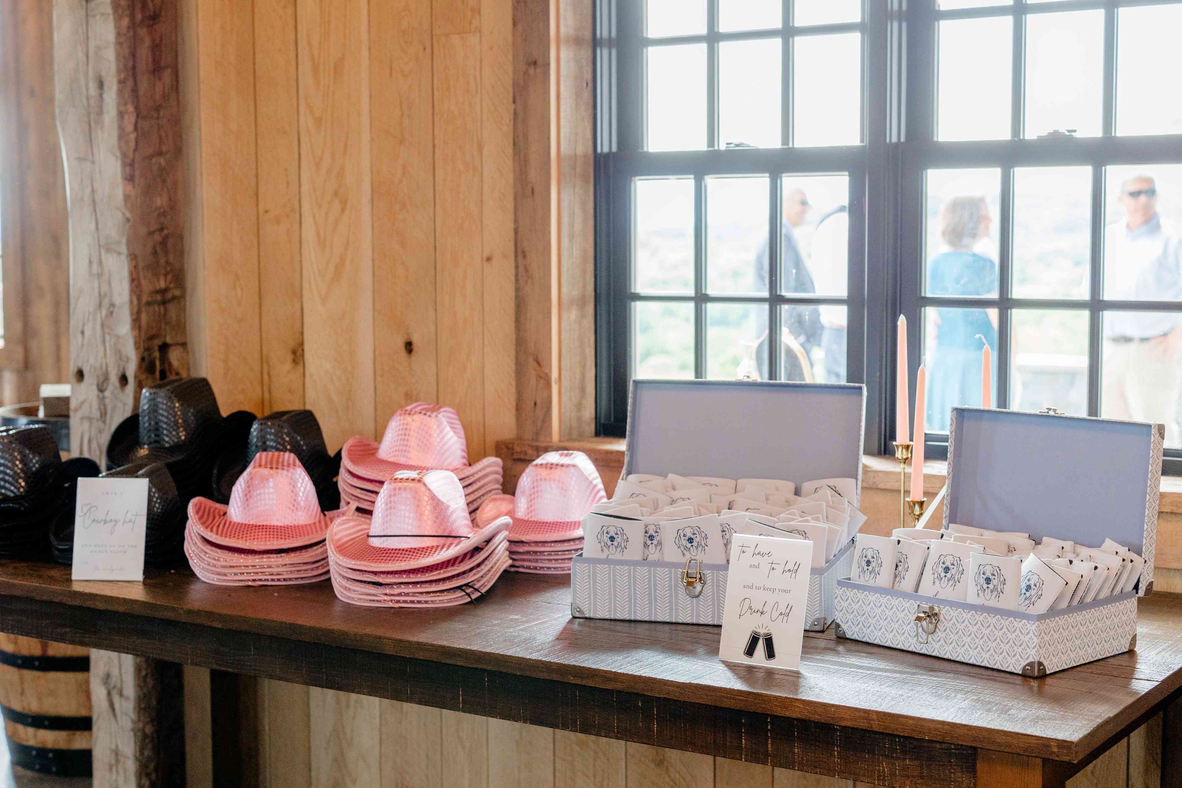
- Custom cocktail napkins or illustrated dog napkins that match the hue—personal and photo-ready
- Frosted plastic cups in your color for outdoor receptions, especially helpful for late-night dancing
- Monochrome favors—scented candles, wrapped chocolates, or custom matches tied with a ribbon
- Coordinated masks or hand sanitizer bottles in the theme color, if you want practical items to match
If you want curated options that are wedding-ready, our best sellers are a good place to start.
Real-Life Styling Example: A Monochrome Blush Wedding
Here's a sample plan for a blush monochrome wedding so you can see how the pieces fit together.
- Venue: Garden conservatory with neutral stone walls
- Ceremony: blush fabric arch, rose-petal aisle in various blush tones, blush ribbon on chairs
- Reception: cream linens with blush runners, mauve napkins, blush and ivory florals, gold flatware
- Signage and stationery: single-ink blush invitations, blush escort cards, matching menus
- Personalized details: illustrated dog napkins in dusty rose, frosted blush cups for the toast
That combination is cohesive, photo-friendly, and feels personal without needing multiple colors. For inspiration and product pairings, check our customer favorites.
Practical Timeline: When to Lock in Your Color
Picking a color early saves you time and confusion. Here's a simple timeline to follow:
- 10–12 months out: choose the main hue and confirm venue
- 8–10 months out: book florist and rentals, share color kit
- 6 months out: finalize stationery, save-the-dates, and custom item designs
- 3 months out: confirm linens, napkin shades, and cake design
- 1 month out: run a color-check with vendors and finalize small details
Having a clear timeline makes it easy to coordinate multiple vendors around the same color story.
Common Mistakes and How to Avoid Them
Monochrome is forgiving, but people still make a few common mistakes. Avoid these to keep the look intentional:
- Avoid using too many unrelated finishes; consistency helps the palette read clean
- Don't assume two vendors' "sage" or "blush" will match exactly—always provide samples
- Watch lighting: test your color in the actual venue lighting before finalizing
- Avoid overloading floral arrangements with too many complementary colors; stay within the tint range
When in doubt, go back to your color kit. It's the single source of truth for all vendors.
Frequently Asked Questions
What are easy monochromatic wedding color ideas for beginners?
Start with neutral-based palettes like blush, dusty blue, or slate gray. They're forgiving, pair well with metallics, and are easy to source. Use one bold element—napkins, a runner, or bridesmaid dresses—to anchor the color.
How many shades of one color should I use?
Generally, use three to five tones: a light tint, a medium base, a deeper shade, and accents (metallics or neutrals). That gives you dimension without drifting into multi-color territory.
Are monochrome weddings suitable for any season?
Yes. Choose hues that complement seasonal light and foliage: pastel tones for spring, saturated jewel tones for winter, warm rusts for fall, and fresh greens for summer.
Will a monochrome palette look dated in photos?
No, if you use varied textures and tones. Monochrome often photographs well because it creates a unified frame. Use natural light and varied finishes to avoid a flat look.
How can I personalize a monochrome theme?
Add custom items in your color: illustrated napkins, custom cups, personalized bar signs, or a unique escort-card treatment. These details tell your story while staying on-theme.
Can I include a neutral accent and still be monochrome?
Yes. Neutral accents like cream, ivory, black, or metallics won't break a monochrome scheme—they'll support it and provide visual rest.
How do I communicate my color to vendors?
Create a color kit with fabric swatches, printed samples, and Pantone or RGB codes. Share it with the florist, rentals, stationery designer, and venue coordinator to ensure consistency.
What are budget-friendly ways to achieve a monochrome look?
Focus on few impactful pieces: linens, napkins, and a statement backdrop. Use simple florals and add a couple of custom items like personalized napkins in your hue to tie everything together affordably. Check our best sellers for budget-friendly, high-impact options.
Conclusion: Make One Color Tell Your Story
Monochromatic wedding color ideas let you create a cohesive, elegant celebration that looks more expensive than it might be. When you focus on a single hue and explore its full range—through shades, textures, and personalized details—you get a wedding that feels curated and personal. Keep a color kit on hand, communicate with vendors, and add a few signature pieces that tell your story. The result will be a memorable day that looks and feels effortlessly intentional.
Related Blog Posts
- Personalized Wedding Color Themes to Inspire Your Big Day
- Wedding Color Palette Ideas for Every Style
- Trending Wedding Color Schemes You Need to See
- Seasonal Wedding Color Choices for Year-Round Inspiration
- Soft Wedding Color Palettes for a Romantic Celebration
- Bold Wedding Color Choices That Make a Statement
- Neutral Wedding Color Palettes for a Timeless Look
- Wedding Color Inspiration Tips from the Pros
- Customizable Napkins for Your Dream Wedding
- Your Complete Checklist for Wedding Decor
Rubi and Lib Brand Message
At Rubi and Lib, we specialize in helping you celebrate life's most memorable moments with personalized wedding and party decor designed to reflect your unique style. From custom cocktail napkins and frosted plastic cups to bar signs and party favors, our curated collections are created to elevate your celebration and leave a lasting impression on your guests. Whether you're planning a wedding, bridal shower, bachelorette party, baby shower, or birthday bash, our products add a thoughtful, stylish touch that turns an ordinary gathering into an unforgettable event. Many of our designs feature custom illustrations—including pet portraits—so your decor feels as one-of-a-kind as your story. As a women-owned small business, we're passionate about making the ordering process seamless and enjoyable. Every item is crafted with care and attention to detail, and most of our products are made in the USA. We believe celebrations should feel personal, joyful, and stress-free—that's why we're here to help you create meaningful moments, one custom detail at a time. Explore our best sellers (https://rubiandlib.com/collections/best-sellers), discover customer favorites (https://rubiandlib.com/collections/best-sellers), or reach out (https://rubiandlib.com/pages/contact-us) for something truly unique. At Rubi and Lib, your celebration is our inspiration.

Written by Bethany Wysolmerski


%0A%0AMonochromatic%20wedding%20color%20ideas%20give%20you%20a%20simple%20way%20to%20create%20a%20cohesive,%20elevated%20look%20that%20fee...)