
Seasonal Wedding Color Choices
Alternate Title: How to Pick the Perfect Palette for Every Season
The right color palette does more than look pretty. It sets the mood, tells a story, and ties every detail of your wedding together. When you focus on seasonal wedding color choices, you make planning easier, styling more cohesive, and photos that feel intentional. Whether you love soft pastels, bold jewel tones, or modern neutrals, you can use the season as a helpful guide to find colors that work for your venue, bouquet, and all your personalized touches.
Why Season Matters When Choosing Colors
Season gives you a built-in mood board. Nature, light, and fashion trends shift across the year, and leaning into those shifts helps your palette feel connected to the moment. Picking seasonal wedding color choices doesn’t limit you; it gives direction so you can make confident decisions about florals, linens, and personalized accents.
- Light: Winter sunlight is cool and low, spring light is soft, summer light is bright, and fall light is golden. Each affects how colors read in photos.
- Florals and foliage: Choose colors that complement what’s available and healthy in that season.
- Comfort: Season-informed palettes help with guest comfort — lighter fabrics and colors for summer, warm textures for fall and winter.
How to Use This Guide
This post breaks seasonal wedding color choices into spring, summer, fall, and winter sections, then walks through how to apply colors across decor, bridal party looks, and personalized items like napkins and cups. You’ll get practical tips, sample palettes, and real examples so you can take action quickly. If you want to see curated decor that pairs beautifully with these palettes, check our best sellers for inspiration.
Spring Palettes: Fresh, Romantic, and Airy
Spring brings a sense of renewal. Think soft, dewy tones and playful accents that feel hopeful and romantic.
Color Ideas
- Soft blush, sage green, and warm ivory
- Pale lavender, dusty blue, and light gray
- Peach, mint, and buttery yellow
Why These Work
Spring palettes pair well with lighter fabrics, garden venues, and delicate florals like ranunculus, peonies, and tulips. Colors read bright but gentle in soft spring light.
Where to Apply Them
- Stationery: watercolor washes and hand-drawn accents
- Napkins and cups: pale backgrounds with a pop of sage or lavender; personalized napkins with an illustrated detail look especially sweet
- Accents: gold or warm brass for a soft contrast
Try browsing our customer favorites to see how pastel palettes look on real items.
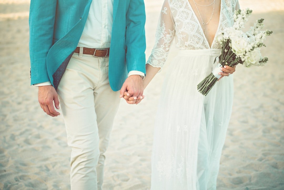
Summer Palettes: Bright, Clean, and Joyful
Summer screams celebration. Use saturated, cheerful colors or clean modern neutrals depending on your vibe.
Color Ideas
- Crisp white, navy, and coral
- Bright fuchsia, tangerine, and teal
- Lemon yellow paired with cool aqua
Why These Work
Strong colors pop in bright sunlight and hold up well in photos. They suit beach venues, backyard gardens, and rooftop receptions.
Where to Apply Them
- Bold napkin borders or printed cups for a playful statement
- Bridesmaid dresses in coordinated but not identical hues
- Graphic signage and cocktail napkins that carry a strong color motif
For summer celebrations that lean modern, consider pairing saturated brights with white space in your decor. You can preview how lively colors look on curated items when you check our best sellers.
Fall Palettes: Warm, Moody, and Textured
Fall gives you permission to go rich and cozy. Think layers, texture, and colors that feel collected and sophisticated.
Color Ideas
- Burnt orange, deep burgundy, and olive
- Mustard yellow, chocolate brown, and cream
- Plum, forest green, and slate gray
Why These Work
Warm tones match autumn foliage and golden light. They pair beautifully with heavier fabrics like velvet and wool and look incredible in dusk photos.
Where to Apply Them
- Layered table settings with textured napkins and depth in centerpieces
- Personalized items in darker backgrounds with metallic type for legibility
- Reception lighting that leans amber to boost warmth
When you want personalized decor with a warm, collected feel, our curated pieces in the customer favorites collection are great references for scale and finish.
Winter Palettes: Elegant, Dramatic, and Festive
Winter palettes can be quiet and classic or bold and dramatic. Either direction feels intentional and glamorous.
Color Ideas
- Ivory, deep emerald, and gold
- Charcoal gray, icy blue, and silver
- Black, wine red, and pearl
Why These Work
Winter light is cool and contrasty. Deep colors give you drama, while icy tones read ethereal. Metallics add sparkle for holiday-adjacent weddings.
Where to Apply Them
- Dark napkin backs with metallic monograms
- Frosted cups for a sophisticated bar presentation
- Statement signage with luxe finishes
If you want custom items that feel elevated, our selection of personalized napkins and signs in the best sellers can help you achieve that winter luxe.
Mixing Seasonal Hues With Your Personal Style
Don’t feel boxed into a season. You can borrow from another season to reflect your personal taste. The trick is to anchor your palette with one or two core tones and use seasonal touches as accents.
- If you love spring pastels but it's a fall wedding, add deeper neutrals or a warm metallic to ground the palette.
- For a winter wedding with summery florals, pick richer versions of the same colors so they read seasonally appropriate.
- Use texture—linen, velvet, matte paper—to push a color into the season you want.
When you’re mixing influences, test samples in the actual light at the venue and order proofs of personalized items. You can preview popular styles in our customer favorites collection to see how materials and colors translate in real life.
How to Build a Palette: A Simple Step-By-Step
- Choose one dominant color that reflects the season and your venue.
- Add one or two supporting colors that complement the dominant color.
- Pick one neutral for balance, like cream, gray, or taupe.
- Choose a metallic or accent color for small details, such as napkin rings, type, or signage.
- Apply the 60-30-10 rule: 60 percent dominant, 30 percent support, 10 percent accent.
Try building a few palettes and laying out a mock place setting to see how items like napkins, cups, and signs work together. If you want ready-made ideas or curated combos, our best sellers provide real-world pairings that are easy to adapt.
Applying Colors to Personalized Items
Personalized decor is where your chosen palette really shines. These pieces are small, but they carry personality and guest experience.
Napkins
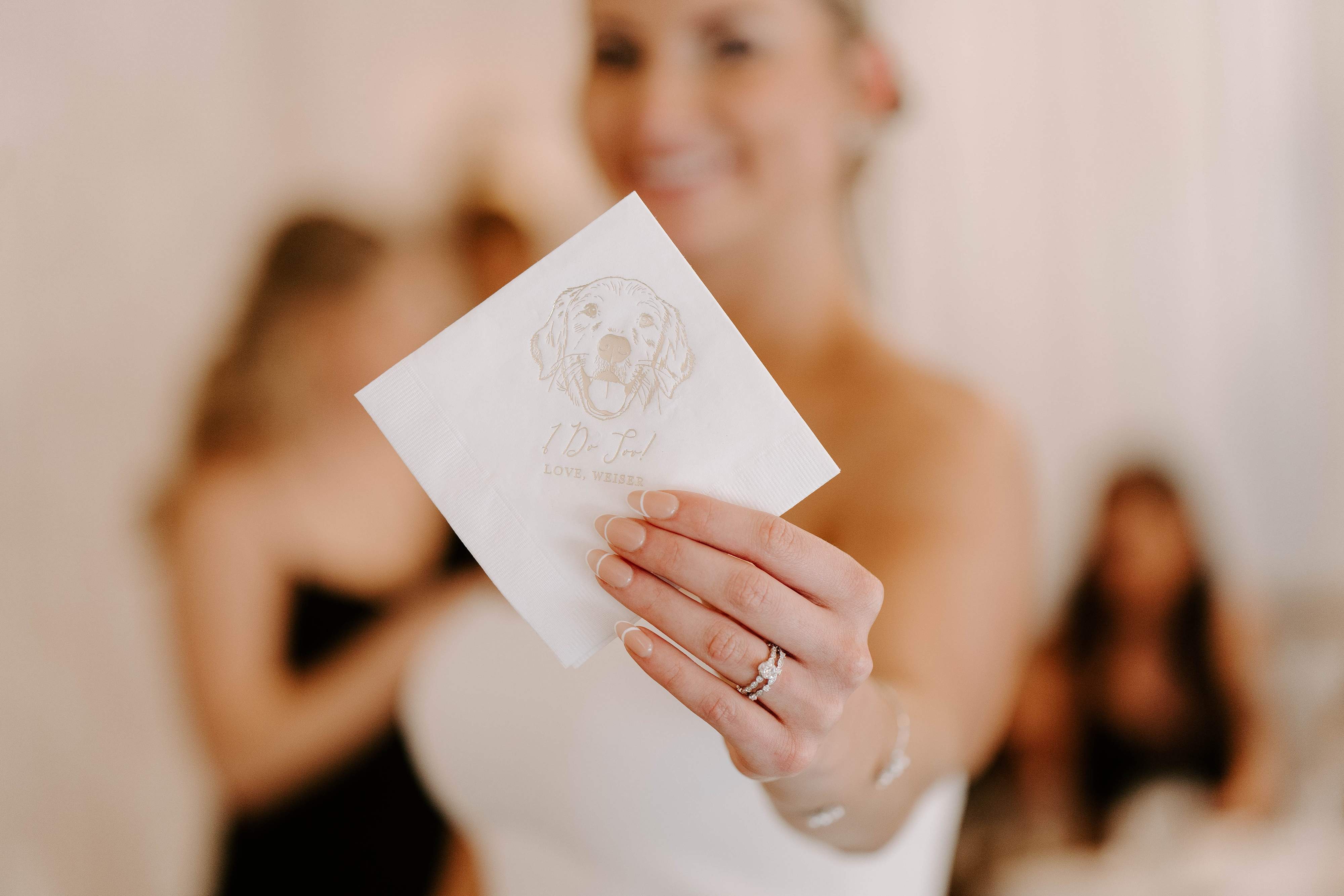
Napkins are surprisingly impactful. A colored napkin or a custom-printed napkin with a monogram, illustration, or pet portrait creates a cohesive, photographed detail. For spring, think soft backgrounds with a colored monogram; for fall, a deep napkin with light printing reads luxe.
We often recommend ordering a few napkin proofs to check color and print placement. See our selection in the customer favorites to find styles that match different palettes.
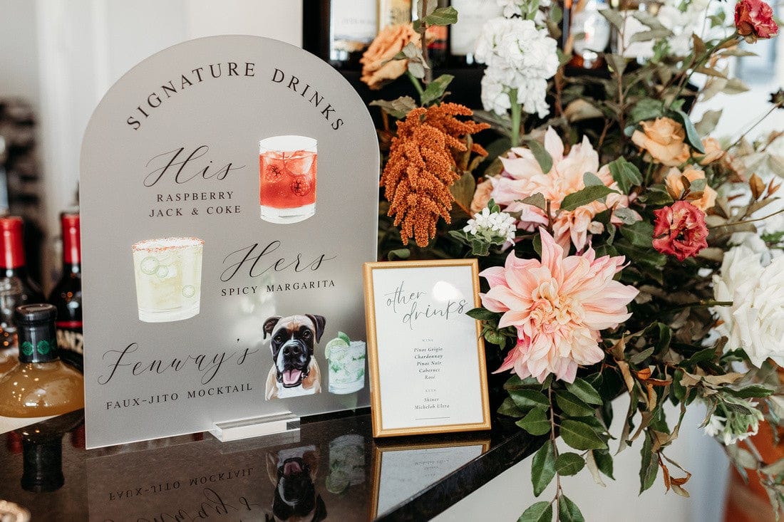
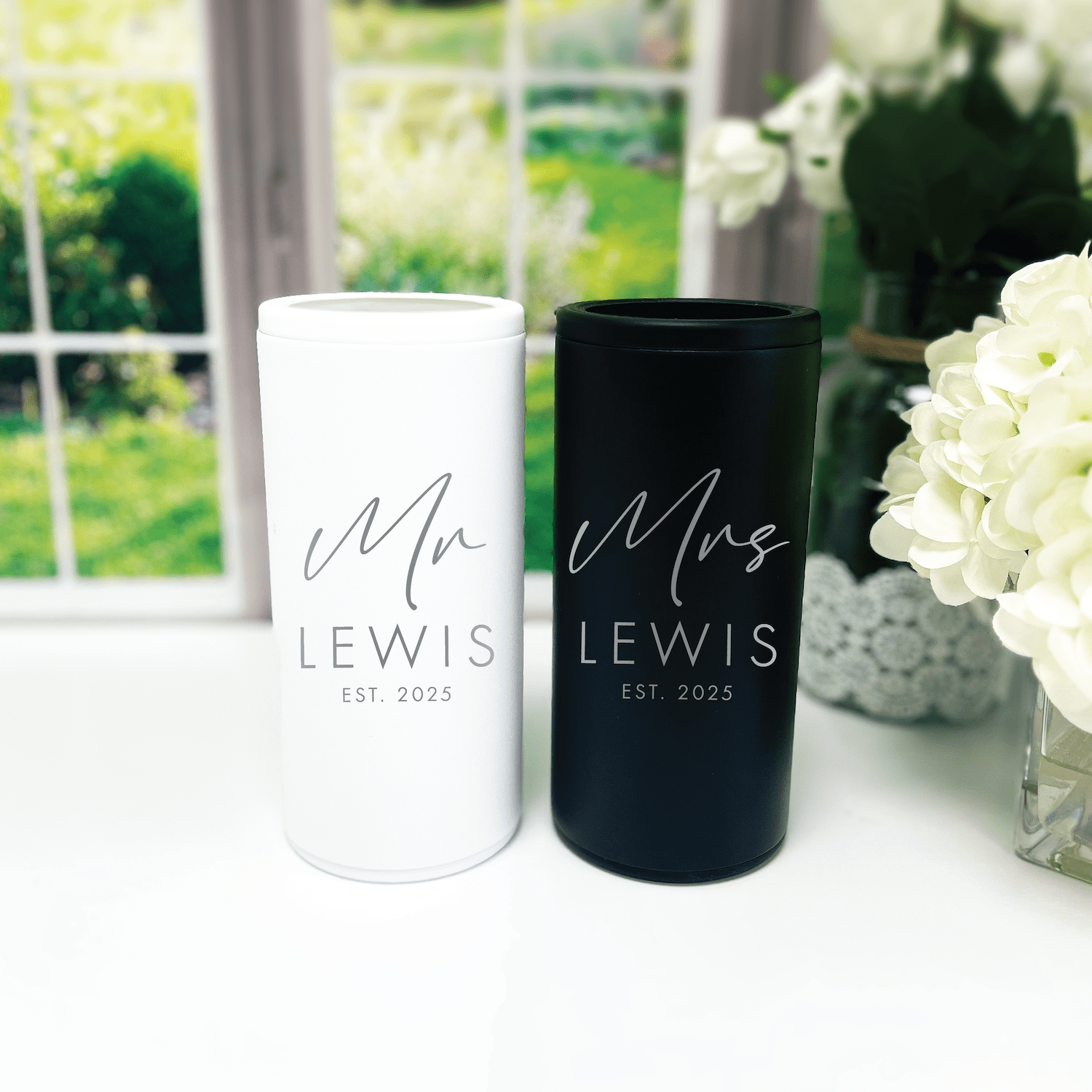
Cups and Drinkware
Frosted or colored cups are great for summer and winter, since they’re both practical and decorative. Use your accent color for the logo or illustration so drinks become part of the visual story. For colder months, metallic print on dark cups looks elegant.
Explore our popular shapes and finishes in the best sellers to see what translates best with your colors.
Signs and Stationery
Signage ties ceremony and reception spaces together. A consistent palette across your welcome sign, bar sign, and menu gives guests clarity and continuity. If you’re ordering custom signs, provide your hex codes or Pantone references so the color stays consistent across items.
You can preview how designs look on assorted materials by checking examples in our customer favorites.
Color and Photography: What Photographers Love
Photographers pay attention to contrast and skin tones. Here are quick rules that help photos look cohesive.
- High-contrast palettes (navy and white, black and gold) create dramatic formal photos.
- Soft palettes (blush, sage, cream) flatter skin tones in natural light.
- Avoid clashing neon hues that can cast color onto skin.
- Give your photographer the palette in advance so they can plan lighting and backdrops.
If you’re ordering colored napkins or cups, be mindful of reflective metallics. They look great in person, but can create highlights in photos. Ask your photographer for quick tests during setup.
Color Psychology: How Your Palette Shapes Mood
Colors evoke feeling. Think about the atmosphere you want guests to feel when they arrive.
- Soft blues and greens calm and relax guests.
- Warm tones like orange and gold feel cozy and welcoming.
- Bright, saturated colors increase energy and playfulness.
- Neutrals and pastels read timeless and understated.
Use small doses of energetic colors to lift a calm palette. A pop of coral on a napkin or a bright ribbon on a sign does a lot without overwhelming the setting.
Practical Tips: From Samples to Day-Of
- Order material swatches and print proofs before finalizing large orders.
- Test colors in the actual venue light and take photos with your phone at different times of day.
- Bring fabric swatches and florals together to see how colors interact.
- Label your prototypes so you remember what each sample represents.
- For personalized items, provide logos and artwork in high resolution and include color codes whenever possible.
Need ideas for coordinating printed items and tableware? Our best sellers are a useful reference for scale and color relationships in real event setups.
Trends vs. Timeless Palettes: How to Decide
Trends are fun, but timeless palettes age better in photos and memories. If you love a trend, consider using it in smaller, replaceable details rather than the primary color. For example, a trending neon straw can be swapped out, while table linens keep a classic color.
- If you’ll keep decor as heirlooms, pick a classic neutral base.
- If you’re driven by the latest hues, commit in accent pieces and personalized items that are inexpensive to change.
- Personalized napkins or cups are a sweet way to showcase a trend without risking the entire style longevity.
To see how trend-forward and classic pieces look in real life, check our curated customer favorites.
Budgeting Your Color Decisions
Color choices can impact cost. Specialty dyes, metallic foils, and custom-printed items may increase price. Here’s how to stretch your budget.
- Choose one custom piece as your splurge, like illustrated napkins or a feature sign; keep other elements simpler.
- Use color in small, repeatable items such as napkins and cups; they deliver high impact at lower cost per guest.
- Mix affordable base linens with a few specialty accents to create depth without overspending.
If personalized items are on your wishlist, start with a statement piece from our best sellers and add coordinated items from the customer favorites as budget allows.
Sample Seasonal Palettes You Can Use Today
Below are concrete palettes you can copy, plus quick notes on how to apply them across decor.
Spring Garden
- Dominant: Blush Pink
- Support: Sage Green
- Neutral: Ivory
- Accent: Warm Gold
- Use: Blush napkins with sage printed monogram, gold cutlery accents, ivory linens.
Summer Coastal
- Dominant: Navy
- Support: Coral
- Neutral: Crisp White
- Accent: Brass
- Use: Navy cups, coral napkin borders, white signage with brass type.
Autumn Harvest
- Dominant: Burnt Orange
- Support: Burgundy
- Neutral: Warm Taupe
- Accent: Antique Gold
- Use: Burnt orange napkins, taupe chargers, gold-foil menus.
Winter Gala
- Dominant: Deep Emerald
- Support: Charcoal
- Neutral: Ivory
- Accent: Silver
- Use: Emerald cups with silver print, charcoal signage, ivory napkins with metallic monogram.
Find ready-made items that pair well with these palettes in our best sellers and mix with tiny personalized touches from our customer favorites.
Quick Checklist Before You Commit
- View colors in your venue lighting at the time of day you’ll be married.
- Ask your florist for seasonal blooms and a swatch of greenery they plan to use.
- Order printed proofs of any personalized items, including napkins and cups.
- Share hex or Pantone codes with vendors to keep colors consistent.
- Test your palette in photos and with your photographer.
These final checks save time and keep surprises off your wedding day. If you want curated options to speed decision-making, browse our customer favorites for tried-and-true pairings.
Real-Life Examples: Personalizing Seasonally
Here are a few short examples to inspire you.
- Early June backyard wedding: You choose crisp white and coral. You use coral-rimmed napkins with a small illustrated detail that references your dog, and white frosted cups with coral text. Guests love the bright, coordinated bar display.
- October vineyard ceremony: You choose mustard, olive, and burgundy. You order custom napkins in olive with a mustard monogram and a signature bar sign in burgundy with antique gold lettering. The overall look feels collected and warm.
- December city hall micro-wedding: You choose charcoal, ivory, and silver. You add a little luxe by printing a metallic silver menu and offering personalized napkins with a minimalist line drawing of your skyline.
Small personalized items—especially ones that reflect you, like our popular illustrated dog napkins—make seasonal color choices feel intimate and memorable. If you want to see how pet illustrations and color work together in real orders, explore our best sellers.
Frequently Asked Questions
How do I pick between warm and cool colors for my wedding?
Start with the season and the venue. Warm tones pair with golden light and rustic venues, while cool tones flatter lofts, galleries, and winter light. If you’re torn, use a warm accent with a cool base or vice versa to balance both.
Can I use non-seasonal colors if I love them?
Absolutely. Use a non-seasonal color as an accent and ground it with seasonal neutrals. Texture and finish will help a color read seasonally appropriate.
How many colors should I include in my palette?
Keep it simple. A three- to five-color palette is easiest to manage: one dominant, one or two supporting, one neutral, and one accent. That keeps things cohesive from ceremony to reception.
Should bridesmaids all wear the same color?
Not necessarily. Mixing shades within the same palette—like different blues or variations of blush—creates depth while keeping cohesion. Coordinate fabrics and cuts for a balanced look.
How do I ensure my printed items match my linens and flowers?
Share hex or Pantone codes with vendors and request proofs. Order small swatches or samples when possible, and view them in the venue light to confirm they work together.
What role do personalized items play in color cohesion?
They act as anchors. Personalized napkins, cups, and signs can repeat your accent color and logo to keep the visual story going. They’re a high-impact, relatively low-cost way to make everything feel tied together.
How far in advance should I order custom-printed items?
Order samples and proofs at least 8 to 12 weeks before the wedding, and finalize quantities about 6 to 8 weeks out. If you have complex prints or metallic foils, allow extra time for production.
Can I change colors for different parts of the day?
Yes. You can use softer daytime colors for the ceremony and amp up contrast for the reception lighting. Use interchangeable elements like napkins and signage to shift the vibe without reinventing the whole event.
Conclusion
Seasonal wedding color choices are your secret weapon. They simplify decisions, create mood, and make every detail feel intentional. Use the season as your starting point, build a simple palette, and add personal touches that tell your story. Small, personalized items like custom napkins and custom cups are a perfect way to lock color into the guest experience. When you pair thoughtful colors with a few standout personalized pieces, your wedding will feel polished, personal, and unmistakably yours.
At Rubi and Lib
At Rubi and Lib, we specialize in helping you celebrate life's most memorable moments with personalized wedding and party decor designed to reflect your unique style. From custom cocktail napkins and frosted plastic cups to bar signs and party favors, our curated collections are created to elevate your celebration and leave a lasting impression on your guests. Whether you're planning a wedding, bridal shower, bachelorette party, baby shower, or birthday bash, our products add a thoughtful, stylish touch that turns an ordinary gathering into an unforgettable event. Many of our designs feature custom illustrations—including pet portraits—so your decor feels as one-of-a-kind as your story. As a women-owned small business, we're passionate about making the ordering process seamless and enjoyable. Every item is crafted with care and attention to detail, and most of our products are made in the USA. We believe celebrations should feel personal, joyful, and stress-free—that's why we're here to help you create meaningful moments, one custom detail at a time. Explore our best sellers (https://rubiandlib.com/collections/best-sellers), discover customer favorites (https://rubiandlib.com/collections/best-sellers), or reach out (https://rubiandlib.com/pages/contact-us) for something truly unique. At Rubi and Lib, your celebration is our inspiration.
Ready to try a palette in real life? Start by ordering a few personalized samples from our best sellers and customer favorites. Seeing your colors on napkins and cups will make choosing the rest of your wedding colors joyful and simple.

Written by Bethany Wysolmerski


