
Personalized Wedding Color Themes: A Complete Guide to Building Your Palette
Make Your Color Palette Feel Like You: A Friendly Guide to Personalized Wedding Color Themes
Your wedding color theme does more than match napkins to bridesmaid dresses; it sets the mood, tells your story, and guides every design choice. When you choose personalized wedding color themes, you make intentional decisions that help guests feel what you want them to feel, whether that's joyful, cozy, dramatic, or playful. This guide walks you through practical steps, creative ideas, and real-world examples so you can design a cohesive palette that's unmistakably yours.
Jump to a Section
- Why a Personalized Wedding Color Theme Matters
- How to Find Your Starting Point
- Methods for Building a Personalized Palette
- Color Psychology: What Different Hues Communicate
- Seasonal Considerations and Venue Lighting
- Personalizing Through Details: What to Color Coordinate
- How to Use Personalized Decor to Reinforce Your Palette
- Palette Examples With Personality
- How to Coordinate Attire Without Overdoing It
- Budget-Friendly Ways to Make Color Feel Luxe
- Timelines: When to Lock In Your Colors
- Common Color Mistakes and How to Avoid Them
- Real Examples: Personalization Ideas That Work
- How to Test a Palette Before You Commit
- Working With Vendors to Ensure Color Consistency
- Eco-Conscious Color Choices
- Final Checklist
- Frequently Asked Questions
Why a Personalized Wedding Color Theme Matters
Color influences emotion and memory. When you create a personalized wedding color theme, you do more than pick pretty hues. You:
- Set the mood: soft neutrals create calm, jewel tones add drama, and bright colors bring energy.
- Tell your story: colors can reflect your culture, hobbies, or the way you two met.
- Unify your day: a clear palette ties ceremony, reception, stationery, and favors together.
- Make photos sing: consistent colors help photographers capture a cohesive album.
Think of your palette as the design thread that runs through everything. It's one of the easiest ways to add personality without overcomplicating planning.
How to Find Your Starting Point
If you're unsure where to begin, these prompts will help you discover colors that feel right.
Look to your love story
Did you meet at a coffee shop on a rainy fall afternoon? Consider warm browns, muted greens, and a pop of deep mustard. Were you on a tropical vacation together? Coral, teal, and sandy beige might be a natural fit.
Use your venue as a guide
- Outdoor garden: soft pastels, sage, and cream
- Industrial loft: charcoal, copper, and dusty rose
- Historic estate: navy, gold, and ivory
Pull inspiration from non-wedding things
Look at a favorite painting, a family heirloom, or your go-to outfit. You'll often find a palette you love in everyday life.
Methods for Building a Personalized Palette
There are several easy frameworks you can use to build your wedding palette.

1. The 60-30-10 Rule
Start with a dominant color (60 percent), a secondary color (30 percent), and an accent (10 percent). For example, 60 percent ivory, 30 percent dusty blue, 10 percent burnt orange.
2. Monochrome With a Twist
Choose one color in varying shades and add a contrasting accent. Think blush pink, rose, and burgundy with a sage green accent.
3. Triadic Color Scheme
Pick three colors evenly spaced on the color wheel. This creates vibrant balance, and navy, mustard, and blush is a modern triad example.
4. Tone and Texture Focus
Sometimes you don't need many hues. Layer textures and materials, such as matte linens, metallic flatware, and glossy signage, to create richness within a limited palette.
Color Psychology: What Different Hues Communicate
Colors carry emotional weight. You don't have to overthink it, but knowing the basics helps you match tone to intention.
- Blue: calm, trustworthy, classic
- Green: fresh, natural, peaceful
- Yellow: joyful, bright, playful
- Pink: romantic, soft, feminine
- Red: passionate, bold, celebratory
- Purple: luxurious, creative, moody
- Neutrals: timeless, grounding, versatile
Combine psychology with personal meaning. Maybe a color has sentimental value because it was in your grandmother's wedding dress or the team jersey you both wore to your first date.
Seasonal Considerations and Venue Lighting
Your palette will look different depending on season and lighting. Keep these practical tips in mind.
Spring
Light pastels and fresh greens work well. Add metallics for polish.
Summer
Bright, saturated hues read well in sunlight. Consider bold accents but keep some neutrals to balance.
Fall
Warm, earthy tones and jewel shades look right at home. Textured linens add cozy warmth.
Winter
Deep tones and high-contrast palettes, such as navy and gold or emerald and cream, create drama. Warm lighting prevents colors from looking flat.
Check your venue lighting before committing. Incandescent light warms colors, while LED and fluorescent can cool tones. Bring fabric swatches and paper samples to look at under the venue lighting if you can.
Personalizing Through Details: What to Color Coordinate
To make your personalized wedding color themes feel cohesive, think beyond centerpieces. Coordinate key touchpoints so the palette repeats in purposeful ways.
- Save-the-dates and invitations: set the tone early
- Bridal party attire: mix and match shades within the palette
- Floral arrangements: play with color saturation and greenery
- Linens and napkins: small changes like custom wedding napkins elevate the table
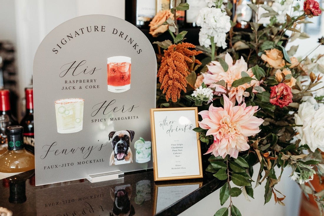
- Drinkware and signage: branded cups and signs tie the bar and lounge areas in
- Favors: use color to make favors feel like part of your story
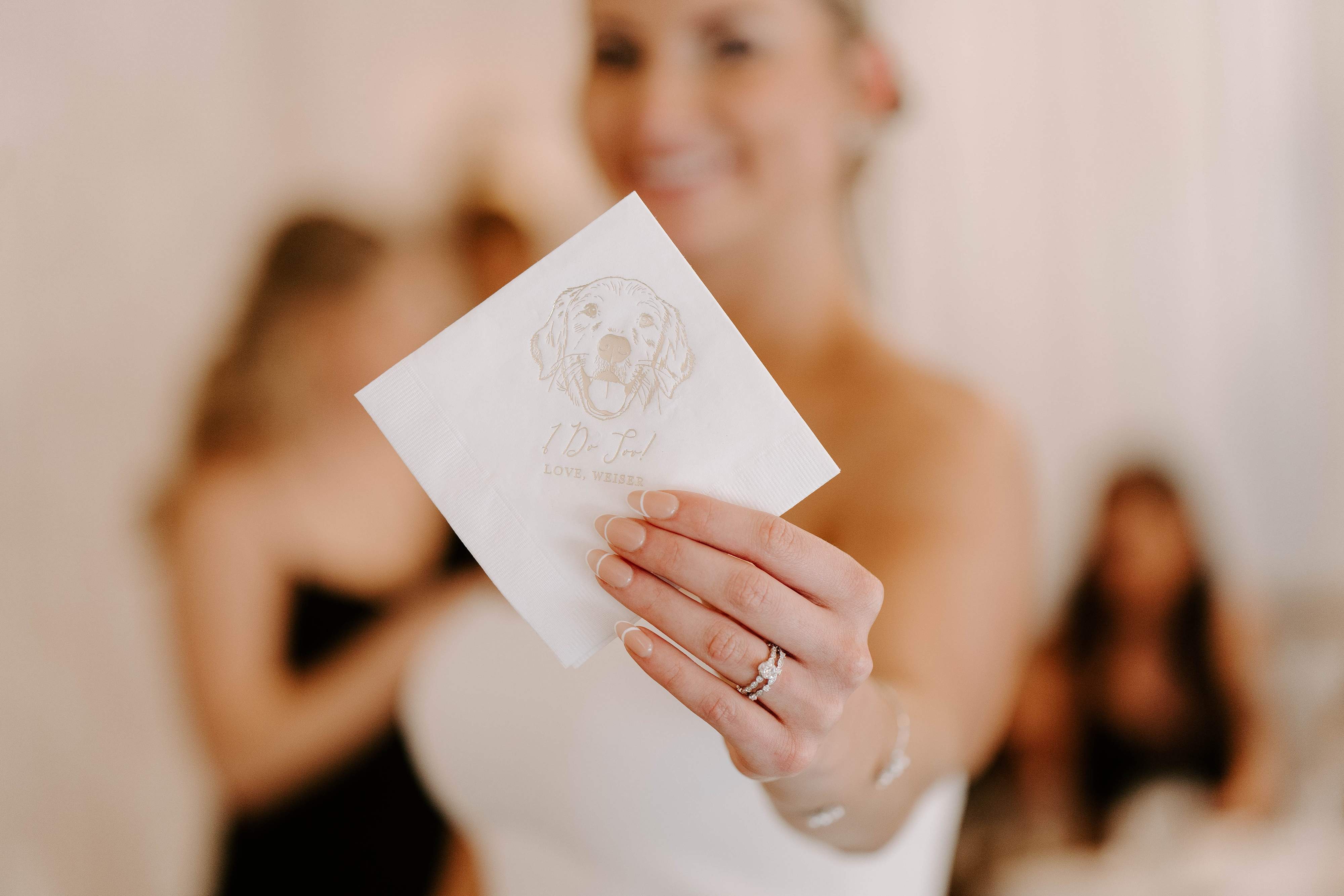
Little items matter. For example, custom illustrated dog napkins that match your palette turn functional items into keepsakes and are a charming way to reflect personality at each table.
How to Use Personalized Decor to Reinforce Your Palette

Custom Cocktail Napkins
Napkins are affordable, visible, and practical. A colored napkin with your initials, a small motif, or a pet illustration makes a lasting impression. Browse our full color wedding napkins to see how simple designs paired with color can elevate a drink station.
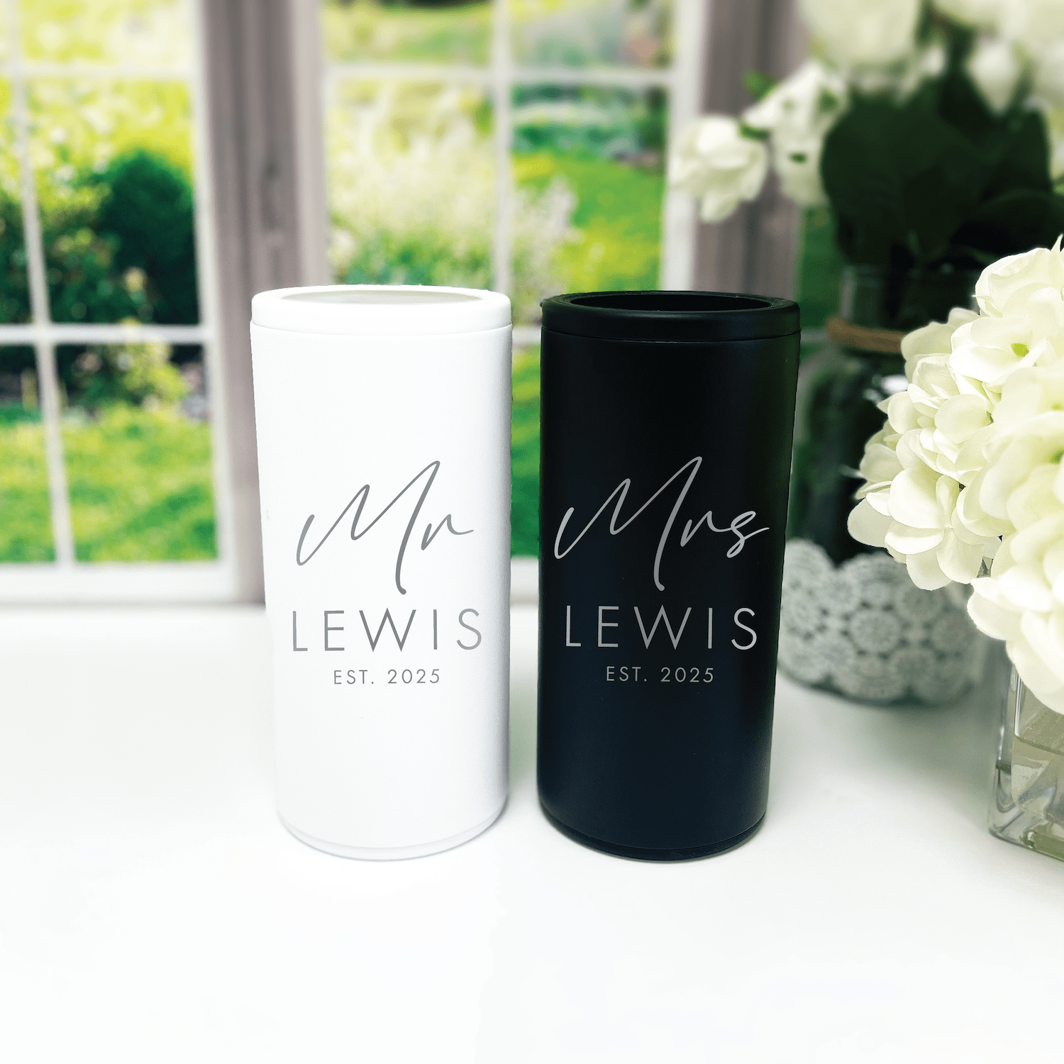
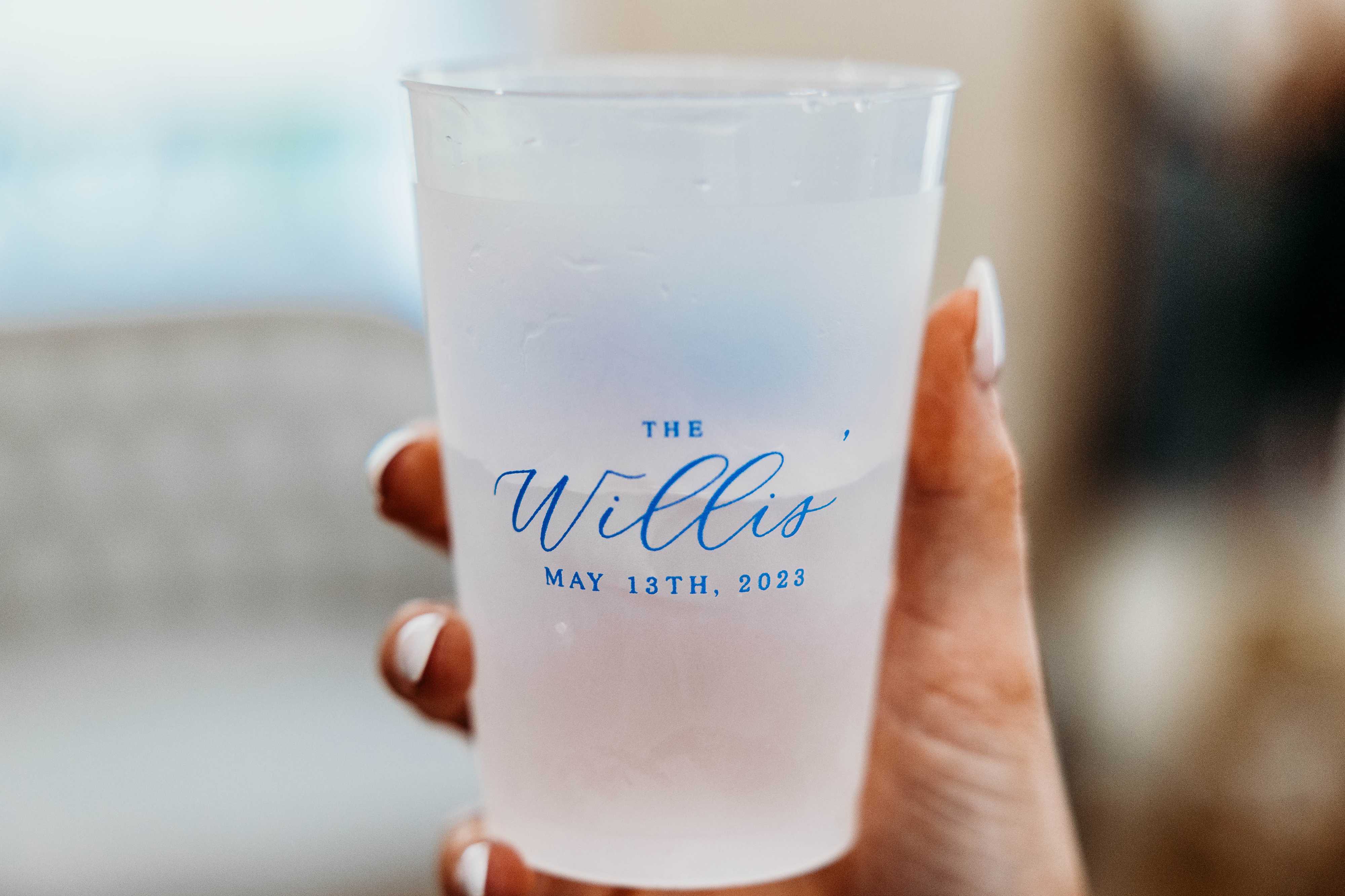
Frosted Plastic Cups
Cups are ideal for outdoor weddings. Match the cup color to one of your palette tones and add a tiny monogram or icon. For popular picks and proven designs, check out our best-selling frosted cups to see how color choices look in context.
Signs and Bar Menus
Signs are large visual anchors. Use your main color for background and a contrasting accent for text. A personalized bar sign in your theme becomes both directional and decorative. Browse our acrylic wedding signs collection for inspiration.
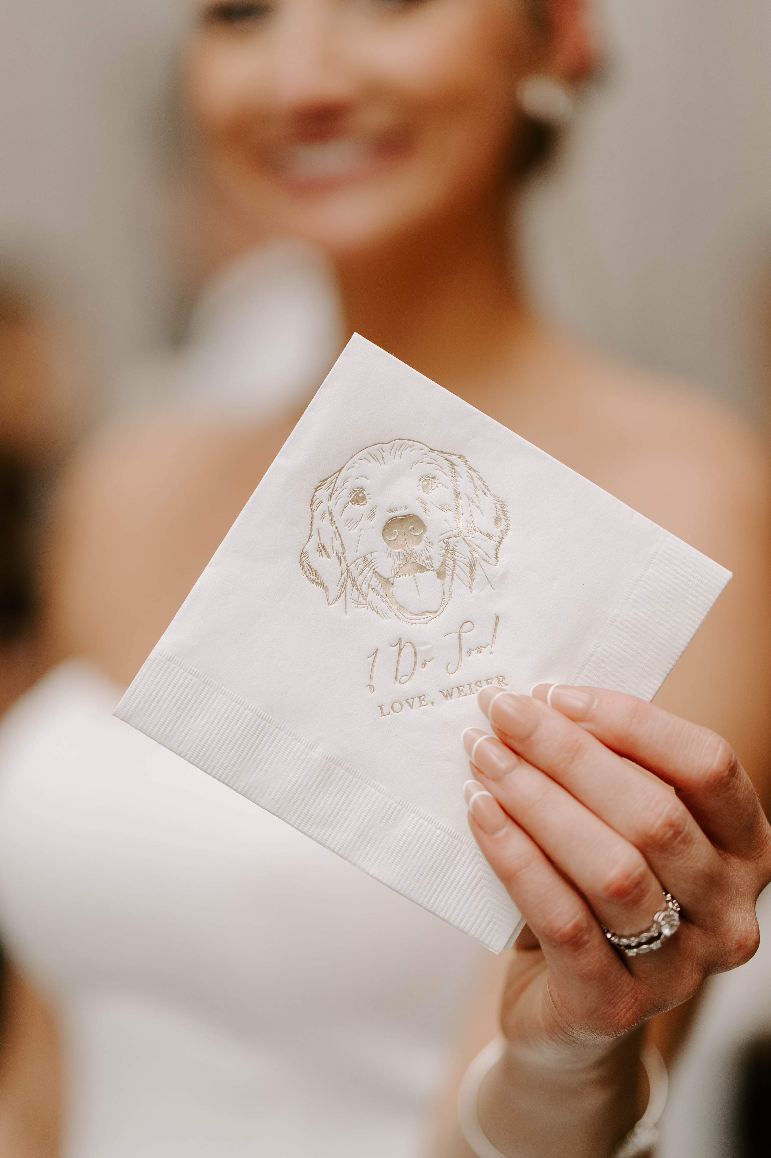
Illustrated Napkins and Pet Portraits
If your dog is part of your story, include them. An illustrated dog napkin in your palette is playful, personal, and highly shareable. Guests love small touches that are authentic to you.
Favors and Gift Tags
Create a mini moment by wrapping favors in paper or ribbon that match your accent color. A consistent color on favor tags helps everything photograph beautifully.
Putting It All Together: Palette Examples With Personality
Here are concrete palettes you can adapt. Each one includes primary, secondary, and accent choices plus where to use them.
Soft Garden Party
- Primary: Sage green
- Secondary: Dusty blush
- Accent: Warm ivory
- Use on: Linens (sage), bridesmaid dresses (dusty blush), napkins and cups (ivory with blush print).
Modern Industrial
- Primary: Charcoal
- Secondary: Copper or rust
- Accent: Soft peach
- Use on: Signage (charcoal with copper foiling), cups (charcoal frosted), napkins (peach accent). Browse our modern names wedding collection for clean, minimal designs that suit this palette.
Coastal Bright
- Primary: Teal
- Secondary: Coral
- Accent: Sand
- Use on: Escort cards (teal), cocktail napkins (coral with sand print), favors (sand-colored ribbon).
Moody Romance
- Primary: Deep plum
- Secondary: Midnight blue
- Accent: Gold
- Use on: Linens (midnight), napkins (plum), signage (gold lettering).
How to Coordinate Attire Without Overdoing It
You want cohesive photos, not matchy-matchy uniforms. Here are ways to let color feel intentional and modern.
- Choose a palette for bridesmaids, but allow different textures and patterns within that palette.
- Let groomsmen choose shirts, ties, or suspenders in the secondary color rather than full suits.
- Use accessories like sashes, pocket squares, and hair pieces to sprinkle your accent color throughout.
- Give guests a gentle clue with a suggested color palette on your wedding website, not a strict dress code.
For example, if your palette is navy, blush, and gold, let bridesmaids pick their navy dress style while adding blush bouquets and gold jewelry for continuity.
Budget-Friendly Ways to Make Color Feel Luxe

- Swap linen colors between ceremony and reception; the change feels intentional and fresh.
- Use colored napkins in a rich fabric; a small upgrade feels luxurious and is cost-effective.
- Customize a few high-visibility items, such as cocktail napkins, cups, and a welcome sign, to create a designer touch without splurging on everything.
- Mix in neutral rentals and use your palette for small decor pieces so color pops without costing a fortune.
Timelines: When to Lock In Your Colors and Order Personalized Items
Timing keeps stress low. Here's a practical timeline so colors and custom items arrive in time.
- 10 to 12 months before: Choose overall palette and secure venue and major vendors.
- 8 to 10 months before: Finalize stationery design and major decor concepts.
- 6 to 8 months before: Order bridesmaid dresses and rental samples; test fabric colors under venue lighting.
- 4 to 6 months before: Choose personalized items like napkins, cups, and signs, and place custom orders.
- 2 to 3 months before: Confirm proofs and place reorders if needed. Receive and inspect custom pieces.
- 2 to 4 weeks before: Pack, label, and cross-check with your wedding timeline. Double-check seating chart colors and decor layouts.
Custom items often require several rounds of proofing. Start earlier if you want illustrations, like a pet portrait, integrated into the design.
Common Color Mistakes and How to Avoid Them
- Relying only on digital swatches: Always request paper or fabric samples before printing or ordering linens.
- Picking too many competing accents: Stick to a main and secondary color, plus one accent max to avoid a cluttered look.
- Forgetting about natural elements: Greenery, wood, and metal finishes affect how your colors read; test how your palette plays with them.
- Ignoring photography: Ask your photographer how your palette will read in photos and at sunset.
Real Examples: Personalization Ideas That Work

Example 1: The Coffee Shop Meeting
You met at a cozy coffee shop. Use warm browns, cream, and a deep teal accent. Personalized napkins with a minimalist coffee cup icon and your initials make the bar feel curated. A frosted teal cup for signature drinks seals the theme. Browse our best sellers for crowd-pleasing color and design combinations.
Example 2: The Beachside Proposal
He proposed under a boardwalk sunset. Choose sand, coral, and ocean blue. Incorporate a sandy ribbon on favors and coral-printed cocktail napkins with a tiny shell motif.
Example 3: Your Furry Friend as Ring Bearer
If your dog is attending, include them in the color story. Use illustrated dog napkins that match your palette. Not only do these napkins show personality, but they also create a delightful photo moment for guests.
How to Test a Palette Before You Commit
- Create a mood board with fabrics, florals, and photos of your venue.
- Order a few napkins or small custom items in your chosen colors to see how they look in person.
- Pin or tape swatches to where they'll appear, on tables, against the ceremony arch, near the bar.
- Take photos in your venue lighting and review them with your partner and planner.
Testing this way prevents surprises and helps you sleep better at night.
Working With Vendors to Ensure Color Consistency
Clear communication is the secret to consistent color across vendors.
- Share your palette as physical swatches and hex or Pantone codes when possible.
- Ask florists to match a swatch rather than rely on a color name.
- Request proofs for printed items and confirm colors under different lighting.
- Keep a central folder with photos and instructions so everyone sees the same reference.
When Rubi and Lib designs custom pieces, we match printed proofs to customer swatches during proofing rounds to make sure the finished item fits your palette perfectly. If you'd like help, reach out to us to discuss your vision.
Eco-Conscious Color Choices
If sustainability matters to you, you can still have a personalized palette that's eco-friendly.
- Choose reusable or recyclable items like sturdy cups or cloth napkins in your colors.
- Pick local florals grown in-season to match your palette and reduce carbon footprint.
- Use digital save-the-dates and only print essential stationery, keeping printed pieces simple and impactful.
Personalized favors that are useful and made locally help your color choices feel thoughtful rather than wasteful.
Final Checklist: Locking Your Personalized Wedding Color Themes

- Test fabric and paper swatches under venue lighting
- Confirm hex or Pantone codes with vendors
- Place orders for key personalized items at least 4 to 6 months ahead
- Ask for proofs for any custom illustration, like pet portraits
- Do a final run-through of photos with your photographer
Frequently Asked Questions
How many colors should I have in my wedding palette?
Keep it simple: one primary, one secondary, and one accent is a tried-and-true approach. You can add neutral shades for balance. Too many competing colors can feel chaotic in photos.
Can I change colors between ceremony and reception?
Yes. A subtle switch, like swapping ceremony aisle runners for different reception linens and napkins, can create two distinct moments while staying cohesive overall. Just repeat at least one color in both spaces to tie them together.
What if my venue has a bold color, like a red wall?
Work with it. Use neutral tones to balance the bold backdrop and add a small accent color that complements the wall. Bring samples and test how florals and fabrics look near the wall before committing.
How do I include my pet in the color theme?
Small personalized touches work best. Illustrated pet napkins, a custom sign, or a collar accent can reflect their personality and your color palette without overwhelming the design.
When should I order personalized items like napkins and cups?
Order personalized items 4 to 6 months before the wedding to allow for proofing and shipping. If you want custom illustrations, start earlier so designers have time for revisions.
Can I use nontraditional colors, like black or neon?
Absolutely. Black can be elegant and modern when paired with metallics. Neon can be playful for a late-night lounge or dance floor. The key is to balance boldness with grounding neutrals.
How do I ensure colors photograph well?
Ask your photographer for input. Photographers can advise on colors that hold up in the venues you've chosen, and they can do test shots of samples in natural and artificial light.
Are there any colors to avoid?
No universal "bad" colors exist. The only colors to be cautious with are those that clash with your venue or create unwanted skin tone effects in photos. Testing samples in the space helps you avoid surprises.
Conclusion
Personalized wedding color themes are one of the most expressive and manageable ways to make your wedding feel like you. Start with a story or a space, pick a simple framework, and bring the palette to life through a handful of thoughtful, personalized pieces. Small touches, like custom napkins, illustrated dog napkins, and frosted cups that match your colors, have outsized impact. Approach your palette with intention and a few practical tests, and you'll create a day that looks cohesive and feels deeply personal.
Related Posts
- Wedding Color Palette Ideas: 25 Stylish Palettes and How to Use Them
- Custom Pet Portrait Napkins for Weddings: Design Ideas and Tips
- Personalized Touches for Guests That Make Weddings Unforgettable
- Checklist for Wedding Decor: Everything You Need
- Welcome Sign to Wedding: A Complete Planning Guide
- Custom Wedding Cups: How to Choose, Design, and Order
- 5 Signs Every Wedding Needs
- Don't Forget Your Wedding Signage!
- Do You Really Need Custom Cups at Your Wedding? Yes, Here's Why
- Monogrammed Cups for Weddings: A Timeless Custom Touch
About Rubi and Lib
At Rubi and Lib, we specialize in helping you celebrate life's most memorable moments with personalized wedding and party decor designed to reflect your unique style. From custom cocktail napkins and frosted plastic cups to bar signs and party favors, our curated collections are created to elevate your celebration and leave a lasting impression on your guests.
Whether you're planning a wedding, bridal shower, bachelorette party, baby shower, or birthday bash, our products add a thoughtful, stylish touch that turns an ordinary gathering into an unforgettable event. Many of our designs feature custom illustrations, including pet portraits, so your decor feels as one-of-a-kind as your story.
As a women-owned small business, we're passionate about making the ordering process seamless and enjoyable. Every item is crafted with care and attention to detail, and most of our products are made in the USA. We believe celebrations should feel personal, joyful, and stress-free, and that's why we're here to help you create meaningful moments, one custom detail at a time.
Explore our best sellers, browse our full color wedding napkins, or reach out for something truly unique. At Rubi and Lib, your celebration is our inspiration.

Written by Bethany Wysolmerski

