
Wedding Color Inspiration Tips
Choose Colors That Feel Like You: A Friendly Guide
Choosing colors sets the tone for every detail of your day, which is why wedding color inspiration tips are one of the smartest places to start in your planning. Your palette will show up everywhere: invitations, florals, bridesmaid dresses, napkins, cups, and those little custom signs that make the day feel yours. Get this right, and your wedding will feel cohesive, stylish, and personal without extra stress.
Here you'll find practical ways to discover, test, and lock in a color story that fits your style, venue, and budget. You'll also get real examples, seasonal palettes, and easy rules you can use to guide vendor conversations. If you love personalized touches—like custom illustrated dog napkins or monogrammed cocktail cups—we'll show you how those details fit into your broader color plan so everything looks intentional.
How to Use This Guide
This post is organized so you can skip to sections you need, or read straight through. Start with your personal inspiration, then move through color basics, testing, and final checks. You'll leave with clear steps and tangible examples you can show to florists, stationers, and your favorite vendors.
1. Start With Your Story: Personal Sources of Color
Your best wedding colors are the ones that tell your story. Think about these sources of inspiration:
- Meaningful places: A beachfront sunset, your favorite café, or the park where you had your first date.
- Shared hobbies: If you two love hiking, earthy greens and rust can nod to that. If you met at a gallery, consider bold jewel tones.
- Family heirlooms: That grandmother's brooch or a vintage scarf can spark a palette and make the day feel familial.
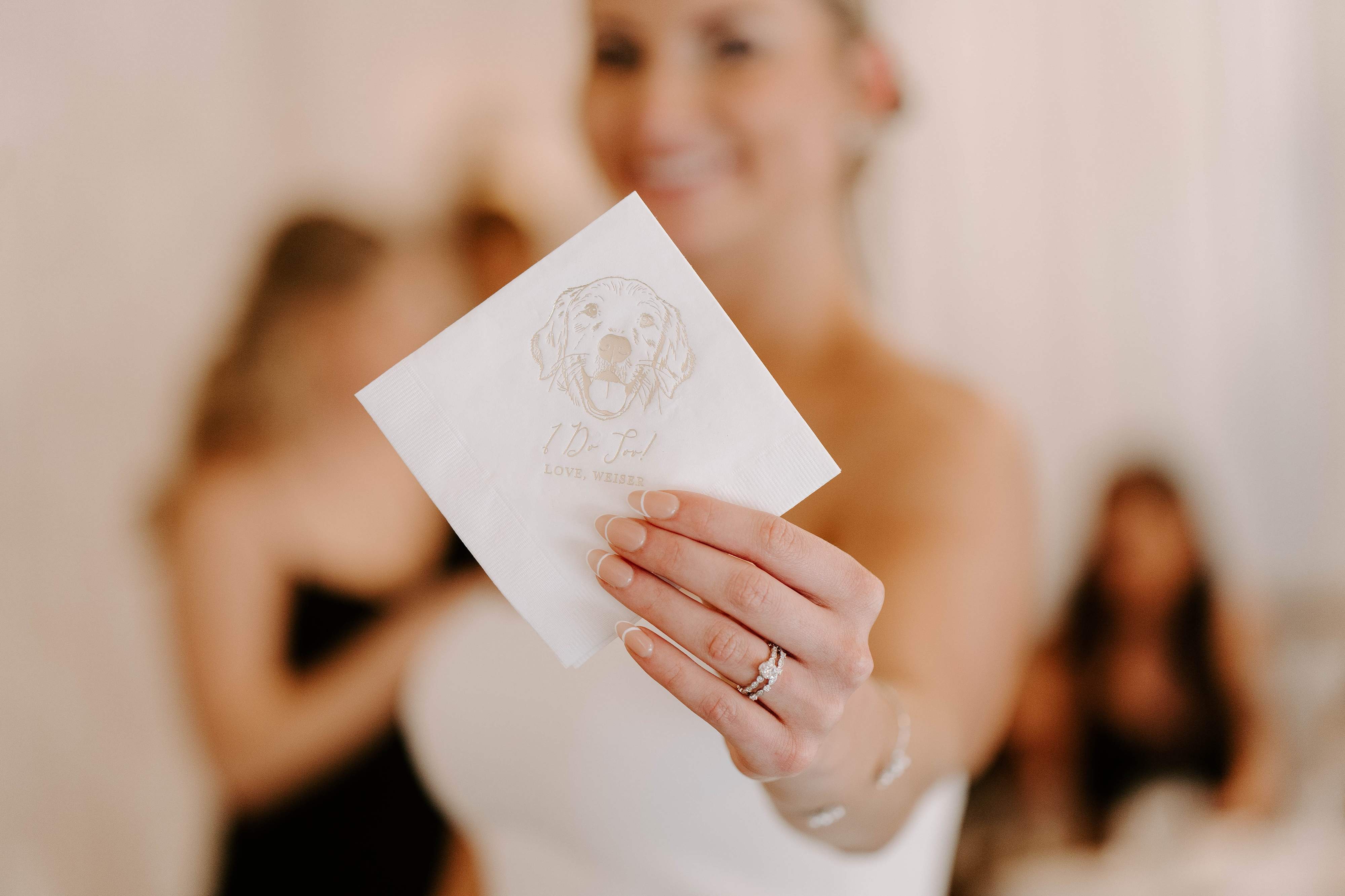
- Pets and personal symbols: Your dog’s coat color or collar can inspire accent hues—our custom illustrated dog napkins are a lovely way to tie that in visually.
Make a quick list of three places, items, or feelings that matter to you. Use this list as your north star when exploring palettes.
2. Learn the Color Basics (Without the Jargon)
You don’t need to become a designer, but a few simple terms will help you communicate with vendors:
- Hue, meaning the basic color family like blue, pink, or green.
- Saturation, meaning how intense or muted the color is. Low saturation looks soft and vintage; high saturation looks bright and modern.
- Value, meaning how light or dark a color is. Mix values to add depth without adding new hues.
When you choose a palette, pick a base hue, a supporting hue, and one or two accent hues. That simple formula keeps things cohesive.
3. Let Season and Venue Guide You
Season and venue aren’t rules, but they make some palettes feel effortless. Here are quick heuristics to help:
- Spring: Think fresh pastels and lively greens. Light, airy fabrics and delicate florals pair well.
- Summer: Go bold with saturated colors or keep it coastal with soft blues and sand tones.
- Fall: Warm neutrals, rust, deep greens, and moody jewel tones work beautifully outdoors or in barns.
- Winter: Deep, dramatic colors like navy, burgundy, and emerald, paired with metallics or crisp white.
Venue influences texture and lighting. A glass conservatory amplifies color saturation, while a rustic barn softens tones. Take photos of the space at the same time of day your wedding will happen to see how colors read in real life.
4. Build a Color Story: Primary, Secondary, Accent
Think of your palette as a tiny cast of characters:
- Primary color: This is the dominant tone. It appears most often—think linens, bridesmaid dresses, or your main floral tone.
- Secondary color: This supports the primary color on larger pieces like table runners, ceremony arch florals, or signage backgrounds.
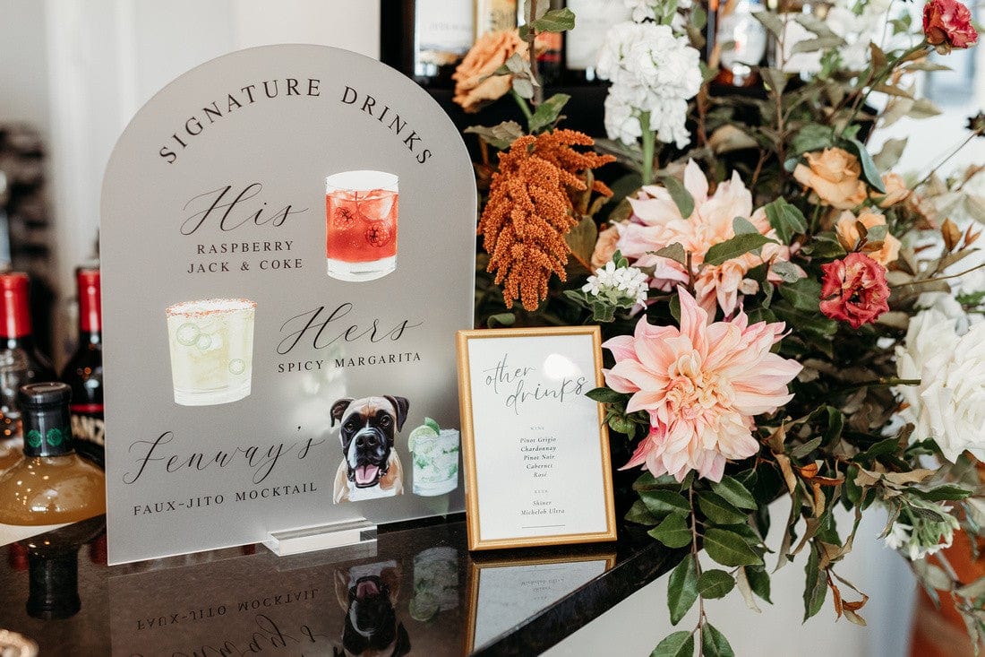
- Accent color(s): These are small pops used for napkins, cocktail cups, ribbons, or a specialty item like a custom illustrated napkin featuring your dog.
Use the 60-30-10 rule as a guide: 60% primary, 30% secondary, 10% accent. It’s an interior design rule that works perfectly for weddings because it creates balance.
Need a quick place to see how favorites look in real customer settings? Check out our customer favorites for inspiration and real-color examples you can replicate.
5. Palette Formulas That Always Work
Here are proven palettes with simple descriptions you can copy, along with styling notes.
Classic Neutrals With a Twist
- Palette: Warm ivory, taupe, soft gray, with a navy accent.
- Why it works: Timeless, easy on budgets, lets textures do the work.
- Styling tip: Use navy napkins or custom-printed cups as your accent for a modern pop.
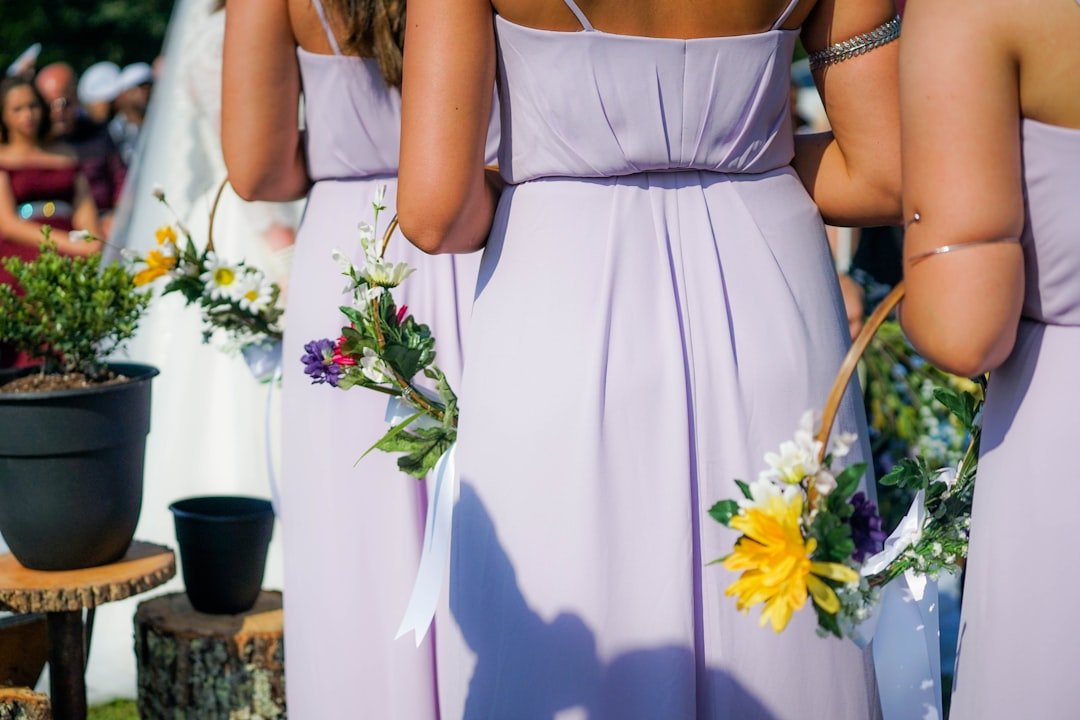
Soft Romantic Pastels
- Palette: Blush, dusty blue, sage green, and champagne.
- Why it works: Great for garden weddings or spring venues; florals blend seamlessly.
- Styling tip: Personalized napkins in blush with gold foil lettering add a luxe feel.
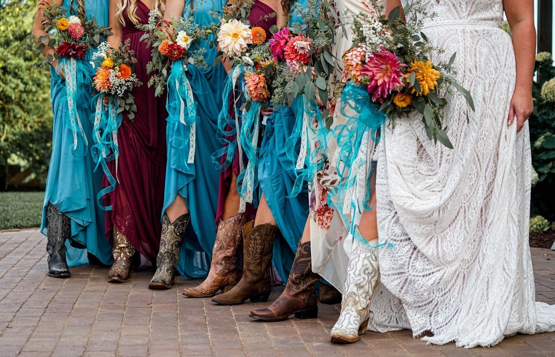
Bold Modern Jewel Tones
- Palette: Emerald, deep teal, burgundy, and muted gold.
- Why it works: High contrast, dramatic, perfect for evening affairs.
- Styling tip: Use dark floral runners and hand-lettered signs; metallic cups and custom bar signage bring shine.
Coastal Brights
- Palette: Aqua, coral, sand, and palm green.
- Why it works: Casual and fun; great for destination weddings or laid-back venues.
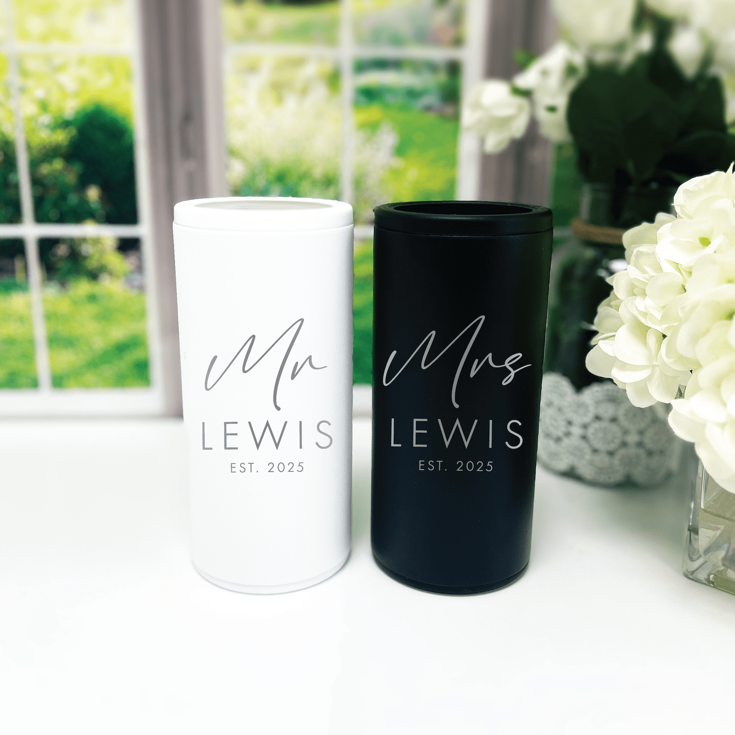
- Styling tip: Frosted plastic cups in a coordinating hue, personalized with your wedding monogram, are guest-friendly and photo-ready.
Earthy Autumn Mix
- Palette: Terracotta, olive, mustard, and cream.
- Why it works: Warm and homey; pairs well with wooden tables and candlelight.
- Styling tip: Custom napkins with an illustrated leaf motif tie in the season without extra cost.
If you want real-life examples, our best sellers collection is a great way to see color pairings that customers have used successfully.
6. How to Test Your Colors (and Avoid Regret)
Testing is the step most couples skip—and regret later. Here are simple, low-effort ways to see how colors behave.
- Swatches and samples: Request fabric swatches for linens and bridesmaid dresses. Paper swatches for invitations and napkin samples for printed pieces are worth the small cost.
- Photos in space: Place swatches in the venue and photograph them in the actual ceremony and reception light. Colors shift a lot in different lighting.
- Mockup photos: Create a mock table setup at home with printouts, a napkin, and a cup. Take phone photos and view them on different screens—you might be surprised.
- Mood board: Use a physical or digital mood board to see how elements work together: dresses, florals, invitation paper, and accessories.
If you need custom mockups or want to order small sample items before committing, reach out to vendors early. If you want a quick sample of personalized napkins or cups, our team is happy to help—just contact us for options and turnaround.
7. Textures and Finishes: How They Change a Color
Texture can make the same hue feel different. Think about how you want your palette to read physically and visually.
- Matte finishes soften colors and feel modern and relaxed. Great for paper goods and chalkboard-style signage.
- Satin or silk gives a hue warmth and a subtle sheen. Use this for bridesmaid dresses, runners, or napkins that will be seen up close.
- Metallics reflect light and brighten deep colors. A gold rim or foil print on cups and napkins can add elegance.
- Natural fibers like linen mute saturation slightly, making colors cozy and organic.
When you order customized items, choose finishes in line with your overall texture story. For instance, a jewel-toned palette with matte paper and metallic accents feels deliberate and high-end.
8. Coordinate Wedding Party, Florals, and Stationery
Coordinating is less about matching and more about harmony. Here’s a quick plan to keep everyone on the same page.
- Start with the dresses: If bridesmaid dresses are varied, pick a unifying accessory color—sashes, bouquets, or shoes.
- Bring florals into the palette: Share your palette with the florist and ask for variations in value and saturation rather than exact matches.
- Use stationery to preview the palette: Invitations and programs are your first chance to introduce colors—pick a paper and print style that reflects the day.
Small coordinated items, like custom napkins with your monogram or illustrated motifs, are a simple and cost-effective way to tie these elements together. Browse our customer favorites to see how small pieces can make a big visual impact.
9. Practical Tips for Budgeting and Vendor Communication
Color choices can affect your budget. Here are ways to stay stylish without overspending.
- Prioritize big-impact items: Invest in florals, linens, and a few personalized pieces like napkins or cups. Small custom touches go a long way.
- Limit metallics: Real metal costs more. Use metallics sparingly as accents, like foil on signage or rims on cups.
- Ask vendors for color codes: Pantone, CMYK, or HEX codes avoid guesswork. If a vendor doesn’t use color codes, ask for printed samples.
- Bundle decor where possible: Ordering multiple matching items from one vendor often reduces unit cost and ensures colors match perfectly.
When you talk to vendors, be specific: show swatches, attach photos, and name your primary, secondary, and accent colors. If you want matching custom items like napkins or frosted cups, linking vendors to sample pages or our best sellers can speed up decisions and keep colors consistent.
10. Real-World Examples and Fresh Palette Ideas for 2026
Here are palettes trending for 2026, with notes on venue fit and styling cues.
Warm Minimalism
- Colors: Cream, warm sand, soft terracotta, charcoal accent
- Venues: Industrial lofts, modern barns
- Notes: Use textured linens, simple greenery, and matte-finished signs.
Vintage Garden
- Colors: Sage, dusty rose, antique blue, cream
- Venues: Historic homes, botanical gardens
- Notes: Lace, soft lighting, and illustrated napkins or cups with botanical motifs help sell the vibe.
Vivid Desert
- Colors: Burnt orange, cactus green, warm ochre, sky blue accent
- Venues: Desert venues, outdoor canyons, modern ranches
- Notes: Layered textures, bold signage, and custom favors in matching hues.
Soft Coastal
- Colors: Seafoam, shell pink, driftwood gray, pearl
- Venues: Beach clubs, coastal resorts
- Notes: Frosted cups, light linens, and muted metallics complement the palette.
Want to see how customers actually styled these palettes? Take a look at our best sellers and customer favorites to see photos and ideas that might match your vision.
11. How to Incorporate Personalized Decor Items
Personalized items make your palette feel intentional. Here are thoughtful ways to include custom decor without overwhelming your budget or design.
- Custom napkins: Add a color-block or monogram in your accent color. Our illustrated dog napkins are a playful way to bring personality and a pop of color to cocktail hour.
- Frosted plastic cups: Match the cup color to your secondary hue for cohesion; add printed initials for a keepsake.
- Bar signs and menus: Use your primary or secondary color for backgrounds and a metallic or cream for type for readability and elegance.
- Welcome signs and favors: Small areas are perfect for a statement accent color or custom illustration that repeats across items.
Ordering multiple personalized items from one source helps colors match across materials. If you want a cohesive sample or mockup of napkins, cups, and signage in your selected colors, contact us and we’ll walk you through samples and lead times. You can also explore popular combinations in our customer favorites or shop staples in our best sellers.
12. Final Color Checklist Before You Commit
Run through this short checklist to avoid last-minute surprises:
- Have you tested swatches in the venue lighting?
- Do your vendors have color codes or printed samples?
- Have you applied the 60-30-10 rule to your major pieces?
- Are small personalized items matching the accent color and finish?
- Do printed items and fabrics photograph the way you expect them to?
- Have you built in a small palette buffer for florals and last-minute substitutions?
If you can answer yes to most of these, you’re ready to lock in your palette. If not, pick the one area that feels most uncertain and test that first.
Frequently Asked Questions
How many colors should I choose for my wedding palette?
Keep it simple: aim for three to four colors. Use a primary, a secondary, and one or two accent colors. Simplicity creates cohesion and makes decisions easier across vendors.
What if my florist can’t match my exact color?
Florists often work with values and tones rather than exact matches. Share your palette and let them know which color is most important. Ask for photos of sample arrangements before finalizing. If a precise match is essential for small items like napkins or cups, order those from the same vendor or provide printed samples.
Can I change colors between ceremony and reception?
Yes. You can keep one core color consistent while shifting accents from ceremony to reception. For example, ceremony flowers could be neutral, while reception centerpieces carry your accent hue. Small items like cocktail napkins or cups can reflect the reception palette for an intentional refresh.
How do I make a bold color feel elegant?
Pair bold hues with neutrals and refined textures. A deep magenta can look luxe with cream linens and gold accents. Let the bold color be the accent rather than the whole room.
Are metallics considered a color in my palette?
Consider metallics as finishes rather than colors. They work well as an additional accent but shouldn’t replace your primary or secondary colors since they reflect light differently across materials.
How early should I finalize colors?
Finalize them before ordering major items like bridesmaid dresses and printed stationery—typically 6 to 9 months before the wedding. That timeline gives vendors time to source fabrics and print accurately.
Can I use different shades of the same color?
Absolutely. Using multiple values of the same hue adds depth without introducing new colors. For instance, pairing pale blush and deep rose keeps your palette unified but visually interesting.
What’s the easiest way to communicate colors to multiple vendors?
Use a single mood board with swatches and color codes, then share it via email or a vendor portal. Include at least one physical sample if possible—digital files may display colors differently across screens.
Conclusion
Color is one of the most powerful tools you have to shape the feeling of your wedding. With a clear approach—personal inspiration, a basic color story, careful testing, and intentional accents—you’ll create a celebration that feels both cohesive and unmistakably yours. Keep the process simple: choose meaningful colors, test them in your venue, and use a few personalized pieces to tell your story. When you do that, the details start to fall into place and your wedding will look like it was made just for you.
Ready to bring your palette to life? If you want samples of custom napkins, cups, or signs to match your chosen colors, contact us. You can also browse our best sellers or see how other couples paired colors in our customer favorites.
Rubi and Lib Brand Message
At Rubi and Lib, we specialize in helping you celebrate life's most memorable moments with personalized wedding and party decor designed to reflect your unique style. From custom cocktail napkins and frosted plastic cups to bar signs and party favors, our curated collections are created to elevate your celebration and leave a lasting impression on your guests. Whether you're planning a wedding, bridal shower, bachelorette party, baby shower, or birthday bash, our products add a thoughtful, stylish touch that turns an ordinary gathering into an unforgettable event. Many of our designs feature custom illustrations—including pet portraits—so your decor feels as one-of-a-kind as your story. As a women-owned small business, we're passionate about making the ordering process seamless and enjoyable. Every item is crafted with care and attention to detail, and most of our products are made in the USA. We believe celebrations should feel personal, joyful, and stress-free—that's why we're here to help you create meaningful moments, one custom detail at a time. Explore our best sellers (https://rubiandlib.com/collections/best-sellers), discover customer favorites (https://rubiandlib.com/collections/best-sellers), or reach out (https://rubiandlib.com/pages/contact-us) for something truly unique. At Rubi and Lib, your celebration is our inspiration.

Written by Bethany Wysolmerski


