
Wedding Color Palette Ideas: 25 Stylish Palettes and How to Use Them
A dusty-rose napkin printed with an illustrated corgi can set the tone for an entire celebration—it's why wedding color palette ideas matter from the first save-the-date to the last dance. Color ties every piece of a wedding together: invitations, florals, attire, signage and even practical items like cups and napkins. For couples who want a wedding that feels intentional and personal, choosing the right palette is one of the highest-impact decisions they’ll make.
Why a Color Palette Matters
A thoughtfully chosen wedding color palette does more than look pretty. It creates mood, guides vendor decisions, improves photography cohesion and gives guests a visual cue about the event’s tone—formal, relaxed, whimsical, or romantic. Cohesive colors also make it easier to pick decor and personalize small details. When a couple orders custom items—like personalized napkins, cups, or wooden signs—the palette ensures those pieces feel like part of a single story rather than random accents.
Key Principles for Choosing a Palette
Start With Mood and Style
Couples should first clarify the vibe they want: classic, modern, rustic, boho, coastal, vintage, moody, or playful. Each mood leans toward certain color families. For instance, a moody romantic look favors deep burgundy and navy, while a coastal theme uses soft blues and sandy neutrals.
Consider Season and Venue
Seasons suggest palettes naturally—spring for pastels, summer for brights, fall for warm earthy tones, winter for deep hues and metallics. The venue also matters: a historic ballroom can handle dramatic jewel tones, whereas a backyard barn benefits from softer, rustic hues.
Balance With Neutrals and Metallics
Neutrals (ivory, beige, gray) act as a canvas that keeps richer colors from overwhelming. Metallics—gold, brass, copper, or silver—add glam and translate well in lighting. Couples should pick one neutral and one metallic to ground the palette.
Think in Color Roles
Break a palette into roles: primary (dominant), secondary (supports primary), accent (pops), and neutral. A simple ratio to aim for is 60% primary, 30% secondary, and 10% accent. This helps apply color consistently across large elements (linens, bridesmaid dresses) and small details (napkins, signage).
Basic Color Theory for Weddings
Harmony Types
- Analogous: Colors next to each other on the color wheel (e.g., blush, rose, wine). They feel cohesive and calming.
- Complementary: Opposite colors (e.g., navy and peach). They create energy and contrast.
- Triadic: Three evenly spaced colors (e.g., teal, coral, mustard). Offers balance without being predictable.
- Monochromatic: Variations of one color (e.g., multiple shades of green). Elegant and minimal.
Practical Tips
- Use Pantone or HEX codes when talking to vendors—this prevents surprises.
- View colors in different lights (outdoors, venue lighting, candlelight) because they shift.
- Test fabric swatches against flowers and printed paper to ensure harmony.
How to Build a Palette: Step-By-Step
- Pick the mood and one primary color that reflects it.
- Select a neutral to act as a base (ivory, warm beige, or soft gray).
- Add one or two secondary colors that complement the primary.
- Choose an accent color for pops—this could be a metallic or a bright hue.
- Decide where each color will live (attire, florals, table linens, signage).
For example, a couple picking dusty blue as primary might choose ivory as neutral, sage green as secondary, and a gold metallic accent. The dusty blue can appear in bridesmaid dresses and table linens; sage in greenery and escort cards; gold on signage and flatware.
25 Wedding Color Palette Ideas (With Specifics)
Below are 25 curated wedding color palette ideas with HEX suggestions, mood descriptions and practical uses—including how bespoke items like personalized napkins, cups and illustrated dog napkins can tie everything together.
1. Timeless Neutrals
- Colors: Ivory #F6F2EE, Warm Taupe #A99A8A, Charcoal #333233
- Mood: Elegant, understated
- Use: Classic stationery, ivory linens, charcoal suits. Personalized napkins with a subtle monogram printed in charcoal create a refined look.
2. Blush and Sage Garden
- Colors: Blush #F2C6C1, Sage #B7C8B6, Cream #FFF7EE
- Mood: Romantic, floral-forward
- Use: Garden wedding florals, bridesmaids in sage, blush cake frosting. Illustrated dog napkins in blush add a playful, personal touch.
3. Navy, Peach, and Gold
- Colors: Navy #0B2545, Peach #FFB997, Gold #D4AF37
- Mood: Modern elegance with warmth
- Use: Navy suits, peach bridesmaid dresses, gold travel signage and metallic-rimmed cups.
4. Dusty Blue and Terracotta
- Colors: Dusty Blue #6E8FAF, Terracotta #D9823A, Linen #F4EBDD
- Mood: Calm, slightly boho
- Use: Terracotta pots with eucalyptus, dusty blue tablecloths, printed napkins in linen tone with terracotta lettering.
5. Jewel-Toned Autumn
- Colors: Emerald #046A38, Burgundy #6B0F1A, Mustard #D39D17
- Mood: Rich, cozy fall vibe
- Use: Velvet accents, deep floral arrangements, mustard napkins for a punch of warmth.
6. Modern Monochrome
- Colors: Slate Gray #7B8B8C, Charcoal #2F3738, Silver #C0C6C8
- Mood: Minimal, chic
- Use: Clean signage, monochrome stationery, laser-cut charcoal wedding favors.
7. Peach, Coral, and Mint
- Colors: Coral #FF6B6B, Peach #FFD1BA, Mint #BFF0D6
- Mood: Playful and fresh
- Use: Bright florals, playful cups with coral lettering, mint napkins to cool the palette.
8. Coastal Blue and Sand
- Colors: Sea Blue #2C9AB7, Sand #E4D7C5, Driftwood #8E7E73
- Mood: Nautical, relaxed
- Use: Linen runners, seashell decor, printed cups featuring a blue motif for beach ceremonies.
9. Lavender and Silver
- Colors: Lavender #CDB4DB, Lilac #B497BD, Silver #BFC7D5
- Mood: Soft, whimsical
- Use: Lavender bouquets, silver accents, delicate napkins and signage with floral illustrations.
10. Rustic Earth Tones
- Colors: Olive #606C38, Clay #B86B3E, Cream #FAF3E0
- Mood: Farmhouse, grounded
- Use: Wooden signage, clay vases, personalized napkins printed in clay for a warm, handmade look.
11. Bright Citrus
- Colors: Lemon #FFF07A, Tangerine #FF8A4D, Teal #00A5A5
- Mood: Energetic, summer-fresh
- Use: Citrus centerpieces, colorful signage, disposable cups in complementary teal for a fun casual wedding.
12. Moody Romance
- Colors: Wine #5C0B1E, Midnight #0A1632, Rose Gold #CFA08B
- Mood: Intense, intimate
- Use: Candlelit tables, dark florals, rose-gold foil on menus and signs.
13. Pastel Spring
- Colors: Powder Blue #BFD7EA, Pale Pink #FFDDE6, Soft Yellow #FFF2B2
- Mood: Airy, joyful
- Use: Garden party, pastel napkins with custom illustrations, soft bridesmaid dresses.
14. Vintage Muted
- Colors: Muted Teal #6B8E8E, Dusty Rose #CDA2A2, Antique Ivory #F2EDEB
- Mood: Nostalgic, romantic
- Use: Antique frames for signage, printed cups with vintage typography, botanical napkin prints.
15. Black, White, and Gold Glam
- Colors: Black #000000, Ivory #F8F4F1, Gold #D3A64E
- Mood: High-glam, formal
- Use: Dramatic lighting, gold foil menus, black napkins embossed with a gold monogram.
16. Soft Neutrals With Terracotta
- Colors: Pale Beige #EFE6DD, Terracotta #C96A4A, Pale Sage #C7D2C6
- Mood: Organic, modern boho
- Use: Macramé details, terracotta pots, napkins in pale beige with terracotta prints for a cohesive boho table.
17. Retro 70s Palette
- Colors: Mustard #E1B12C, Burnt Orange #D46B29, Avocado Green #6B8C47
- Mood: Fun, nostalgic
- Use: Retro signage, patterned napkins, playful cup designs—perfect for an informal, themed celebration.
18. Winter White With Emerald
- Colors: Frost #FAFBFD, Emerald #04724D, Pewter #9CA3A8
- Mood: Fresh and luxe
- Use: Evergreen arrangements, white linens, emerald accents in signage and place cards.
19. Minimal Pastel Pop
- Colors: Soft Gray #E3E6E8, Powder Mint #DFF7EE, Coral Pop #FF6F61
- Mood: Clean with a playful twist
- Use: Gray stationery with coral brushstroke accents, mint napkins, coral dessert details.
20. Sunset Palette
- Colors: Coral #FF7A5A, Magenta #C94F9A, Deep Purple #4A1F7A
- Mood: Vibrant, dramatic
- Use: Sunset-hued floral installations, vivid linens, bold signage and cocktail napkins in matching coral.
21. Blush, Navy and Olive
- Colors: Blush #EBC8C4, Navy #20324A, Olive #758A3C
- Mood: Balanced feminine/masculine blend
- Use: Navy suits, blush bridesmaids, olive sprigs in bouquets; custom cups with navy type for contrast.
22. Tea Rose and Mint
- Colors: Tea Rose #E5A8A1, Mint #BFE8D2, Porcelain #FEFEFA
- Mood: Vintage tea-party chic
- Use: Tiered cake with rose frosting, mint napkins, porcelain-style signage for a refined vibe.
23. Tropical Green and Coral
- Colors: Jungle Green #007B5A, Coral #FF6F61, Sand #E7D9C3
- Mood: Lush, destination wedding
- Use: Palm-leaf tables, coral floral pops, illustrated dog napkins featuring tropical motif for island brides.
24. Soft Gray and Lilac
- Colors: Soft Gray #D6D9DB, Lilac #C5B4E3, Silver #B7BAC0
- Mood: Sleek, romantic
- Use: Modern venue, lilac bridesmaids, gray napkins with silver script for an elevated, contemporary look.
25. Bold Black and Fuchsia
- Colors: Jet Black #0F0F0F, Fuchsia #E4007C, White #FFFFFF
- Mood: Edgy, modern party vibe
- Use: Black linens, fuchsia floral and napkin accents, neon signage for receptions that want to feel like a night out.
Applying Palettes to Personalized Decor
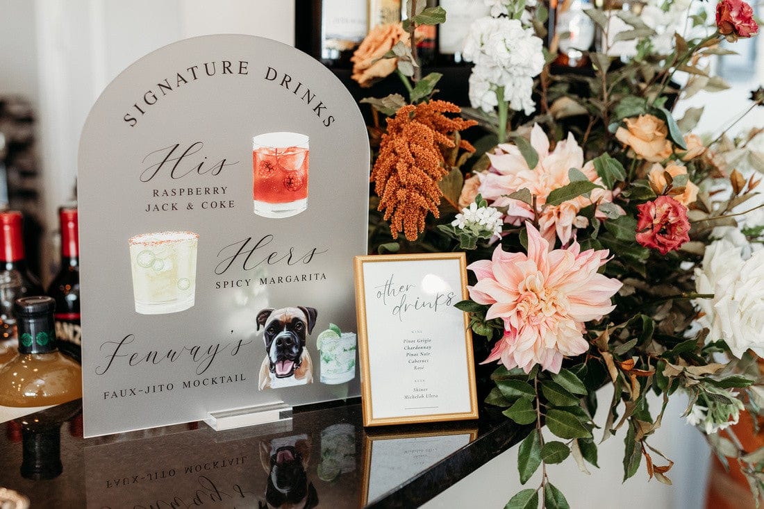
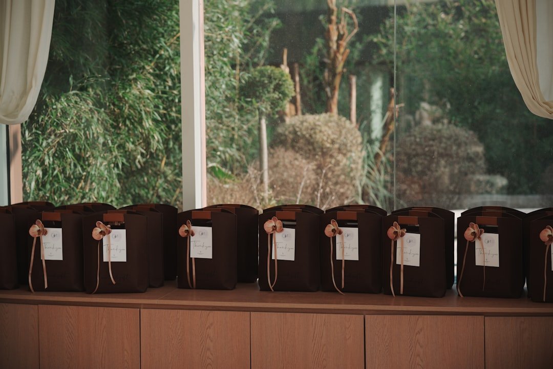
Personalized items are where a palette really becomes visible to guests. Rubi and Lib’s range of tailored wedding decor—custom napkins, cups and signs—lets couples extend their palette into everyday items. For example:
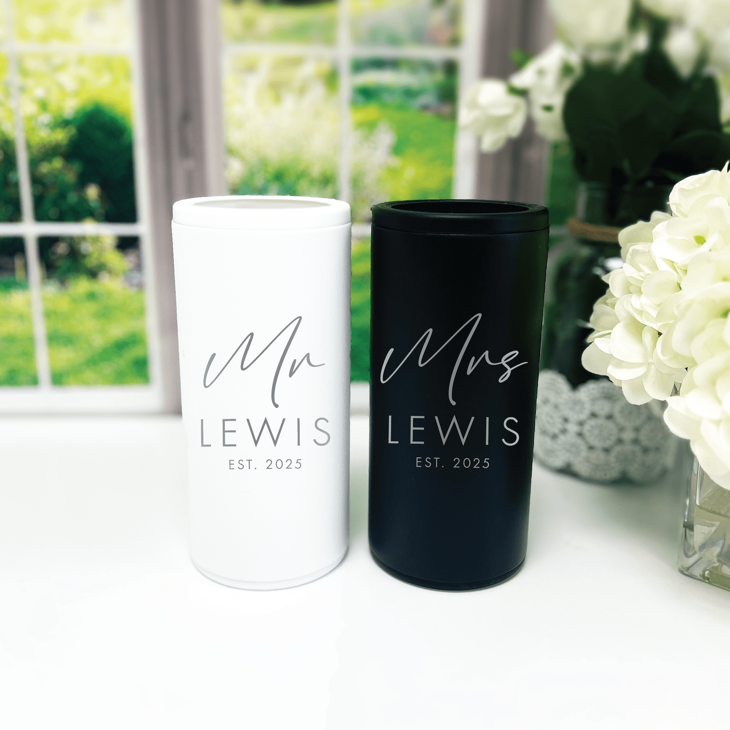
- Custom napkins: Printing an illustrated dog or couple’s monogram in a palette’s accent color adds personality while staying cohesive.
- Personalized cups: Using the secondary color on cups keeps bars, welcome areas and cocktail hours coordinated.
- Custom signs: A wooden welcome sign finished in the primary color with metallic foil text ties the entrance to the ceremony and reception aesthetic.
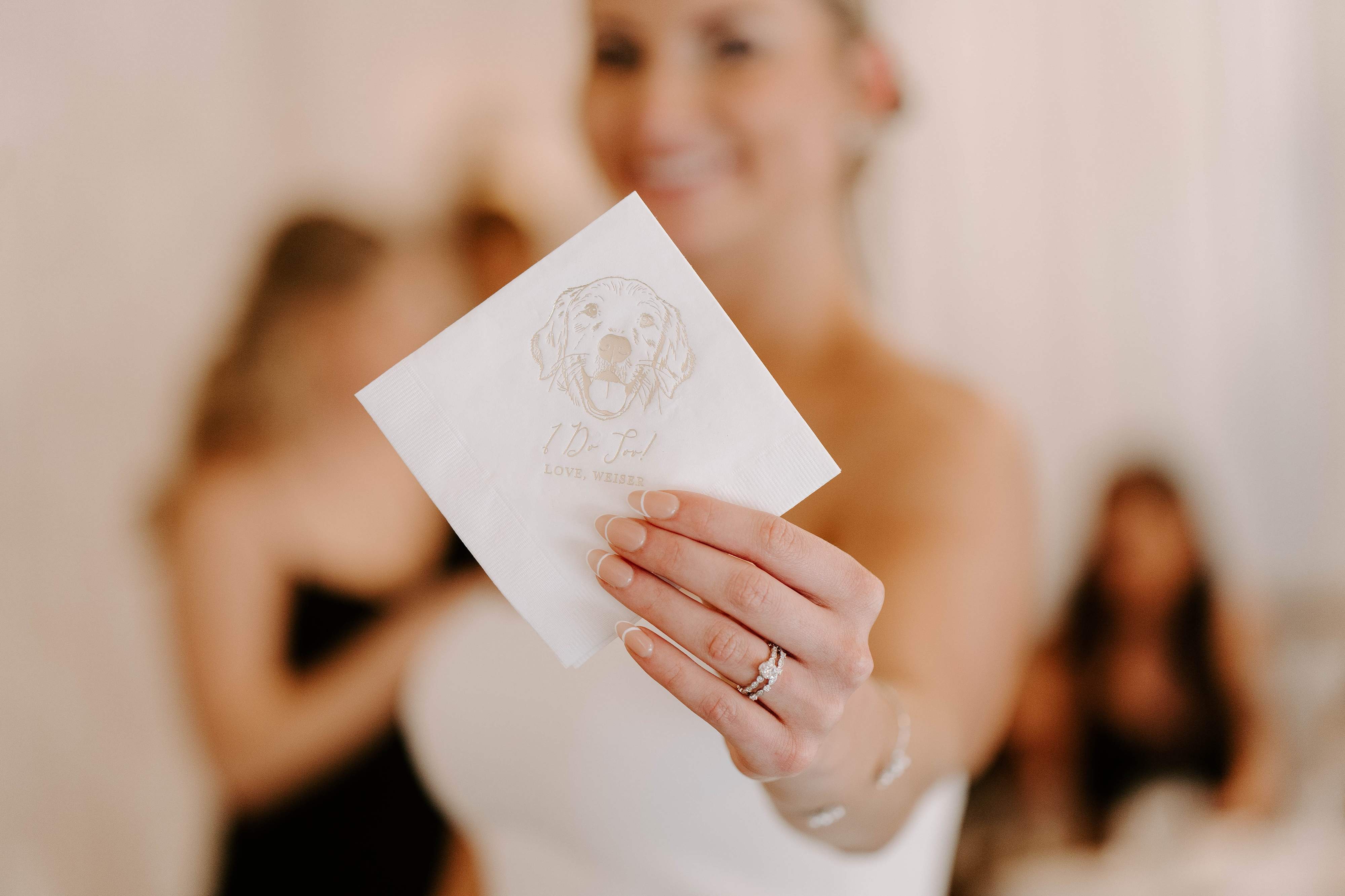
Couples planning a playful or pet-focused touch can include illustrated dog napkins that match the overall palette. These small, branded details are memorable and practical—guests use them, and they photograph beautifully.
Practical Execution Tips
Create a Mood Board
Collect images of flowers, dresses, linens, invitations and venue photos. Tools like Pinterest or a shared Google Drive folder help vendors quickly see the vision. A mood board ensures florists and rental companies match colors rather than guessing.
Order Swatches and Samples
Fabrics look different on screens. Request swatches from dress shops, linens from rental houses, and printed samples from paper vendors. Place these near each other with sample flowers to spot clashes early.
Use HEX or Pantone Codes
Share exact codes with vendors to avoid interpretation. A navy on screen may not be the same navy on fabric—Pantone bridges that gap, while HEX is great for digital assets and printers.
Consider Photography
Colors photograph differently under warm incandescent light versus daylight. Discuss with the photographer how colors will read in portraits and reception photos. Jewel tones and deeper hues often pop on camera, while pastels may need strategic lighting to avoid looking washed out.
Stick to the 60/30/10 Rule
60% dominant color, 30% secondary, 10% accent. This helps with visual balance—think table linens, bridesmaid dresses, and small decorative items.
Common Color Mistakes and How to Fix Them
- Too many competing accents: Limit bright pops to one or two accent colors. If a palette feels chaotic, mute one accent with a neutral.
- Ignoring venue tones: A wooden barn adds warm undertones. Choose colors that complement, not fight, a venue’s inherent palette.
- Not testing under lighting: Colors can shift at night. Review swatches at the same time and lighting as the event.
- Forgetting practical items: Napkins, cups and signage should match. Personalized items are an easy fix—ordering them in the exact palette unifies the look.
Examples: How Couples Used Color to Tell Their Story
A couple who loved urban chic chose navy, blush and gold. They used navy bridesmaids, blush florals and gold foil on menus. Their Rubi and Lib personalized napkins featured a small gold foil monogram on blush paper—simple, elegant and practical.
Another pair planning a seaside ceremony picked coastal blue and sand with driftwood accents. They ordered custom cups in sea blue for cocktail hour and napkins printed with a small line-drawn wave and their wedding date, making their welcome table feel intentional and beachy.
Final Checklist Before Placing Orders
- Confirm final palette and capture HEX/Pantone codes.
- Order fabric swatches, printed samples and wedding stationery proofs.
- Get floral mock-ups from the florist with the palette in mind.
- Ask lighting vendor about color temperature and plan for uplighting if needed.
- Order personalized items (napkins, cups, signs) after samples are approved.
Conclusion
Wedding color palette ideas are the backbone of a cohesive celebration. When couples choose a palette that reflects their personality and the venue’s character, every detail—from florals to napkins—feels part of a single, intentional story. Personalized decor, like the custom napkins, cups and signs offered by Rubi and Lib, makes it easy to carry color through to practical items that guests actually use. Whether the goal is timeless elegance, boho warmth, or playful brightness, a well-chosen palette helps a wedding feel curated, memorable and unmistakably theirs.
Frequently Asked Questions
How many colors should a wedding palette have?
A useful approach is three to five colors: one primary, one neutral, one or two secondary colors, and an accent. This gives flexibility while keeping cohesion. Couples can follow the 60/30/10 rule for application.
When should couples finalize their color palette?
Ideally, the palette is finalized before ordering stationery, bridal-party attire and personalized items—roughly 6–9 months before the wedding. That timeline allows for swatches, proofs, and adjustments.
How to match napkins and other printed pieces to flowers?
Bring fabric swatches to floral consultations. Florists can mix blooms and greenery to complement fabric tones. For printed pieces, share HEX or Pantone codes so printers can match colors closely.
Are bold palettes harder to photograph?
Bold palettes can photograph beautifully and often translate well on camera. The key is lighting: discussing color and lighting with the photographer helps ensure tones read as intended—especially at reception when lighting changes.
Can small details like illustrated dog napkins really make a difference?
Yes. Small personalized touches—like illustrated dog napkins or custom cups—offer memorable, Instagram-friendly moments and reinforce the wedding’s visual narrative. They’re practical keepsakes that carry the chosen palette in a charming, tangible way.

Written by Bethany Wysolmerski


