
Trending Wedding Color Schemes
Alternate Title: Fresh Color Ideas You’ll Love for Your Wedding
Choosing the right colors sets the tone for your whole wedding. If you’re searching for trending wedding color schemes, you’ve landed in the right place. You’ll find practical picks, mood-driven guidance, and real styling tips so your palette feels cohesive, photogenic, and totally you. If you want quick inspiration, check our best sellers to see how popular palettes translate into real decor.
Why Color Matters More Than You Think
Color affects emotion, photography, and the way your space reads. The colors you choose will show up in photos, florals, attire, rentals, and the smallest details like napkins and cups. When your scheme is consistent, guests feel the vibe before the ceremony even starts. That consistency makes your wedding feel intentional, stylish, and memorable.
How to Pick a Palette That Feels Like You
Start with just a few simple steps so you don’t get overwhelmed.
- Choose one anchor color. This is your main hue—think blush, navy, or terracotta.
- Add one supporting color. This complements the anchor without competing—sage with blush, cream with terracotta.
- Pick an accent. A metallic or bright color for small pops: gold, brass, or coral.
- Include neutrals. Ivory, sand, or charcoal balance everything and prevent visual overload.
- Test in context. Look at swatches in the actual venue lighting and take phone photos so you see how it reads on camera.
If you want tangible examples of how a cohesive color scheme looks, browsing our customer favorites can spark fresh ideas and show color in real settings.
Top Trending Wedding Color Schemes Right Now
These palettes keep coming up for their versatility and visual impact. I’ve grouped them by vibe so you can match your mood to the color story.
Soft & Romantic
- Blush, sage, cream
- Where it shines: Garden ceremonies, soft floral bouquets, delicate bridesmaid dresses
- Styling tip: Use blush as your anchor, sage for bridesmaid accents, and cream for linens and invitations.
Warm & Earthy
- Terracotta, mocha, burnt orange, cream
- Where it shines: Barn or vineyard weddings, earthy florals, wooden signage
- Styling tip: Terracotta makes florals feel modern; balance with cream table runners and warm metallics.
Moody & Dramatic
- Plum, charcoal, antique gold
- Where it shines: Historic venues, moody evening receptions, luxe editorial photos
- Styling tip: Use charcoal linens to anchor the room and add plum florals for depth. Add antique gold for light and luxe touches.
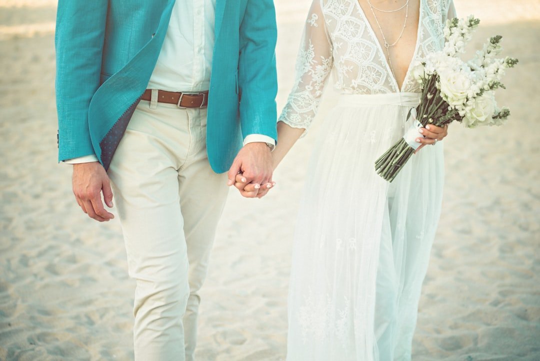
Bright & Playful
- Coral, teal, sunny yellow
- Where it shines: Beach or summer weddings, fun receptions, energetic playlists
- Styling tip: Keep bright colors in accents—cocktail napkins, signage, or stationery—and pair with a neutral base.
Classic & Modern Neutral
- Ivory, sand, taupe, black accents
- Where it shines: City lofts, galleries, minimalist weddings
- Styling tip: Focus on texture—linen napkins, woven chargers, crisp stationery—and add black for graphic clarity.
Pastel Revival
- Lavender, sky blue, soft mint
- Where it shines: Spring weddings, tea parties, romantic brunch receptions
- Styling tip: Mix pastels with a single neutral to keep them from feeling too sugary.
How to Use Accent Colors, Metallics, and Neutrals
Think of your palette like a painting. Too many bold colors makes it chaotic. Use accents and metallics sparingly to highlight focal points.
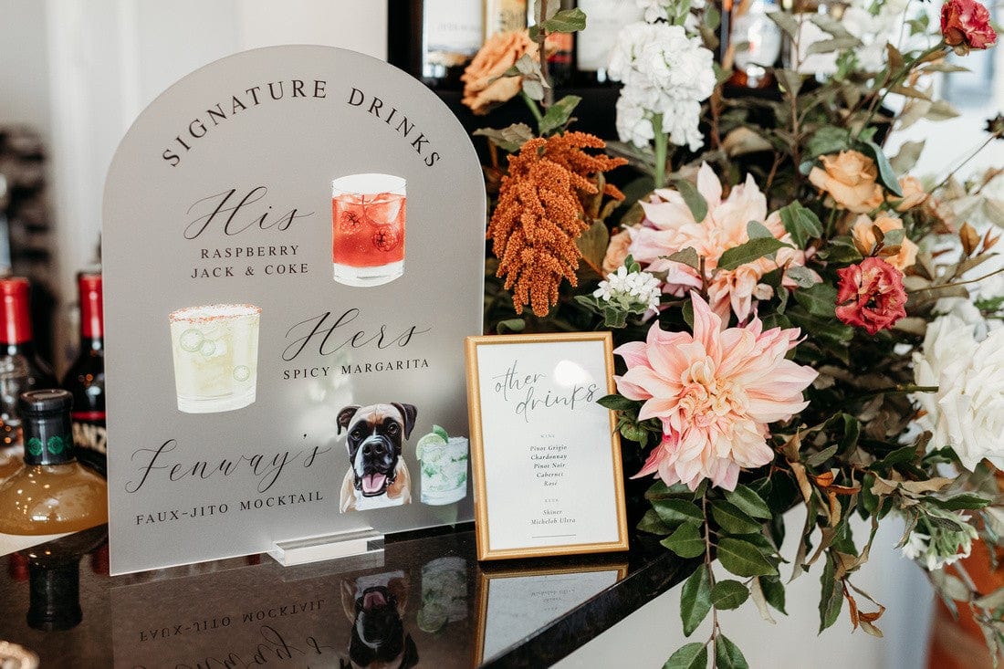
- Accent colors should pop in small doses: cocktail napkins, escort card table florals, or a bold cake tier.
- Metallics add warmth and light: gold flatware, brass candle holders, or a metallic rim on glassware.
- Neutrals are your canvas: tablecloths, ceremony backdrop, and bridesmaid dresses can live here so accents remain special.
Want to see finished pieces in trending palettes? Our best sellers are a great place to see which colors people actually pick for their celebrations.
Color Psychology: What Your Palette Says
Colors communicate mood. Use this to make your wedding feel the way you want it to feel.
- Blues are calm and trustworthy, great for classic or coastal weddings.
- Greens feel natural and grounding, perfect for garden or eco-friendly events.
- Warm tones like terracotta and coral feel intimate and friendly.
- Dark tones like navy and plum add drama and elegance.
- Metallics suggest luxury and celebration.
Pick colors that reflect the atmosphere you want for your ceremony and reception. If you’re leaning into joy and warmth, choose sunlit hues; for quiet elegance, choose muted jewel tones.
Real Styling: Where Your Colors Appear (and How Much to Use)
Knowing where to place color helps you plan purchases and keeps your budget focused on what guests will notice most.
- High-visibility places—ceremony backdrop, cake table, head table—get the strongest color presence.
- Medium-visibility—table linens, bridesmaid dresses, major floral arrangements—carry the supporting hues.
- Small pops—napkins, signage, favors, cups—are perfect for accent colors and affordable personalization.
Personalized items are a smart way to make small pops feel intentional. Our custom cocktail napkins and frosted plastic cups show up in photos and at the bar, so they punch above their weight. Check out our customer favorites to see how couples use small touches to tie a look together.
Personalized Details That Make Color Schemes Sing
Custom decor is the easiest way to cement your palette. When details match, everything feels curated. You can personalize:
- Napkins with monograms or custom illustrations
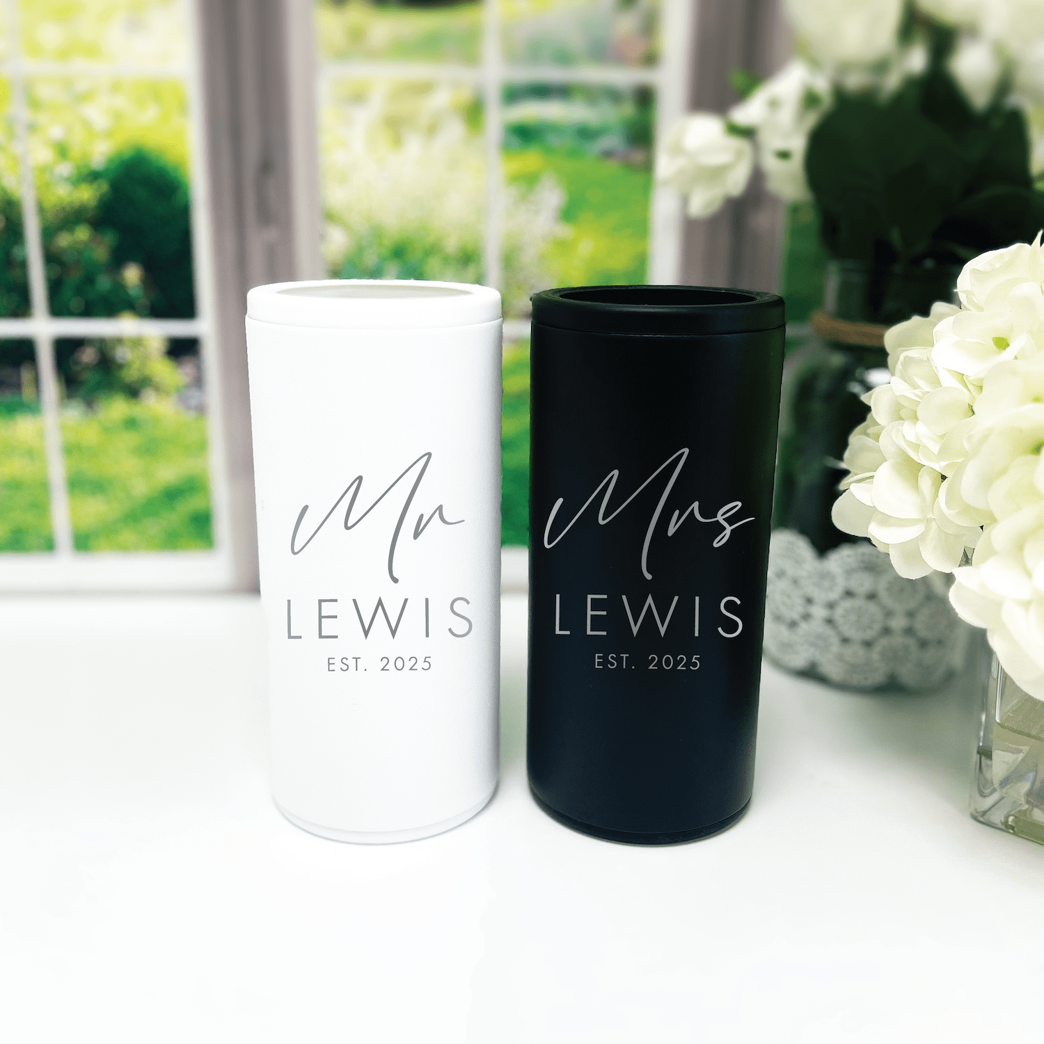
- Frosted cups with your wedding colors and names
- Bar signs and menus that use your accent colors and fonts
- Favor tags that match your invites and place settings
We’ve seen custom illustrated napkins become a guest favorite. They bring personality and are a playful way to weave in color. If you’re thinking about custom items, reach out early—design and production timelines matter. You can contact us to discuss custom options and get color-matched samples.
Seasonal Color Guide: Match Palette to Date and Venue
Season influences available flowers, appropriate fabrics, and natural light—so match accordingly.
Spring
- Think soft pastels and fresh greens.
- Flowers are abundant, so pastel palettes feel lush and effortless.
Summer
- Brighter hues and bold contrasts work well outdoors.
- Consider heat when choosing dark linens or heavy fabrics.
Fall
- Warm, saturated tones like rust, mustard, and olive look at home amid changing leaves.
- Natural textures like burlap or wood pair well with these colors.
Winter
- Deep jewel tones and metallics look dramatic and luxurious.
- Neutrals like ivory and charcoal keep a winter palette from feeling heavy.
Budget-Friendly Ways to Embrace Trending Palettes
You don’t need to spend a fortune to make a color scheme feel intentional. Try these hacks.
- Focus on key elements. Spend on high-visibility areas like florals and your head table; save on linens or charger plates.
- Use printable decor. Signage, menus, and place cards are inexpensive ways to introduce color.
- Personalized napkins and cups are an affordable luxury that look custom and cohesive. Take a peek at our best sellers to see popular, budget-friendly pieces.
- DIY accents. Spray-paint votives or wrap ribbons around candles to match your scheme.
Color Pairing Mistakes to Avoid
Little missteps can throw off an otherwise beautiful palette. Here’s what to watch for.
- Too many equally strong colors. Stick to one anchor, one support, one accent, and neutrals.
- Ignoring venue lighting. Bright artificial light can wash out pale hues; warm incandescent light shifts cool tones warmer.
- Overmatching. Matching everything exactly can feel staged. Let textures and different tones do the work.
- Not testing with photos. Colors can look different on camera—take several test photos under wedding lighting.
Color Ideas for Popular Wedding Themes
Match your theme to a palette that enhances the concept without being literal.
- Modern Minimalist: Charcoal, ivory, muted sage
- Boho/Rustic: Terracotta, dusty rose, natural linen
- Beach: Teal, sand, coral
- Glam: Black, gold, deep red
- Garden: Blush, olive, cream
Use one or two signature pieces to lock in the theme: a bold floral installation, a custom sign, or monogram napkins. If you want ideas from real weddings, our customer favorites collection is full of creative combos couples loved.
Ordering Personalized Items: Timelines and Color Matching
Order personalized items early. Here’s a simple timeline to follow to make sure colors match across vendors.
- 8–12 months before: Choose palette and confirm venue details.
- 6–8 months before: Order large rentals and confirm bridesmaid dress colors.
- 3–6 months before: Order personalized items like napkins, cups, and signage.
- 1–2 months before: Receive samples and confirm final color matches with your florist and photographer.
For truly custom items, it helps to share fabric swatches or Pantone references with your vendor. If you’d like help color-matching napkins or cups, you can always contact us—we can walk you through color options and sample ordering.
Real Examples: How Couples Brought Trending Palettes to Life
Stories help make palettes tangible. Here are a few real examples that show how to use colors creatively.
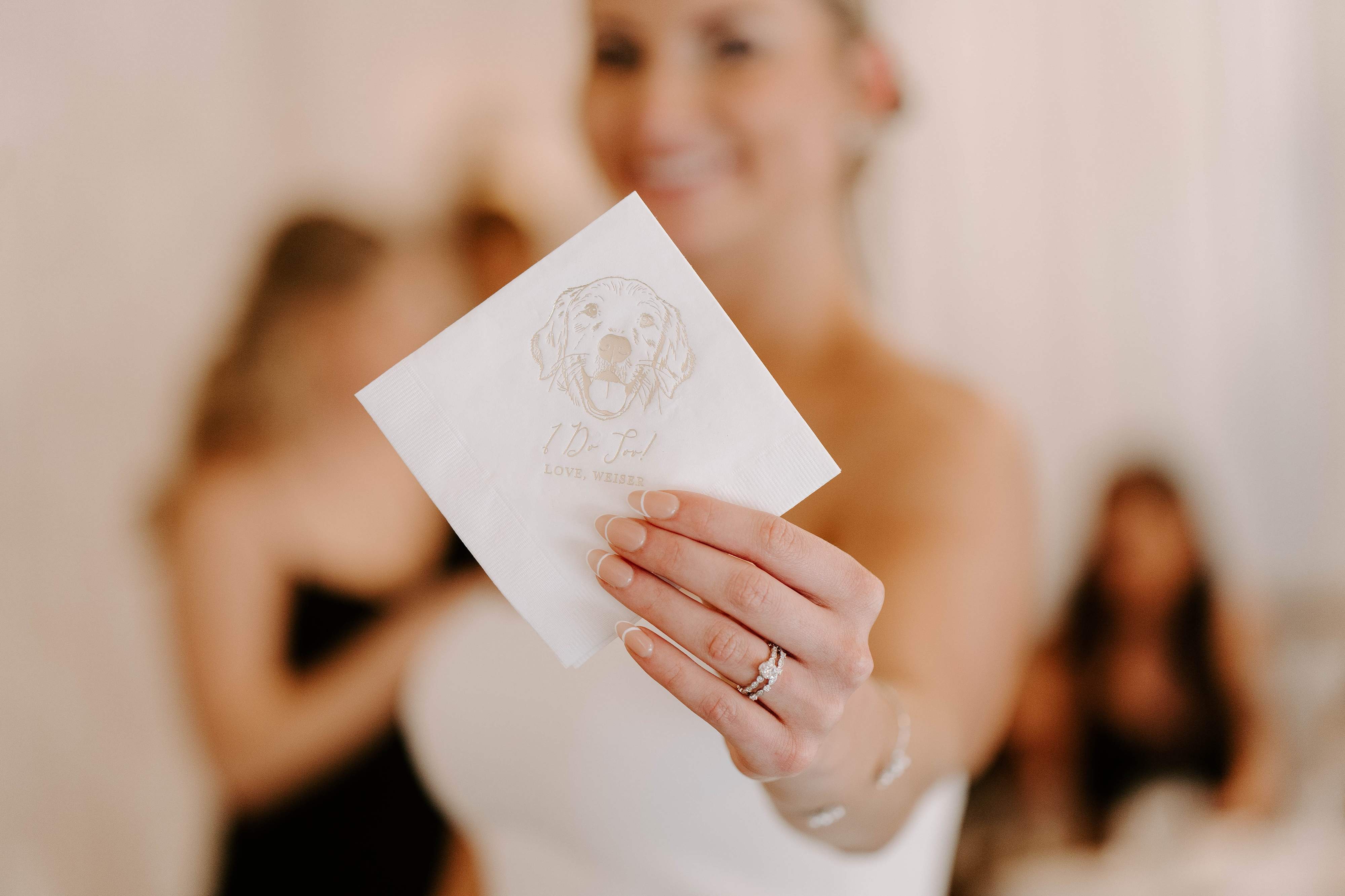
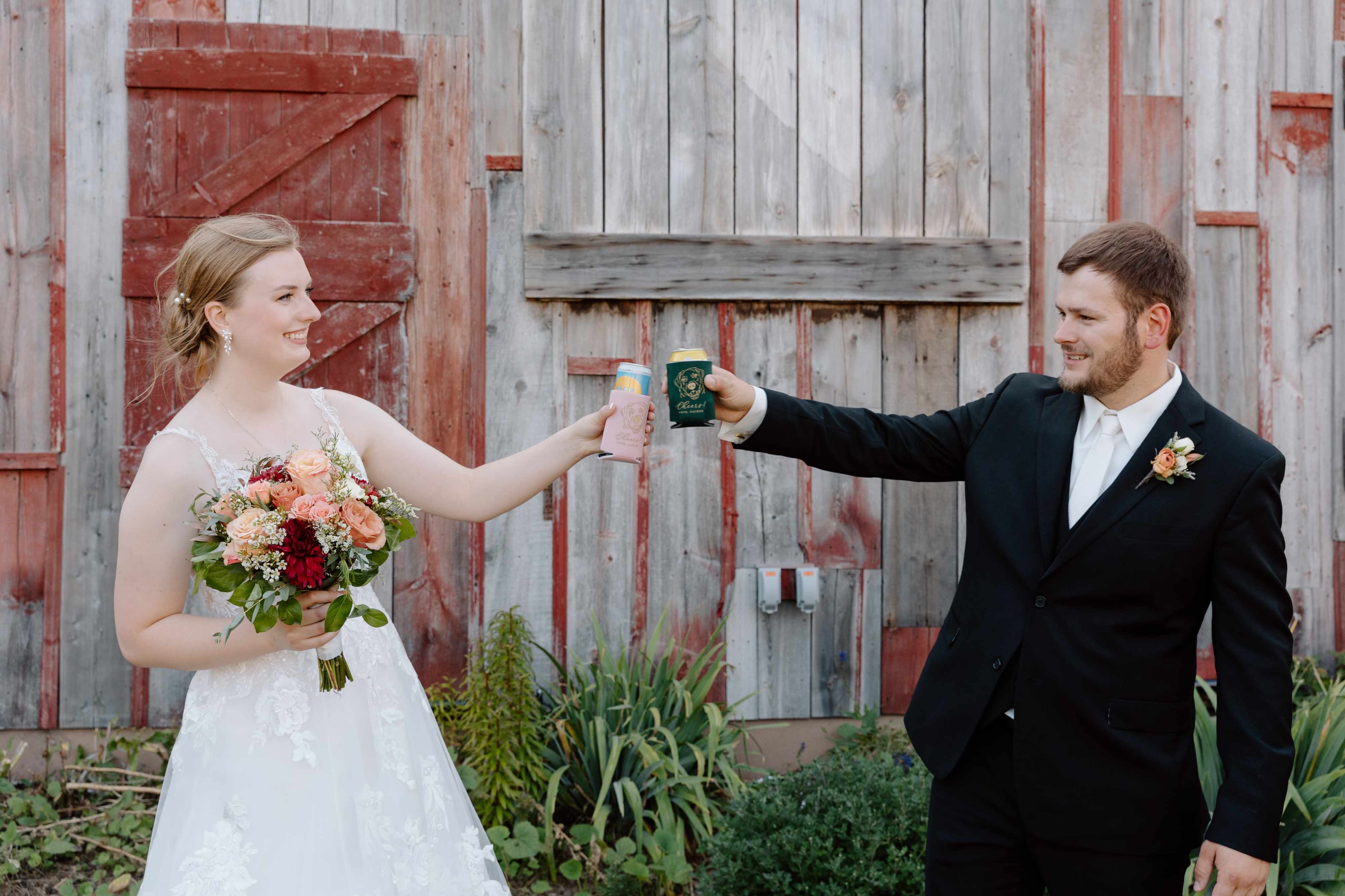
- Blush and Sage Garden Reception: Anchor the ceremony with blush florals, use sage linens on guest tables, and place blush-printed napkins at every place setting for a subtle, repeatable element. Guests loved the personal napkin details and took them home as keepsakes, which felt like a small, beautiful favor.
- Terracotta Vineyard Wedding: Terracotta napkins and signs echoed the earthy florals. Cream linens kept the look fresh while custom illustrated napkins featuring the couple’s dog added a playful, personal touch.
- Moody City Loft: Charcoal linens amplified plum flowers and antique gold candles. Customized black-rimmed cups with the wedding monogram became a chic and useful keepsake for guests.
If you want to see trending picks and products other couples loved, check our best sellers for ideas and finishes that photograph well.
Final Styling Checklist: Make Sure Your Colors Read Right
Before you finalize everything, run through this checklist so small surprises don’t derail the look.
- Compare swatches under venue lighting.
- Take mirror and natural light photos of dress and party attire.
- Ask your florist for sample stems or foam mockups.
- Order samples for personalized items like napkins and cups.
- Confirm timing so custom items arrive at least two weeks before the wedding.
When you’re ready to pick custom pieces that echo your color scheme, our best sellers are a great starting point for items that are timeless and well-reviewed.
Frequently Asked Questions
What are the most popular trending wedding color schemes right now?
Current favorites include blush and sage for romantic settings, terracotta and cream for earthy vibes, plum and charcoal for moody elegance, and coral with teal for fun, beachy celebrations. Each of these palettes adapts well across florals, linens, and custom decor.
How many colors should I use in my wedding palette?
Use three main components: one anchor color, one supporting color, and one accent, plus neutrals. That keeps things cohesive and flexible without looking busy.
How do I test colors for photography?
Take swatches to your venue and photograph them under the same lighting you’ll have on the day. Also take swatches near reflective surfaces and under both natural and artificial light to see how colors shift.
Can I mix seasonal palettes, like spring pastels with fall tones?
You can, but do it carefully. Choose one family as the main theme and add subtle accents from the other. If you mix pastels and fall tones equally, the palette can feel disjointed.
What are affordable ways to add my wedding colors?
Use printable signage, personalized napkins and cups, and small décor accents like ribbon, votives, and favor tags. These are cost-effective ways to introduce color without splurging on every rental.
How far in advance should I order personalized items?
Order custom decor at least 3–6 months ahead. This gives time for proofs, revisions, and shipping. For complex or large custom jobs, allow 8–12 weeks minimum.
How do I coordinate colors with my florist and rentals?
Share Pantone numbers, fabric swatches, or photos you’ve taken in your venue. Communication is key—ask vendors for photos of sample arrangements or mockups before finalizing.
Are metallics considered part of the color scheme?
Yes. Metallics like gold, silver, or brass function as accents. They reflect light and add a celebratory feel, so use them in moderation to highlight focal areas like the cake table or table centerpieces.
Conclusion
Choosing from trending wedding color schemes is about more than copying a palette—it’s about picking colors that tell your story and make your day feel unified. Start with a main color, add a supporting tone, and finish with an accent plus neutrals. Test swatches in venue light, order personalized items early, and use small custom details to make the palette feel intentional. When colors are thoughtfully chosen, your wedding photos, decor, and overall mood will align to create something both beautiful and deeply personal.
At Rubi and Lib
At Rubi and Lib, we specialize in helping you celebrate life's most memorable moments with personalized wedding and party decor designed to reflect your unique style. From custom cocktail napkins and frosted plastic cups to bar signs and party favors, our curated collections are created to elevate your celebration and leave a lasting impression on your guests.
Whether you're planning a wedding, bridal shower, bachelorette party, baby shower, or birthday bash, our products add a thoughtful, stylish touch that turns an ordinary gathering into an unforgettable event. Many of our designs feature custom illustrations—including pet portraits—so your decor feels as one-of-a-kind as your story.
As a women-owned small business, we're passionate about making the ordering process seamless and enjoyable. Every item is crafted with care and attention to detail, and most of our products are made in the USA. We believe celebrations should feel personal, joyful, and stress-free—that's why we're here to help you create meaningful moments, one custom detail at a time.
Explore our best sellers (https://rubiandlib.com/collections/best-sellers), discover customer favorites (https://rubiandlib.com/collections/best-sellers), or reach out (https://rubiandlib.com/pages/contact-us) for something truly unique. At Rubi and Lib, your celebration is our inspiration.

Written by Bethany Wysolmerski

