
Neutral Wedding Color Palettes: Timeless Ways to Style Your Celebration
Alternate Title: How to Build a Stylish, Personal Wedding Look with Neutral Hues
Neutral wedding color palettes create a calm, elegant backdrop that makes your personalized details shine. If you want a wedding that feels effortless, chic, and truly yours, choosing the right neutral palette is a smart place to start. Neutral doesn’t mean boring; it means thoughtful, versatile, and endlessly flattering.
Introduction
Neutral tones are a favorite for a reason. They flatter every skin tone, adapt to any venue, and let special pieces—like an illustrated napkin with your dog’s portrait—take center stage. This guide walks you through selecting and styling neutral wedding color palettes that feel modern, cozy, and personal. You’ll get practical tips, visual examples, and easy ways to add personality without overpowering your overall look.
Why Neutral Wedding Color Palettes Work
Neutral palettes work because they create a cohesive, timeless look that’s easy to customize. They don’t fight with florals or patterns, they photograph beautifully, and they make it simple to layer textures and metallic accents. Whether you’re planning a backyard party, a barn reception, or a downtown loft celebration, neutral colors give you flexibility.
- Timelessness: Neutrals don’t date quickly, so your photos will still look stylish years from now.
- Versatility: You can dress neutrals up or down with fabrics, accents, and lighting.
- Focus on details: Personalized items and heirlooms pop against a neutral backdrop.
Choosing Your Neutral Base
Start by thinking of neutrals as a family of tones rather than one single color. Your base should set the mood—soft and romantic, modern and minimal, or warm and rustic.
Common Neutral Bases
- Ivory and cream: Soft and romantic, great for classic or vintage-inspired weddings.
- Warm beige and tan: Cozy and approachable, pairs well with wood and natural textures.
- Cool greys and stone: Modern and elegant, ideal for industrial or minimalist venues.
- Soft taupe and mushroom: Sophisticated, sits nicely between warm and cool palettes.
When you pick your base, gather fabric swatches and paint chips and compare them in natural light. This prevents surprises when a color shifts under indoor lighting or during golden hour. If you’re still gathering inspiration, check out our best sellers for neutral decor ideas that other couples love, or browse our personalized wedding gifts for neutral-ready paper goods and small decor items.
Adding Subtle Accents That Don’t Fight the Palette
Neutral wedding color palettes let you add small pops of color or texture without breaking the overall calm. Accent choices should support the mood you want: romantic, playful, moody, or fresh.
Accent Ideas
- Muted blush or dusty rose: Adds warmth and romance without dominating.
- Olive or soft sage: Brings an organic feel and works well with greenery.
- Deep navy or charcoal: Adds contrast while staying refined.
- Warm terracotta or rust: Makes the palette feel more seasonal and grounded.
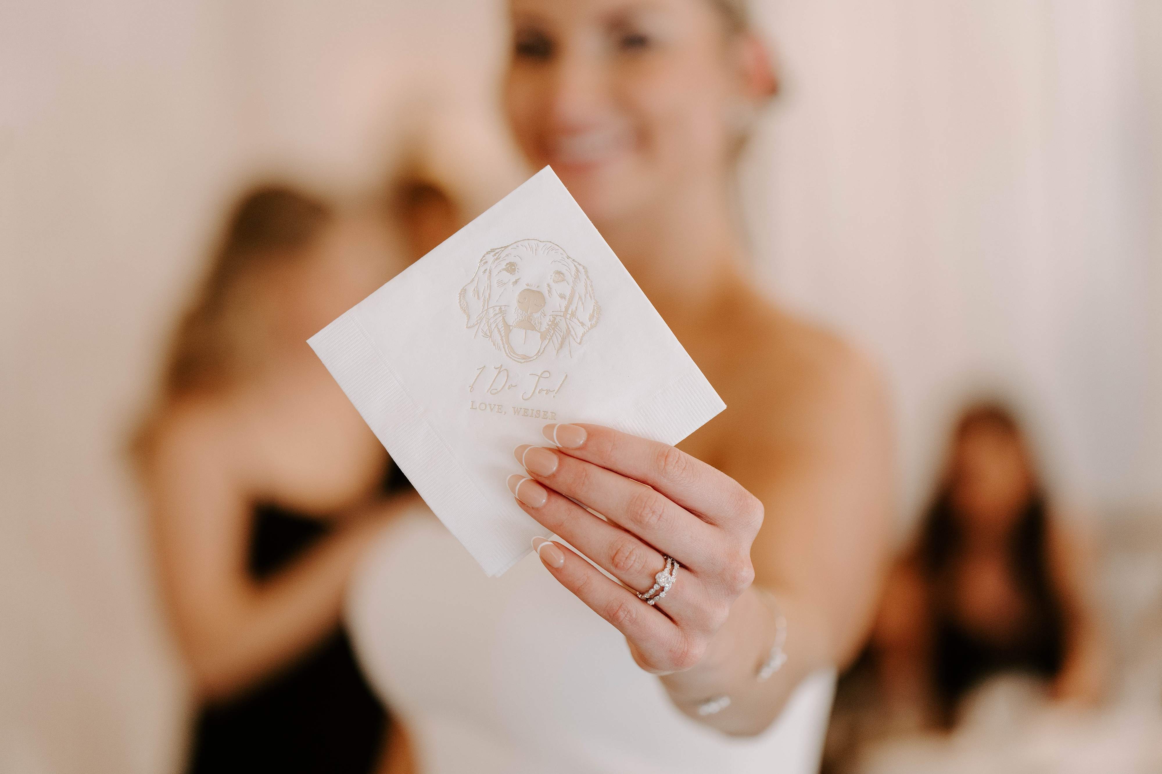
Keep accents to one or two areas—think bridesmaid bouquets, a statement runner, or personalized napkins—and let the rest stay neutral. Customers love the balance of a mostly neutral table with a single, thoughtful accent, like a custom pet portrait napkin at each setting.
Textures and Layers: How to Keep Neutrals Interesting
Because neutral colors are understated, texture becomes a major player. Layer fabrics, surfaces, and finishes to avoid a flat look.
Texture Options
- Linens: Washed linens read relaxed; crisp linens read formal.
- Velvet and suede: Add depth and a luxe feel to colder seasons.
- Rattan, wicker, and wood: Bring warmth and tactile contrast.
- Metallics: Brushed gold or antique brass give subtle sparkle without feeling flashy.
- Matte vs. gloss: Mix matte chargers with glossy glassware or vice versa for balance.
Think tactile layers: a linen tablecloth, a silk runner, taper candles, and matte ceramic plates. If you’re looking for decor items that pair beautifully with neutral setups, explore our best sellers for pieces designed to complement subtle palettes, or see our personalized wedding gifts for small, neutral-friendly paper goods and keepsakes.
Florals and Greenery: Choosing Blooms for Neutral Palettes
Florals are one of the easiest ways to influence the tone of a neutral palette. You can keep bouquets and centerpieces monochrome, or introduce muted color contrasts.
Floral Directions
- Monochrome Whites and Creams: Roses, peonies, ranunculus, and lisianthus create a soft, cohesive look.
- Greens-Forward: Use eucalyptus, olive branches, and ferns to create movement and organic texture.
- Muted Blooms: Dried grasses, pampas, and dusty lavender add an editorial edge.
- Single Accent Stem: A few stems of deep burgundy or navy scabiosa can add sophistication without stealing the show.
Ask your florist to assemble mood boards with a swatch of your neutral linen. That way, you can ensure the blooms blend with fabric undertones. If you want to showcase a small personal detail, consider placing a custom napkin or place card from our customer favorites collection under each menu for a sweet surprise.
Bridal Party and Attire: Dressing Neutrals Up
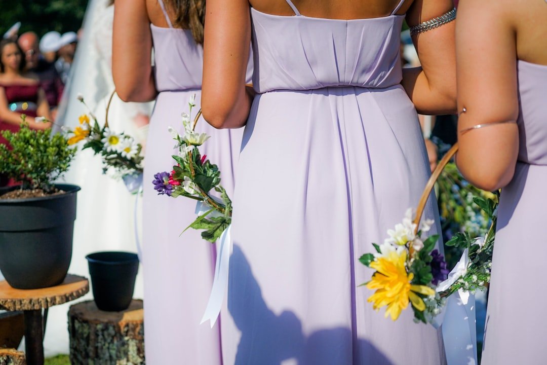
Neutral wedding color palettes make bridesmaid dress shopping less stressful. You can choose matching tones, or mix shades within the neutral family for a layered look.
Styling Tips
- Mix-and-match neutrals: Let each attendant pick a shade that flatters them, from cream to warm taupe.
- Texture coordination: Mix satin, chiffon, and crepe to keep the look interesting.
- Groom’s attire: A charcoal or navy suit works perfectly with neutrals, especially with a pocket square that ties into your accent color.
- Accessories: Use metallic jewelry or muted floral crowns to complete the look.
If you love the idea of small matching details, consider personalized cocktail napkins or wedding cups as favors, which guests will actually use. For real-life inspiration, check items that frequently show up in our neutral palettes in the best sellers.
Ceremony and Reception Decor: Making Spaces Feel Cohesive
Neutrals give you a clean canvas. That makes it easier to design a ceremony and reception that feel like pieces of the same story.
Key Elements to Unify
- Welcome signage: Keep fonts and materials consistent with your stationery and other signs.
- Aisle decor: Subtle arrangements or simple greenery ties keep the focus on the moment.
- Table settings: Repeat one or two decor elements from the ceremony, like a small floral detail or a ribbon color.
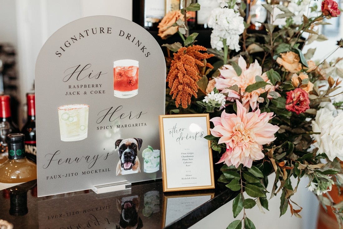
- Bar area: Neutral signage and understated glassware elevate the experience without clashing.
Signage and small decorative elements are the perfect place to add personalization, like a bar sign that reflects your nicknames, or cocktail napkins featuring an illustrated pet portrait. If you want ideas that other couples love, take a look at our customer favorites for tasteful, personalized pieces that work with neutral themes.
Table Settings and Place Settings: Layering Neutrals with Purpose
Tables are where your guests will spend most of their time, so make them inviting. Neutral wedding color palettes allow table settings to feel elegant without excess.
Table Styling Checklist
- Base layer: Linen or natural fiber tablecloth in cream, taupe, or warm beige.
- Middle layer: Charger plate or runner in a complementary neutral.
- Top layer: Dinnerware in simple white or soft grey, with textured napkins for contrast.
- Personal touches: Place cards, menu cards, or custom napkins that reflect your personality.
- Centerpieces: Low arrangements that allow conversation across the table.
Personalized napkins are a small detail that create a big impression. They’re functional and memorable, especially when they feature custom illustrations or witty text. Browse our most loved items for ideas in the best sellers collection.
Lighting and Venue Considerations for Neutral Palettes
Lighting affects how neutral tones read. Soft, warm light makes neutrals feel romantic, while cooler light can read a bit modern and stark.
Practical Lighting Tips
- Golden hour: Schedule photography near sunset when possible, neutral tones look gorgeous in that light.
- Warm bulbs: Use bulbs with warmer Kelvin ratings for a cozy atmosphere.
- Candles and string lights: They add depth and highlight textures without changing colors.
- Spotlighting: Use subtle uplighting to wash neutral walls in warm tones and make decor pop.
Consider visiting your venue at the time of day when the event will happen, and view your swatches and decor pieces in that light. If you’re ordering specialized pieces, like signage or napkins, it helps to have a physical sample on hand—our customer favorites can give you a sense of finishes that photograph well.
Seasonal Twists: How to Make Neutrals Feel Seasonal
Neutral wedding color palettes are adaptable across seasons. Small material and flower choices will make your palette feel appropriate for the time of year.
Seasonal Suggestions
- Spring: Add soft pastels, fresh greenery, and light linens.
- Summer: Keep fabrics breathable, add brighter floral accents or citrus greenery.
- Fall: Introduce warm browns, terracotta, and dried grasses.
- Winter: Use deep neutrals like charcoal, velvet textures, and rich metallics.
Small switches—dried florals for fall, airy blooms for spring—make the neutral base feel seasonally right. For inspiration, many couples turn to curated collections to see how small elements change the overall mood, like our best sellers.
Mistakes to Avoid When Working With Neutrals
Neutral color palettes are forgiving, but there are a few pitfalls to avoid so your wedding doesn’t feel flat or washed out.
- Too many identical tones: Use varying shades within your neutral family to create dimension.
- No texture variation: Add textiles, metals, and natural elements to keep things interesting.
- Ignoring lighting: Neutrals can read differently under fluorescent or harsh LED lights.
- Over-accessorizing with color: One intentional accent is better than many small, competing accents.
If you’re uncertain about balance, create one fully styled table as a mock-up. That test run helps you spot missing depth or an over-saturated accent color before the big day. You can also consider personalized decor pieces from our customer favorites to add interest in the exact spots you want guests to notice.
How to Personalize Neutral Palettes with Rubi and Lib
Neutral wedding color palettes are ideal for highlighting personalized touches, and at Rubi and Lib, we specialize in items that make those details memorable. You want guests to feel the care behind each element, and small, custom pieces do exactly that.
Ideas for Adding Personality
- Custom cocktail napkins: Add your monogram, wedding date, or an illustrated pet portrait for a cute, usable keepsake. Many guests tuck these into their take-home bags.
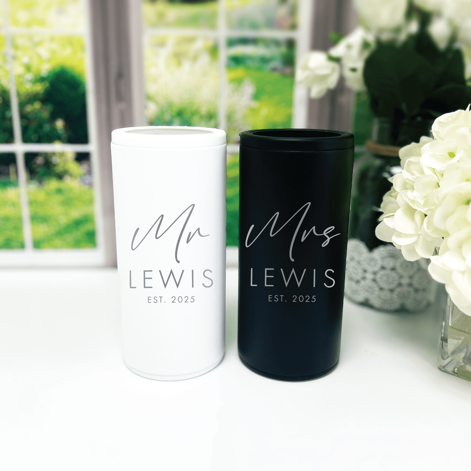
- Frosted plastic cups: Neutral cups with metallic text look chic and keep branding subtle.
- Bar and welcome signs: Keep signage in neutral tones with custom fonts that match your invitation suite.
- Favor tags and stickers: Coordinate them with place cards and napkins to create a cohesive table story.
We find that personalized napkins and small paper goods are where couples get the most joy for the cost. They’re practical, visible, and photo-friendly. If you’d like ideas tailored to your palette, our best sellers and customer favorites collections are great places to start for inspiration.
Real Planning Examples
Here are three quick examples to show how neutral palettes can play out in different wedding styles.
Example 1: Rustic Barn Wedding
- Base: Warm beige and taupe linens
- Textures: Burlap runner, wooden chargers, amber glassware
- Florals: Dried grasses, cream roses, olive branches
- Personal touch: Illustrated cocktail napkins with your dog’s portrait to place at each setting
Example 2: Modern City Loft
- Base: Cool greys and stone
- Textures: Matte ceramics, brushed steel accents, monochrome signage
- Florals: Low white arrangements with sculptural greenery
- Personal touch: Minimalist frosted cups with your names and date
Example 3: Garden-Inspired Outdoor Ceremony
- Base: Ivory and soft sage
- Textures: Linen tablecloths, rattan place mats, hand-tied napkins
- Florals: Loose, wild bouquets with lots of greenery
- Personal touch: Printed menus and napkins that coordinate with your stationery
If any of these ideas spark your interest, browse products that frequently complement these looks in our customer favorites collection.
Budget-Friendly Ways to Achieve a High-End Neutral Look
You don’t need a huge budget to make a neutral palette feel elevated. Smart choices go a long way.
- Prioritize a few statement items: Spend on a few personalized pieces that guests will notice, like napkins or signage.
- Rent larger items: Rent tables or chairs in a neutral finish rather than buying.
- DIY accents: Simple votive clusters and gathered greenery are low-cost but impactful.
- Repeat elements: Use the same neutral linen or ribbon across multiple spots to achieve cohesion.
Small, thoughtful upgrades feel expensive. Personalized paper goods from our best sellers give your day a custom look without stretching your vendor list or budget.
Checklist: Final Steps Before the Big Day
Use this short checklist to make sure your neutral wedding color palettes translate smoothly from concept to reality.
- Confirm final swatches in your venue’s lighting.
- Order a small sample run of any printed or personalized items.
- Coordinate with your florist to match undertones, not just color names.
- Do a table mock-up for scale and texture checks.
- Plan where personalized items will have the most impact.
Order samples early, especially if you’re using custom items like illustrated napkins or custom cups. If you’re curious what others pick, our customer favorites are a helpful reference.
Frequently Asked Questions
What exactly are neutral wedding color palettes?
Neutral wedding color palettes are color schemes built around muted, earthy, or soft tones like ivory, beige, greige, taupe, and warm or cool greys. They create a subtle, elegant look that pairs well with many styles and personal touches.
Are neutral palettes boring?
No. Neutral palettes can be richly layered with texture, metallics, and small accents to create depth. The surprise and personality come from details, like custom napkins, textured linens, and curated florals.
How many accent colors should I add to a neutral palette?
One or two accents are enough. Use accents sparingly so they feel intentional—think ribbons, a bold bouquet stem, or a single decor element like a runner or printed napkin.
Can neutrals work for an outdoor wedding?
Yes. Neutral wedding color palettes work beautifully outdoors because they harmonize with natural surroundings. Greens and natural wood tones often enhance a neutral look outdoors.
How do I make sure my neutrals don’t clash with my venue?
Bring swatches and visit the venue at the time of day of your event to see how light affects colors. If your venue has dominant colors or patterns, choose neutrals that complement rather than compete with them.
What personalized items look best with neutral palettes?
Small, functional items like custom napkins, frosted cups, and tasteful signage stand out against neutrals. They add personality without overwhelming the overall aesthetic.
Should the wedding party all wear the same neutral color?
They can, but mixing shades within a neutral family often looks more modern and forgiving. It lets each person choose a shade and fabric that flatters them, while the group still reads cohesive.
How far in advance should I order personalized neutral decor items?
Order personalized items at least 6 to 8 weeks before the wedding to allow for proofs, revisions, and shipping. If your wedding is during a busy season, add a little more buffer time.
Conclusion
Neutral wedding color palettes give you a calm, elegant foundation to build a wedding that feels uniquely yours. By focusing on tones, textures, and a few meaningful personalized touches, you can create a celebration that’s both stylish and intimate. Small details, like illustrated napkins or custom cups, are the pieces that guests remember. With thoughtful planning, your neutral palette will feel intentional, warm, and beautifully you.
At Rubi and Lib, we specialize in helping you celebrate life's most memorable moments with personalized wedding and party decor designed to reflect your unique style. From custom cocktail napkins and frosted plastic cups to bar signs and party favors, our curated collections are created to elevate your celebration and leave a lasting impression on your guests. Whether you're planning a wedding, bridal shower, bachelorette party, baby shower, or birthday bash, our products add a thoughtful, stylish touch that turns an ordinary gathering into an unforgettable event. Many of our designs feature custom illustrations—including pet portraits—so your decor feels as one-of-a-kind as your story. As a women-owned small business, we're passionate about making the ordering process seamless and enjoyable. Every item is crafted with care and attention to detail, and most of our products are made in the USA. We believe celebrations should feel personal, joyful, and stress-free—that's why we're here to help you create meaningful moments, one custom detail at a time. Explore our best sellers (https://rubiandlib.com/collections/best-sellers), discover customer favorites (https://rubiandlib.com/collections/best-sellers), or reach out (https://rubiandlib.com/pages/contact-us) for something truly unique. At Rubi and Lib, your celebration is our inspiration.

Written by Bethany Wysolmerski


