Bold Wedding Color Choices
Want a Show-Stopping Palette? Try These Bold Wedding Color Choices
Bold wedding color choices can turn a pretty wedding into an unforgettable one. When you pick confident colors, you’re telling a story: about your style, the mood you want, and the memories you want guests to take home. Whether you’re drawn to jewel-toned drama, saturated neons, or a single punchy accent, this guide helps you choose, balance, and apply bold color so your wedding feels cohesive and effortless.
We’ll walk through how to pick palettes, pair bright hues with neutrals and texture, plan for florals and photography, and add personalized details that tie everything together—like custom napkins, cups, and signs that highlight your color story. If you want inspiration you can actually use, read on.
Why Choose Bold Wedding Color Choices
Picking bold colors isn’t just about being loud. It’s about making distinct design choices that give your wedding personality and clarity. Here’s what bold colors do for your celebration:
- Create an emotional tone, from electric joy to cozy intimacy.
- Make photos pop, so your gallery looks magazine-ready without heavy editing.
- Unify décor across venue, flowers, stationery, and favors.
- Help guests remember the day because visuals stick long after the music fades.
Bold wedding color choices also let you lean into trends or timeless palettes. You can be contemporary with saturated citrus and fuchsia, or classic with ruby and navy. Either way, the key is intention: decide why each color is there and how it contributes.
How to Pick the Right Bold Palette for Your Wedding
Picking colors feels fun until you’re staring at 50 swatches. Use this simple framework to choose a palette you’ll love.
Start with a feeling
Ask yourself what mood you want. Celebratory? Intimate? Playful? Bold colors can convey different emotions—so start with the vibe and then find hues that match.
Choose a primary bold color
Pick one color you love most. That color becomes your anchor. It’ll appear on large pieces like linens, signage, or bridesmaid dresses so everything reads as intentional.
Add a secondary bold color
Choose one contrasting or complementary bold hue. This gives depth and prevents a flat look. For example, electric teal with punchy coral, or deep plum with mustard.
Pick two supporting neutrals
Strong colors need calm companions. Use one warm neutral and one cool neutral; both will help ground your bold palette. Think ivory and slate, or tan and charcoal.
Test in real light
Swatches look different under daylight, warm reception lighting, and candles. Order fabric and paint swatches and view them at different times so you know how the palette behaves.
Color Psychology: What Bold Colors Communicate
Each bold hue carries its own energy. Knowing the basic psychology helps you choose colors that align with your wedding’s story.
- Red, ruby, or burgundy: Passion, warmth, elegant drama.
- Hot pink or fuchsia: Playful, modern, high energy.
- Orange and tangerine: Joyful, unexpected, lively.
- Yellow: Bright, optimistic, conversational.
- Electric blue and teal: Confident, contemporary, crisp.
- Purple, plum, or violet: Romantic, rich, slightly vintage.
- Green: Natural, calming, versatile from neon to emerald.
- Black used boldly: Modern, luxe, high-contrast drama.
Think about what you want your guests to feel: energetic and playful? Reach for brighter warms. Calm and sophisticated? Deep jewel tones will do the trick.
Classic Bold Combinations That Always Work
Some pairings have a track record of visual success. Use these as starting points, then tweak shades to suit your taste.
- Ruby and navy, with ivory accents: Luxurious and timeless.
- Emerald and blush, with gold touches: Romantic with contemporary flair.
- Hot pink and tangerine, with white: Unapologetically fun and vibrant.
- Teal and mustard, with walnut wood tones: Retro-modern and warm.
- Purple and chartreuse, with slate gray: High-contrast editorial energy.
Want to see examples of curated products that pair beautifully with these kinds of palettes? Explore our best sellers to get a sense of how bold colors read across different decor pieces.
Seasonal Bold Palettes and When to Use Them
Season can inform your choices, but don’t feel limited by it. A winter wedding can be bright and lively, and a summer wedding can be deep and dramatic. Still, certain palettes naturally complement seasonal lighting and surroundings.
Spring
Fresh and saturated: fuchsia, periwinkle, kiwi green. These pair well with lighter neutrals and lots of fresh foliage.
Need curated ideas? Our customer favorites collection is a great place to see what other couples love in springtime color stories.
Summer
Bright and punchy: tangerine, lemon yellow, turquoise. Keep linens light to avoid overheating the look, and use bold accents like napkins and cups to pop color without overwhelming the space.
Fall
Rich and saturated: burnt orange, deep cranberry, olive. Use wood, leather, and metallics to ground bright hues.
Winter
Deep jewel tones: navy, emerald, amethyst. Metallic accents and candlelight will make bold colors glow.
Balancing Bold Colors with Neutrals and Texture
Bold wedding color choices work best when you balance them with texture and calm tones. Here’s how to avoid sensory overload while keeping the impact.
Use scale to your advantage
Let bold colors dominate in small, repeated elements—napkins, cocktail cups, signage—while larger surfaces stay neutral. Or flip it: a bold table runner with neutral napkins. Playing with scale helps guide the eye.
Add texture
Velvet, linen, woven napkins, and textured paper reduce color saturation visually. Textures give depth so a bright color reads as sophisticated, not garish.
Limit metallics
One metallic, used sparingly, provides polish. Too many reflective surfaces can amplify bold hues in a way that feels chaotic.
Neutral palette examples
- Ivory, warm tan, and charcoal
- Greige, muted olive, and soft white
- Soft slate, oatmeal, and light wood
To see how curated decor items complement neutral anchors and bold highlights, browse our best sellers for inspiration and real examples.
Bringing Color Into Your Decor: Flowers, Linens, and Lighting
Here’s how to apply your bold wedding color choices across the major visual elements so they feel cohesive rather than scattered.
Flowers
Florals are a perfect place for bold color. Use one dominant bloom in your primary bold hue, mixed with greenery and small filler flowers in your neutrals. Ask your florist for photos of previous palettes so you can be sure the color saturation will translate well in photos.
Linens and tableware
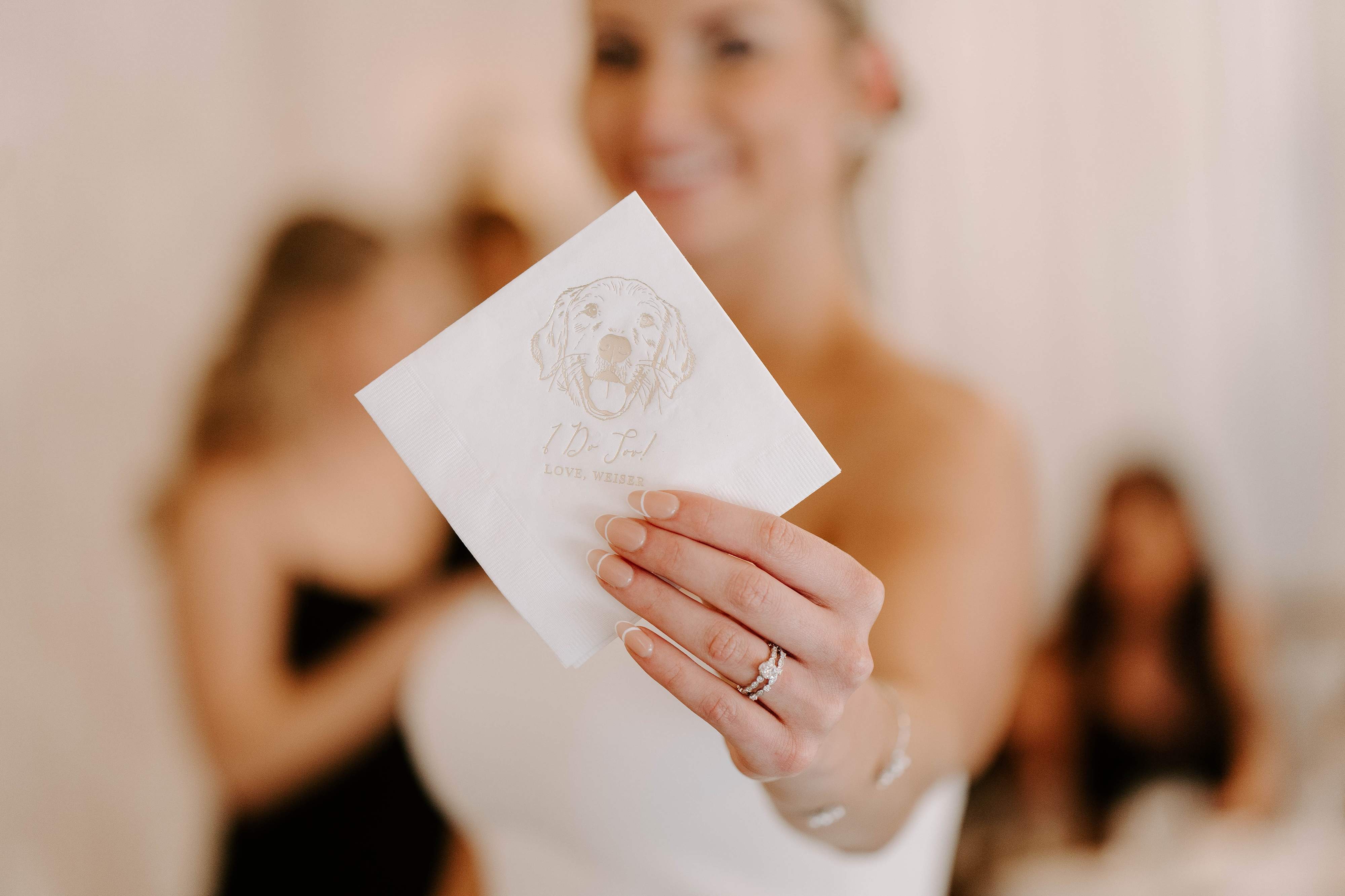
Choose linen color for either the table surface or the runner, not both, unless you want an immersive color block. Napkins are a tiny, affordable place to make a big impact. Personalized napkins are a subtle, memorable detail that guests notice and keep.
If you’re choosing personalized items, our customer favorites include designs that play nicely with bold palettes and show how color can be personalized tastefully.
Lighting
Lighting changes the way color reads. Warm light will subdue some neon tones and enhance jewel tones. Talk with your lighting vendor and test color swatches under venue lighting before finalizing big pieces.
Personalized Touches: Napkins, Cups, and Custom Signs
Personalized decor is where your wedding design gets its voice. Small custom items reinforce your color story and create keepsakes your guests will remember.
Why personalized items matter
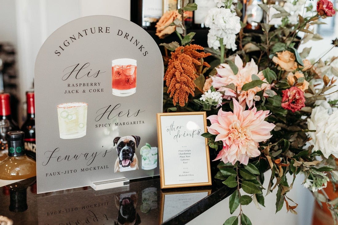
They carry your palette into the guest experience: a cocktail napkin in a bold hue, a frosted cup with your monogram, or an illustrated bar sign that picks up a secondary color. Personalized items are practical and decorative—they make your color choice feel deliberate.
Where to place color intentionally
- Cocktail napkins, in your primary bold color, at the bar for photo ops.
- Frosted plastic cups for signature cocktails, using a contrasting secondary hue.
- Welcome sign in your bold accent color, to set expectations at the ceremony entrance.
- Favor tags or custom coasters that repeat the palette on each place setting.
We love how small, custom pieces can add high-impact color without a large budget. If you want practical ideas, check out our customer favorites to see how color comes through on everyday items.
Attire and the Bridal Party: Let Bold Colors Shine
Bold wedding color choices extend to clothes. You don’t need everyone to wear the same bold hue. Use variations and accessories to keep it cohesive.
Bridesmaid dresses
Either dress the party in the primary bold color, or let each person choose from a palette of bold shades so you get a varied but intentional look. Fabrics matter; silk vs. chiffon will change how saturated the color appears on camera.
Groom and groomsmen
Ties, pocket squares, socks, or boutonniere ribbons are subtle ways to carry bold colors into menswear. If you’re using jewel tones, a muted suit with a bold tie is usually a safe, stylish approach.
Bridal look
If you’re open to nontraditional bridal styling, a bold sash, colored shoes, or a statement bouquet can bring your primary color into the look without compromising the classic wedding aesthetic.
What to Tell Your Vendors and How to Share Your Palette
Clear communication stops color confusion before it starts. Here’s what to send to florists, rental companies, and your photographer.
Create a color kit
Assemble swatches, hex codes, and photos that capture the mood. Include:
- Primary and secondary color swatches
- Two supporting neutrals
- One or two photo references
- Any metallic accents
Send this kit early, and ask your vendors to confirm the exact shades they’ll order. If you want help realizing a color-driven concept, our best sellers can show how custom printed decor reads in real settings.
Give your photographer guidance
Tell your photographer about bold wedding color choices up front. They can plan lighting and camera settings to capture accurate color. Ask for test shots during the first look or portrait time so you can approve how colors are rendering.
Confirm lighting and linen samples
Ask rental companies for fabric swatches and view them at the venue for realistic color checks. Venue lighting, flooring, and wall color will all affect how your bold palette reads.
Budget-Friendly Ways to Use Bold Colors
You don’t need a huge budget to make bold impact. Use these cost-effective strategies to put color where it matters most.
- Accent pieces: Napkins, menus, and signage are affordable and highly visible.
- DIY elements: Spray paint chargers or vases in your accent color for big visual payoff.
- Rent strategically: Rent a bold linen for the sweetheart table only, and use neutrals elsewhere.
- Lighting tricks: Colored gels on uplights or string lights with colored bulbs can shift mood without replacing decor.
Customized items, like personalized napkins, give a boutique look without the boutique price. See how personalized pieces can elevate your color story among our best sellers and customer favorites.
Testing Your Palette: Samples, Mockups, and Timelines
Give yourself time to test. Color decisions are easier to make when you’ve seen them in context.
- Order fabric and paper swatches at least three months before the wedding.
- Assemble a mock table or mood board in venue lighting two months out.
- Approve vendor samples in writing so everyone’s on the same page four to six weeks before the wedding.
Testing is also how you avoid last-minute surprises. If color is central to your vision, schedule time with your florist and rentals manager to compare samples side by side.
Common Mistakes and How to Avoid Them
When you’re excited about bold wedding color choices, a few pitfalls can creep in. Here’s how to dodge them.
- Too many bold colors: Stick to two bold hues plus neutrals.
- Not testing under real light: Swatches under fluorescent or evening light will look different than in daylight.
- Ignoring scale: A bold color on a small napkin reads differently than on a 100-person linen. Mix scales thoughtfully.
- Letting DIY get sloppy: Bold colors show mistakes easily. If you’re painting or dyeing, test first.
Real-World Examples and Color Palettes to Steal
Here are seven tested, bold wedding color choices you can adapt. I’ve listed the core colors, supporting neutrals, and where to use them.
1. Ruby, Navy, and Ivory
- Use ruby for bridesmaid dresses, navy for groom’s suit, ivory linens with ruby napkins.
- Feels dramatic and classic.
2. Electric Teal, Coral, and Sand
- Teal tables, coral florals, sand-toned linens.
- Bright, beachy, and photogenic.
3. Hot Pink, Tangerine, and White
- Great for an outdoor summer wedding: hot pink napkins, tangerine signage.
- Playful and modern; good for a bold, festive feel.
4. Emerald, Blush, and Gold
- Emerald linens or bridesmaids, blush florals, gold accents.
- Romantic with a luxe twist.
5. Mustard, Plum, and Charcoal
- Rich fall palette: mustard napkins, plum florals, charcoal tablecloths.
- Vintage-inspired and warm.
6. Neon Yellow, Slate Blue, and Ivory
- Use neon as an accent: cocktail napkins or signage, with slate blue table linen.
- Modern, energetic, and surprisingly sophisticated when balanced with neutrals.
7. Cherry Red, Blush, and Walnut Wood
- Cherry red as the primary bold color for signage and napkins, complemented by blush and natural wood textures.
- Strikes a balance between bold and romantic.
Want to see how real products look within these palettes? Our best sellers collection includes popular items that customers have used to achieve similar color stories.
Day-Of Tips to Keep Color Cohesion
On the wedding day, small slips can throw off a carefully chosen palette. Here’s a short checklist to keep things consistent.
- Assign someone to check napkin and linen placement before guest arrival.
- Keep extra napkins and signage on hand for last-minute swaps.
- Confirm lighting cues with your DJ or lighting tech to protect color accuracy during key moments.
- Ask your photographer to take venue detail shots early, so you can see how colors will appear in the album.
Final Styling Advice: Trust Your Instincts, Then Test
Bold wedding color choices are as much a personal statement as a design decision. If a color excites you, that energy will translate to your guests. But combine that instinct with practical testing: swatches, mockups, and vendor confirmations. A little preparation turns confident color choices into a polished, memorable day.
Frequently Asked Questions
What are some easy bold wedding color combinations for a small budget?
Pick one bold color and one neutral. Use the bold color in small, high-visibility areas like napkins, signage, and cocktail cups. You can achieve big visual impact with little cost by focusing on these repeatable elements.
How many bold colors should you use in one wedding palette?
Stick to two bold colors maximum, plus two neutrals. Any more and the design can feel scattered. Use variations in saturation and texture to add depth instead of additional hues.
How do bold colors photograph?
Bold colors photograph beautifully if they’re planned with lighting in mind. Share swatches and mood photos with your photographer so they can adjust settings and lighting. Jewel tones and saturated hues often pop in portraits and detail shots.
Can bold colors work for very formal weddings?
Absolutely. Deep jewel tones like navy, burgundy, and emerald can look very formal when paired with rich textures, tailored attire, and polished metallic accents.
Is it OK to mix bright and muted tones?
Yes, mixing can create sophistication. Use the bright color as an accent and the muted tones as your base. For example, a muted green base with pops of neon yellow will feel contemporary without overwhelming guests.
How far in advance should I order personalized items in my bold colors?
Order custom items at least 8 to 10 weeks before the wedding to allow for proofs, revisions, and shipping. If your palette includes unusual shades, allow extra time for sample approvals.
What should I do if the venue’s decor clashes with my bold palette?
Bring swatches and photos to the venue and discuss options. You can use temporary covers, runners, or strategic signage to create continuity. If the clash is severe, consider focusing your bold colors on elements you control, like table settings and stationery.
Conclusion
Bold wedding color choices give you the chance to create a wedding that feels unmistakably yours. Choose a primary bold color, add a complementary bold secondary, ground the palette with neutrals and texture, and test everything in real light. Focus boldness where it matters most: in florals, signage, and personalized pieces like napkins and cups. With a little planning, your color story will look intentional, polished, and joyful.
If you’re dreaming of a wedding that really stands out, start with a single color that makes you smile, and let it lead the way.
At Rubi and Lib
At Rubi and Lib, we specialize in helping you celebrate life's most memorable moments with personalized wedding and party decor designed to reflect your unique style. From custom cocktail napkins and frosted plastic cups to bar signs and party favors, our curated collections are created to elevate your celebration and leave a lasting impression on your guests. Whether you're planning a wedding, bridal shower, bachelorette party, baby shower, or birthday bash, our products add a thoughtful, stylish touch that turns an ordinary gathering into an unforgettable event. Many of our designs feature custom illustrations—including pet portraits—so your decor feels as one-of-a-kind as your story. As a women-owned small business, we're passionate about making the ordering process seamless and enjoyable. Every item is crafted with care and attention to detail, and most of our products are made in the USA. We believe celebrations should feel personal, joyful, and stress-free—that's why we're here to help you create meaningful moments, one custom detail at a time. Explore our best sellers (https://rubiandlib.com/collections/best-sellers), discover customer favorites (https://rubiandlib.com/collections/best-sellers), or reach out (https://rubiandlib.com/pages/contact-us) for something truly unique. At Rubi and Lib, your celebration is our inspiration.

