
Soft Wedding Color Palettes
Alternate Title: How to Choose and Style Soft Wedding Color Palettes That Feel Timeless and Personal
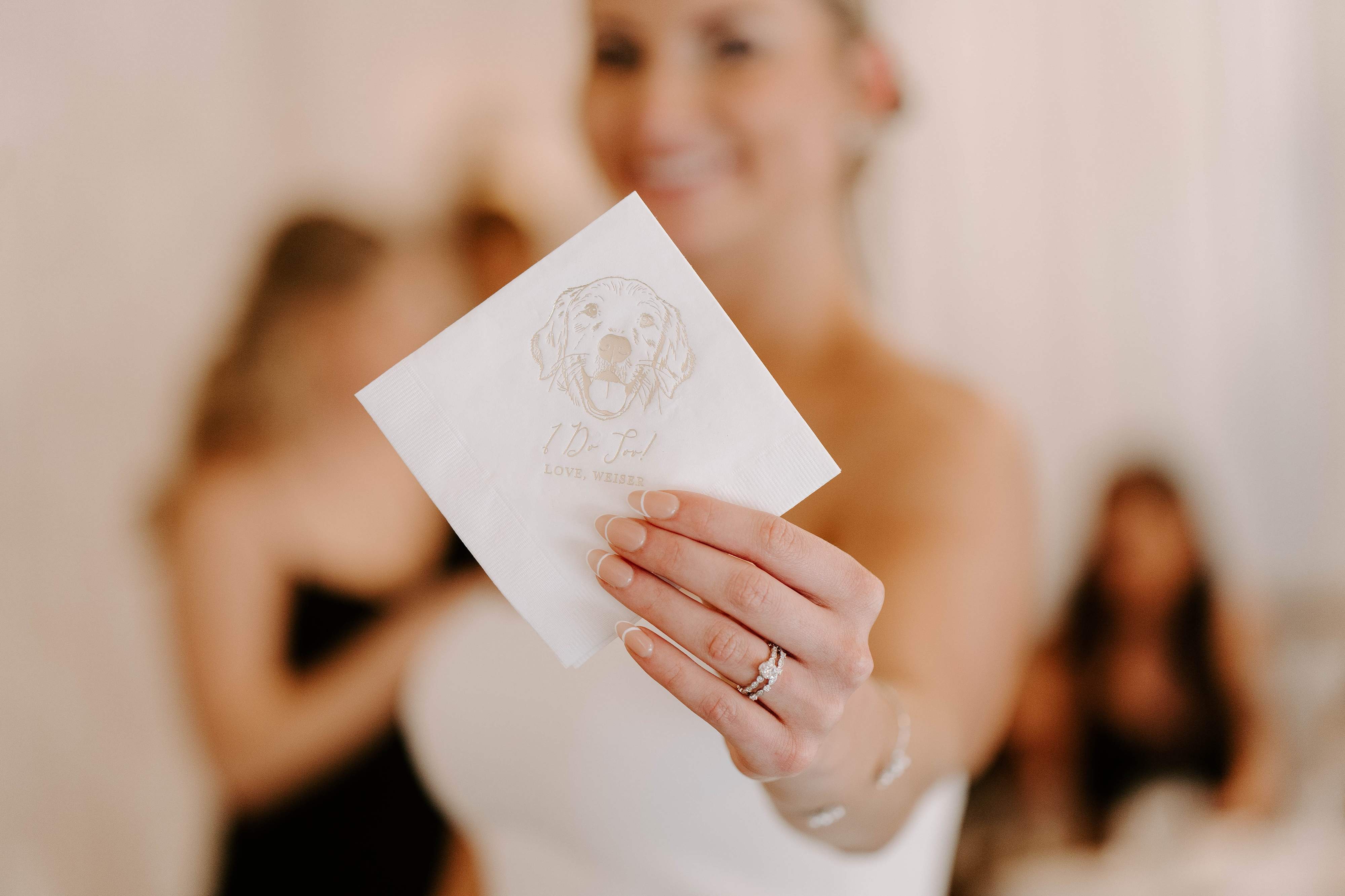
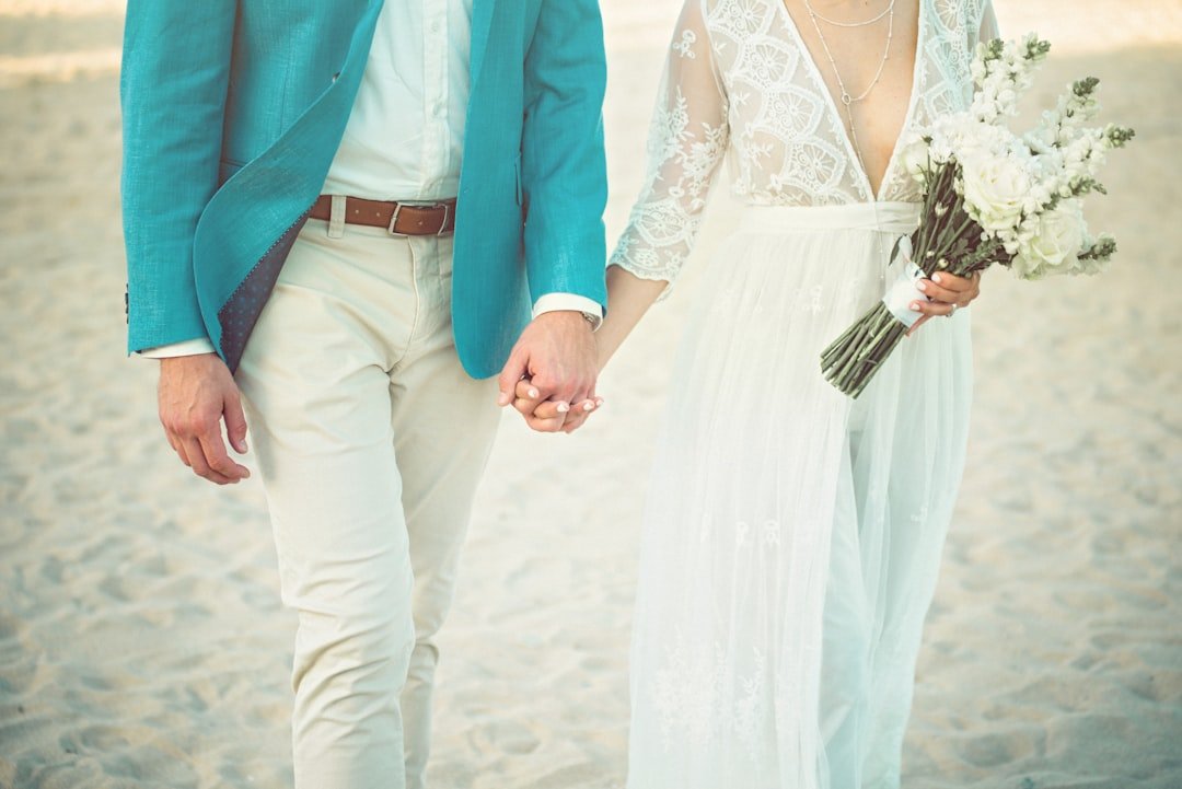
If you're drawn to gentle hues, airy vibes, and décor that feels effortless yet intentional, soft wedding color palettes are a beautiful place to start. Soft wedding color palettes give your day a romantic, cohesive look without shouting for attention. They let texture, light, and personalized details—like illustrated dog napkins or custom signs—shine through.
Why Choose Soft Wedding Color Palettes?
Soft wedding color palettes work because they're flexible and flattering. They create a calm, cohesive visual story that keeps the focus on your love and the people you care about. Here's why you might choose them:
- Timelessness: Pastels and muted tones age well in photos, so your gallery keeps feeling fresh years later.
- Versatility: Soft colors pair easily with metallics, neutrals, and various floral palettes.
- Flattering on film: Soft hues reduce harsh contrasts, which helps wedding photos feel warm and romantic.
- Personalization friendly: Custom details pop subtly against gentle backgrounds, whether that's your monogram napkins, frosted cups, or a custom bar sign.
How to Build Your Soft Wedding Color Palette
Building a palette is part art, part process. Use this straightforward approach to choose colors you'll love from planning through photos.
- Pick your lead color, the one that sets the mood. Think dusty rose, sage, or a pale blue.
- Choose a supporting color that sits next to the lead on the color wheel, like blush with mauve, or mint with soft gray.
- Add an accent for visual interest, usually a slightly deeper or brighter shade, or a warm metallic like gold or brass.
- Anchor with neutrals—ivory, warm white, oatmeal, or light taupe—to give the eye rest and tie elements together.
- Test in real life against fabrics, flowers, and venue lighting. Colors look different in sun, shade, or under string lights.
Keep the rule of threes in mind: one primary color, one secondary, and one accent plus neutrals. That gives you structure without feeling rigid.
Soft Palette Examples and Hex Codes
Here are practical, tested palettes you can adapt. I'm including hex codes so you can share exact shades with florists, stationers, and decorators.
Romantic Blush
- Blush Rose: #F4C6C6
- Dusty Mauve: #D7A6B0
- Warm Ivory: #FFF7F3
- Champagne Accent: #D8C5B8
Soft Coastal
- Pale Seafoam: #CFEFE9
- Muted Sky Blue: #BFDDEE
- Sand Neutral: #EAE6DD
- Soft Pewter Accent: #A7B1B8
Vintage Garden
- Antique Sage: #C4D3C5
- Dusty Lavender: #D6C7E0
- Ivory Lace: #FFF8F2
- Warm Brass Accent: #C9A972
Minimal Modern
- Pale Greige: #DFD8D3
- Soft Charcoal Accent: #9EA3A6
- Creamy White: #FFFDF9
- Matte Gold Trim: #DAB78B
Want real-life inspiration? Browse curated items to see how soft palettes translate into décor and keepsakes: best-sellers and customer favorites. (Tip: If you're considering personalized napkins, seeing samples in similar tones makes the decision easier.)
Seasonal Soft Wedding Color Palettes
Soft palettes adapt beautifully to every season when you swap accents and florals. Here's how to tailor your palette by season.
Spring
Think peony pinks, soft lemon, and new leaf green. Use lighter, brighter pastels and pair with plenty of fresh greenery for an airy feel.
Summer
Go softer on saturation, introduce pale corals, peachy apricots, or a light aqua. Keep linens breathable and choose materials that won't look heavy under sunlight.
Fall
Soft doesn't mean cold. Use warm muted tones like dusty terracotta, mushroom gray, and amber-tinged neutrals with deeper accents like warm brass.
Winter
Lean into cool soft tones like slate blue, frosted sage, and pearl ivory. Metallics like silver or brushed nickel add a festive glow.
Matching Your Venue and Lighting
Where you say "I do" affects how soft colors will appear. A quick checklist helps you plan smartly.
- Outdoor daytime: Colors read brighter in full sun. If you want soft, pick more muted shades or add a slightly darker accent to keep contrast for photos.
- Indoor with warm lighting: Warm bulbs push colors toward yellow; cooler blues may feel muted. Add warm neutrals or brass accents to harmonize.
- Evening with string lights: Soft palettes become romantic with tiny warm lights. Use texture like lace or linen so colors keep depth in low light.
- Historic or wood-heavy venues: Soften heavy architecture with pale colors and plenty of light neutrals to balance the room.
Before finalizing, photograph your swatches at the venue if possible. If not, ask vendors for samples and test them under similar light, or shoot quick phone photos with the lighting you'll have at the event.
Dresses, Florals, and Styling with Soft Colors
Your color choices should flow into what people wear and what you pick for floral arrangements. Here's how to keep things cohesive.
- Bridal gown: Soft palettes pair beautifully with ivory, champagne, or very pale blush gowns. Avoid stark white if your palette leans warm.
- Bridesmaids: Mix and match tones in the same family for a curated, layered look. For example, different shades of sage or various blush tones create depth without chaos.
- Groom and groomsmen: Neutral suits with accents—like a dusty rose tie or sage pocket square—tie them into the palette without being matchy.
- Florals: Ask your florist for a range of textures—soft garden roses, ranunculus, and dusty miller for muted foliage. A few deeper blooms act as focal points.
- Bouquets: Keep one repeating color in each bouquet to visually link the party while allowing variety in other stems.
Using Soft Palettes in Stationery, Tabletop, and Decor
This is where your color choices become tangible for guests. Soft colors shine on paper, fabric, and curated tabletop elements.
- Stationery: Use soft hues as washes or background tones and pick a slightly darker or metallic ink for legibility. Letterpress or soft-touch finishes add luxury without high contrast.
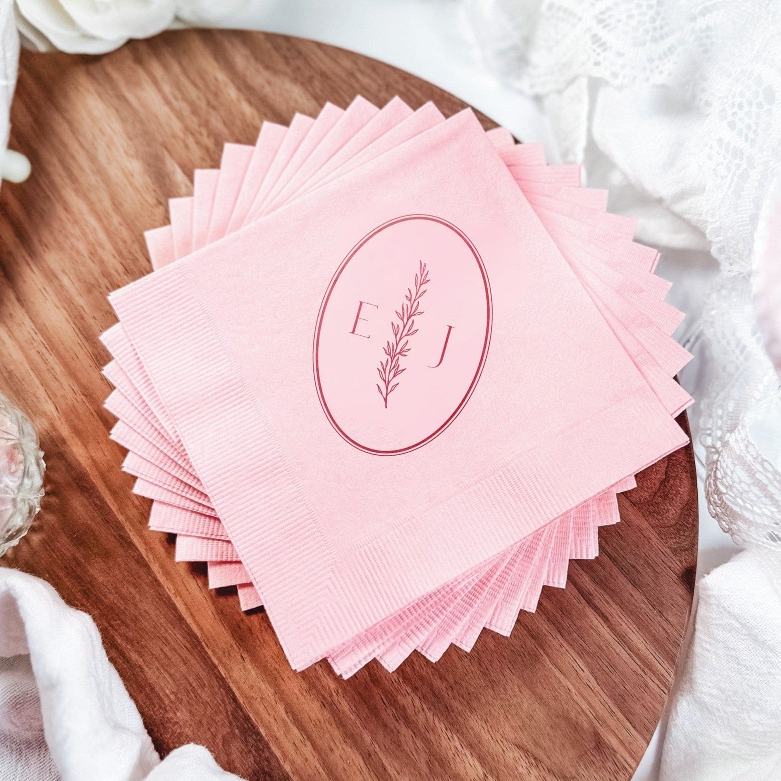
- Table linens: Neutral tablecloths with soft-colored napkins create a calm canvas for dishware. Consider mixing napkin textures—linen on the guest table and cotton at cocktail stations—to add interest.
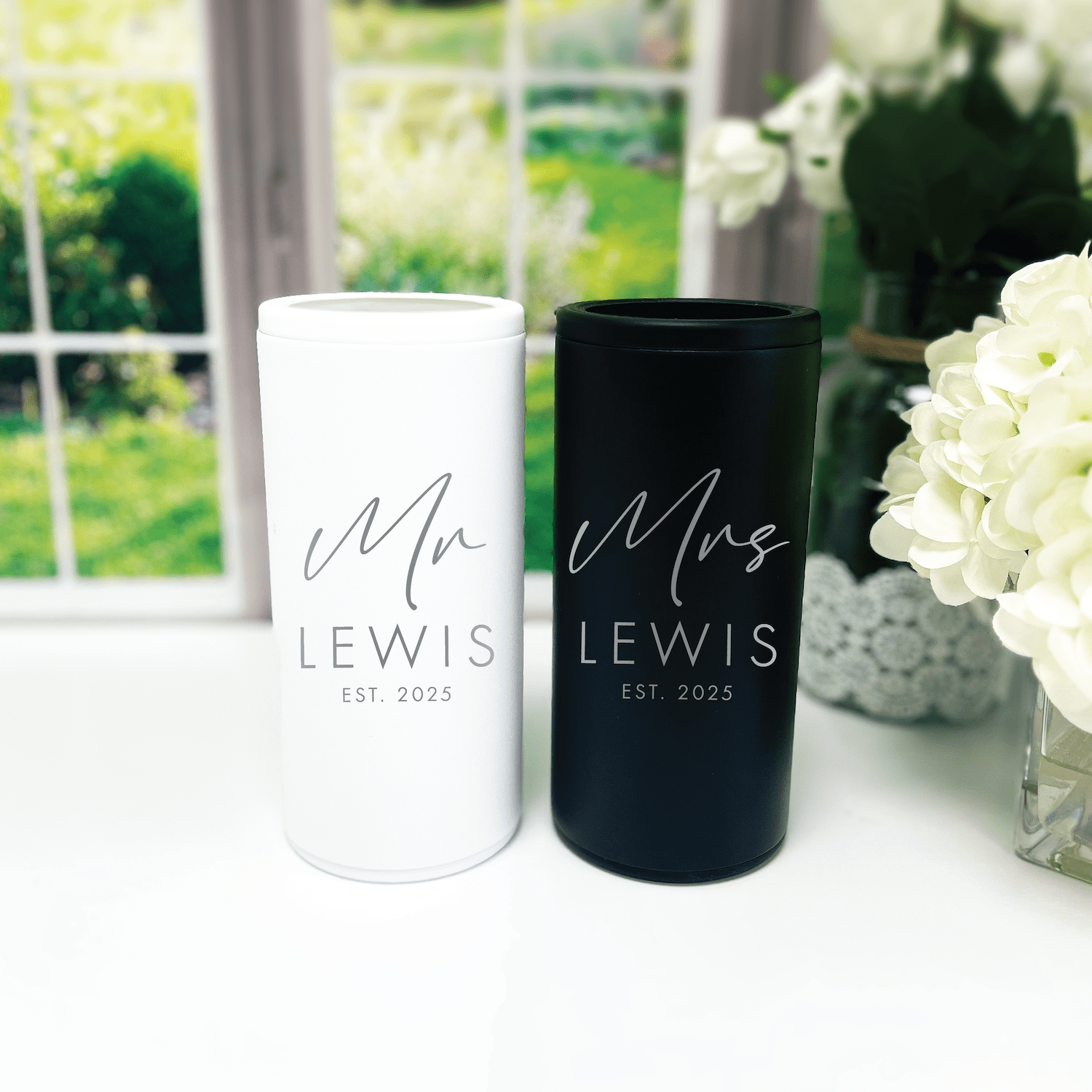
- Place settings: Gentle color pops on napkins, menu cards, or place cards look refined. Personalized napkins or illustrated details create memorable keepsakes.
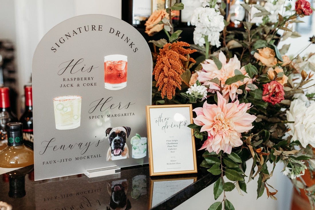
- Signage and bars: Soft palettes allow elegant script signs to read nicely without overpowering the space.
If you want personalized touches like custom cocktail napkins, frosted plastic cups, or bar signs, check our curated options to find colors and styles that echo your palette: best-sellers and customer favorites. Personalized napkins—especially our illustrated pet napkins—are a lovely way to add personality in a subtle, soft color.
Textures, Metals, and Materials That Complement Soft Colors
Soft colors thrive on texture. Choosing the right materials will give dimension to a palette that might otherwise read flat.
- Linens: Washed linen, raw-edge napkins, and soft cottons enhance the relaxed elegance of soft palettes.
- Florals: Combine full, round blooms with wispy botanicals like astilbe or eucalyptus for contrast.
- Metals: Warm golds, rose gold, and brass add warmth to cool pastels. Brushed silver or pewter suits cooler palettes.
- Paper finishes: Soft-touch or cotton-stock papers make stationery feel more luxurious in muted palettes.
- Glass and acrylic: Frosted cups or matte acrylic signage keep things subtle while adding modern texture. You can see examples for inspiration in our curated collections: best-sellers.
Common Mistakes to Avoid with Soft Palettes
Soft palettes are forgiving, but there are pitfalls. Avoid these to keep your wedding looking intentionally styled instead of under-planned.
- Too many low-contrast elements. If everything is the same pale tone, details get lost in photos. Add one anchor color or a metallic accent for contrast.
- Ignoring lighting. Pale colors can wash out under harsh light. Test swatches in the ceremony and reception lighting.
- Overmatching. Don't force every detail to match exactly. Let patterns and textures play together in the same color family.
- Not sharing exact references. Always give vendors hex codes or swatches. "Blush" means different things to different people.
Testing Your Palette: Samples, Mockups, and Mood Boards
Testing is the most satisfying step. You'll feel confident when colors work in real life—not just on a screen.
- Create a physical mood board with fabric swatches, paint cards, and printed photos. Pin them to a board to see how they interact.
- Order small samples of napkins, cups, or signage in your chosen hues. You can compare them under different lights and next to floral samples. Check curated items for color inspiration: customer favorites.
- Make a mock table at home. Set a plate, napkin, menu, and a sample centerpiece to see the full effect.
- Take photos of your tests in the same lighting conditions as your venue. Photos sometimes reveal undertones you didn't notice in person.
Want to preview personalized items? Try ordering a small run or a single sample of a custom napkin or cup to see how your palette translates to finished products. Many couples love the way an illustrated napkin or a frosted cup ties the color story together. For inspiration, check our collections: best-sellers and customer favorites.
Working with Vendors and Custom Items
Clear communication is the secret to getting colors right across vendors.
- Share exact references, including hex codes, Pantone numbers if possible, and physical swatches. Asking for paper or fabric swatches is reasonable.
- Supply a one-page color guide with images of how you want the colors to appear in floral, stationery, and textiles.
- Ask for mockups from stationers and sign makers. A digital mockup is useful, but a physical sample is best for textiles.
- Coordinate timelines so any samples arrive early enough to make changes.
At Rubi and Lib, we love helping couples translate soft color palettes into personalized decor, from custom cocktail napkins to bar signs. If you're unsure where to start, our curated collections are a helpful place to see color and style pairings in real examples: customer favorites and best-sellers.
Frequently Asked Questions
What exactly are soft wedding color palettes?
Soft wedding color palettes use muted, low-saturation hues—think dusty rose, pale sage, or soft blue—often paired with warm neutrals and a subtle metallic. They create a gentle, cohesive aesthetic that reads as romantic and timeless.
How many colors should I include in my palette?
Follow a simple structure: one primary color, one supporting color, one accent, and neutrals. That gives you variety without chaos. You can expand slightly with different shades from the same family for depth.
Will soft colors photograph well?
Yes. Soft colors generally photograph beautifully because they reduce harsh contrast and create a warm, dreamy look. Make sure to test under your venue's lighting to avoid any unexpected shifts.
Can I mix pastels with bold colors?
You can, but use bold colors sparingly as accents. A single bold element—like a deep ribbon on the bouquet or a stronger color in signage—can add drama without overpowering the soft palette.
How do I incorporate personal elements, like pet illustrations, without breaking the palette?
Use personalized items—like illustrated dog napkins or custom favors—in colors that match or softly contrast with your palette. Subtle personalization keeps the look cohesive while highlighting what matters to you. For ideas, explore curated collections that showcase personalized options: best-sellers and customer favorites.
What should I tell vendors about my colors?
Give vendors hex codes or physical swatches, describe the mood you want to achieve, and show them your mood board. Ask for samples and mockups before final approval.
Are soft palettes more expensive?
Not necessarily. Costs depend on materials, finishes, and customizations. However, choosing high-impact custom items—like personalized napkins or a bespoke sign—can be a cost-effective way to elevate a soft palette without breaking the budget. Check out examples of affordable custom pieces in our collections: customer favorites.
How can I add contrast without making the palette feel harsh?
Add contrast via texture, metallics, or a slightly deeper accent hue. For example, pairing pale sage with a warm brass candle holder adds depth without introducing a jarring color.
For further assistance with personalized items that match your color story, our collections show how soft palettes come to life in real products: best-sellers and customer favorites.
Soft wedding color palettes are a lovely way to make your wedding feel intimate, timeless, and effortlessly styled. They play well with personalized details—like custom napkins, cups, and signs—so the day feels like you. Test, tweak, and trust your eye; once everything ties together, you'll have a celebration that looks as calm and joyful as it feels.
Ready to make it personal? If you want decor that reflects your palette and your story, explore inspiration and shop personalized pieces in our curated collections: customer favorites and best-sellers. We're here to help you bring your soft color story to life.
Related Blog Posts
- Personalized Wedding Color Themes to Match Your Vision
- Romantic Wedding Color Combinations for Every Season
- Neutral Wedding Color Palettes That Feel Effortlessly Elegant
- Wedding Color Palette Ideas to Inspire Your Big Day
- Seasonal Wedding Color Choices for Year-Round Inspiration
- Trending Wedding Color Schemes Couples Are Loving Right Now
- Customizable Napkins for Your Dream Wedding
- How to Match Your Wedding Favors to Your Theme
- Your Complete Checklist for Wedding Decor
- 5 Elegant Frosted Cups to Elevate Your Wedding Aesthetic
Rubi and Lib Brand Message
Explore our best sellers, or reach out for something truly unique.

Written by Bethany Wysolmerski


