
Vibrant Wedding Color Themes
Alternate Title: Bright, Bold, and Beautiful — How to Use Vibrant Wedding Color Themes Without Overdoing It
If you're drawn to lively, saturated hues, vibrant wedding color themes are a perfect way to make your celebration feel joyful and unforgettable. Choosing bold colors doesn't mean everything has to be loud; when you plan intentionally, those hues can elevate your venue, photos, and guest experience. This guide walks you through picking a palette, applying color across your wedding, working with florals and lighting, and using personalized decor to make the look feel uniquely yours.
Why Choose Vibrant Wedding Color Themes?
Bright color palettes do more than look pretty. They set a tone, tell a story, and create an energy your guests will remember. Vibrant colors can:
- Reflect your personalities, whether you love tropical vibes or jewel-toned elegance.
- Pop in photos, giving you lively memories rather than muted tones.
- Help define different spaces — ceremony, cocktail hour, and reception — without heavy decor work.
- Create easy focal points, like a bold altar, neon sign, or colorful table runner.
If you want guests to feel excited the moment they walk in, a vivid palette gives that instant emotional hit. You'll also find it easier to coordinate decor elements when you choose a clear, saturated direction early.
How to Pick a Palette That Feels Like You
Picking colors is part taste, part logistics. Start by asking a few direct questions:
- What mood do you want? Energetic, romantic, whimsical, modern?
- What's your venue like? Bright outdoor spaces handle saturated colors differently than dim ballrooms.
- What season are you planning for? Some palettes feel natural in summer but overpowering in winter.
- How photo-forward are you? Bold colors photograph beautifully, but skin tones and lighting matter.
Work from one anchor color and build around it. For example, pick a vivid fuchsia as your anchor, then add two supporting hues and a neutral. That gives you enough contrast to be exciting, while staying coherent.
12 Vibrant Palettes With Real Examples
Here are high-impact palettes to inspire you, paired with quick styling ideas so you can picture them in real life.
1. Tropical Punch: Coral, Turquoise, Lush Green
Perfect for beach or garden weddings. Use turquoise linens for cocktail areas, coral bouquets, and palm fronds as natural table runners.
2. Sunset Boulevard: Tangerine, Magenta, Gold
Great for outdoor evening celebrations. Accent with warm fairy lights and brass candlesticks to enhance the golden-hour feel.
3. Jewel Box: Emerald, Sapphire, Amethyst
Luxurious and dramatic. Deep velvet linens, gemstone-hued glassware, and candlelight make this palette feel upscale.
4. Neon Pastel Remix: Neon Peach, Mint, Lemon
Playful without being juvenile. Pair neon accents—think signage and cocktail napkins—with soft linens to balance brightness.
5. Citrus Orchard: Lemon, Lime, Hot Pink
Bright and zesty. Use citrus slices in centerpieces, bold napkin placements, and playful signage.
6. Electric Garden: Fuchsia, Royal Blue, Chartreuse
Vivid and unexpected. This palette pops in floral installations and on aisle runners.
7. Modern Fiesta: Scarlet, Turquoise, Mustard
Warm and festive. Great for daytime receptions, paired with patterned textiles and terracotta details.
8. Candy Shop: Raspberry, Bubblegum Pink, Aqua
Sweet and nostalgic. This works especially well for engagement parties, bridal showers, or bachelorette events.
9. Bold & Minimal: Cobalt, White, Black
High-contrast and chic. Use color sparingly on signage and small accents to maximize impact.
10. Peacock Luxe: Teal, Gold, Deep Purple
Regal and expressive. Metallics add a polished touch, while deep hues ground the look.
11. Floral Fiesta: Magenta, Orange, Chartreuse
Inspired by Latin American celebrations. Layer patterns and bright florals for a joyful atmosphere.
12. Rainbow Accent: One Neutral Base + Multiple Neon Accents
Use a neutral palette for large surfaces and add pops of multiple neons in small touches—cocktail napkins, cups, signage—to feel playful without chaos.
Want to see how curated collections can help bring any of these palettes to life? Explore a selection of our most-loved pieces for easy color coordination: best sellers.
How to Use Color Across Every Wedding Element
Consistency is key. Use your chosen palette everywhere, but in different doses so nothing competes. Here are practical placements and tips.
Ceremony
- Anchor the ceremony with a colorful backdrop or floral arch in your palette.
- Use aisle accents—like ribbon, petals, or signage—in one of your accent colors for rhythm.
Reception
- Choose table linens in a mid-tone and layer with napkins in your brightest accent color.
- Create color zones—one bold lounge area, subtler dining tables, and a vibrant dessert bar.
Attire
- Bridesmaid dresses are a great place to go bold; you can pick a single shade for cohesion or mix complementary tones for depth.
- Ties, pocket squares, and boutonnieres are easy ways to tie groomsmen into the palette.
Stationery and Signage
- Use a statement color on invitations for instant personality.
- Bring color to signs and menus; bold lettering on a bright background is readable and photo-friendly.
Tabletop Touches
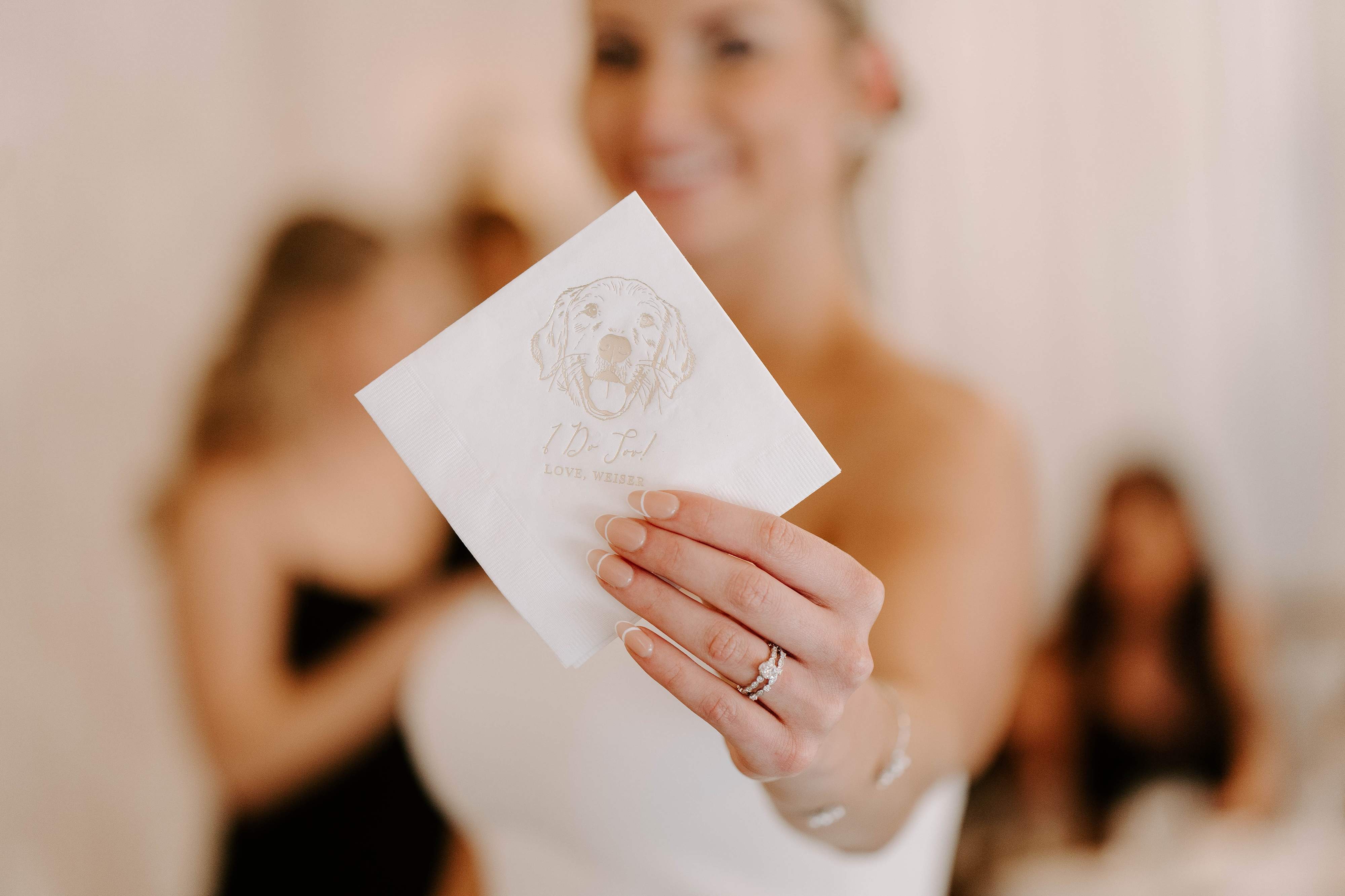
- Napkins are small, cost-effective pieces that transform your tablescape—consider printed or illustrated napkins for extra personality, like pet portraits or custom motifs.
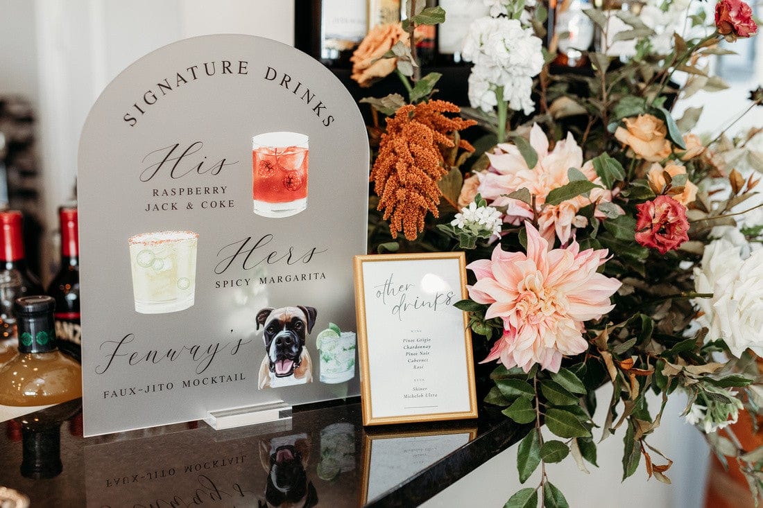
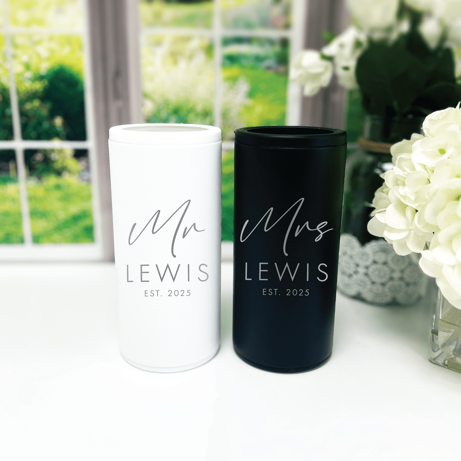
- Frosted plastic cups and custom stirrers can continue the color story into the bar area, where guests notice details.
If you're looking for curated items to match your palette, check popular customer choices: customer favorites.
Pairing Vibrant Colors With Neutrals and Metallics
Bright colors need breathing room. Neutral anchors—cream, stone, soft gray—balance saturation and make accents pop. Metallics like gold, brass, or copper can add warmth and sophistication.
- Use a neutral base for linens and large furniture.
- Add metallics through chargers, candleholders, and flatware for a luxe feel.
- Introduce one bright color as the hero, then use 1–2 supporting hues and a neutral to create structure.
For example, pair fuchsia with soft blush, rich navy, and warm brass to keep the palette energetic but refined.
Color, Lighting, and Photography Tips
Lighting changes everything. Under warm lighting, some colors will read differently than in daylight. Chat with your photographer and venue about what to expect.
- Test your palette with sample lighting. Bring fabric swatches and printed items to the venue to see them in context.
- Avoid tiny, highly saturated prints when you want clean photos; solids or bold blocks of color render better.
- For evening receptions, uplighting in a complementary color can transform the space, but keep it subtle so skin tones stay natural.
Pro tip: Use a few white or soft elements—like a white runner or neutral napkins—to give cameras a reference point, so bright colors don't blow out in photos.
Budget-Friendly Ways to Go Bold
Bold color doesn't always mean big spend. Here are affordable strategies that still make a statement.
- Focus spending on high-visibility areas: a colorful entry, the head table, and the bar.
- Use rental items like colored glassware or linens to avoid buying expensive pieces you'll rarely reuse.
- DIY signage and table numbers using bold paint or paper to add color without the cost of full-scale decor.
- Buy small personalized touches—like custom napkins or cups—to deliver big visual payoff at a modest cost.
Want to see popular, budget-friendly pieces that instantly add color? Browse our best-sellers for ideas: best sellers and customer favorites.
Timeline: When to Lock Colors and Order Personalized Items
Timing matters, especially when you want custom pieces like illustrated napkins or engraved signs. Here's a simple timeline to keep you on track.
- 9–12 months before: Choose your palette and book the venue and major vendors.
- 6–9 months before: Finalize major rentals, attire, and floral direction. Start mood boards and sample ordering.
- 3–6 months before: Order personalized items—napkins, cups, signs—so proofs and production fit the timeline.
- 1–2 months before: Confirm lighting plans and do a final color check at the venue with samples.
- 2–4 weeks before: Receive custom items and check them against your final palette to ensure everything coordinates.
Custom items often have production and proofing times, so don't leave them to the last minute. If you want help creating something unique, reach out early: contact us.
Creating Mood Boards and Sample Kits
Before you commit, build a mood board that includes:
- One hero color swatch
- Two supporting colors
- A neutral base
- Metallic accents
- Photo inspiration for florals, signage, and attire
Order small sample kits where possible: napkin swatches, printed invitation samples, or a mockup of a menu. Seeing physical pieces together prevents surprises and keeps your vendors aligned.
If you need coordinating pieces, our curated collections can spark ideas. Try some of our most popular items to build a cohesive look: best sellers.
Personalization Ideas to Make Color Themes Uniquely Yours
Personalized touches are where your wedding moves from magazine-perfect to unmistakably you.
- Custom Napkins: Add initials, a motif, or even a hand-illustrated pet portrait on colorful napkins to delight guests and tie in your palette.
- Custom Cups: Frosted plastic cups in your accent shade make the bar pop and are practical for outdoor events.
- Coordinated Signage: Use a consistent font and color across welcome signs, menus, and place cards for a polished look.
- Illustrated Motifs: Integrate a small illustration across stationary and napkins. If you have a dog or another meaningful symbol, a custom illustration makes decor feel personal.
Small, intentional items—like personalized napkins at each place setting—create big emotional returns. For inspiration, check some customer favorites that couples use for personalization: customer favorites.
Real-World Styling Tips From Planners and Photographers
Here are practical tips professionals share when working with vibrant palettes:
- Limit prints. Large, bold solids read better on camera than tiny patterned fabrics.
- Balance brightness across heights. If tabletop colors are saturated, soften overhead or vertical elements to avoid visual overload.
- Use repetition for cohesion. Repeat a single accent color in multiple elements—napkins, signage, and cocktail garnishes—so the palette reads as intentional.
- Test florals with non-floral elements. Colorful blooms next to brightly colored acrylic signs can clash; add a neutral buffer like simple greenery or white candles.
When you plan this way, your photos will feel cohesive, and guests will move through spaces that feel thoughtfully designed.
Where to Source Colorful, Personalized Decor
Finding pieces that match your palette can be overwhelming. Focus on stores and makers who specialize in custom items so you can proof colors and designs in advance. If you want coordinated, made-in-the-USA decor—like custom cocktail napkins, frosted plastic cups, and bar signs—you can start by browsing a curated selection of best-selling items for quick inspiration: best sellers and our customer favorites.
If you're dreaming of something bespoke, it's smart to reach out before booking production: contact us.
Frequently Asked Questions
How many colors should I include in a vibrant wedding palette?
A practical palette includes one hero color, one to two supporting hues, and a neutral. That gives you enough variety to be interesting, while keeping the overall look coherent.
Will bright colors clash in photos?
They can if not balanced, but when you test colors under the venue lighting and include neutrals for contrast, bold hues photograph beautifully and add life to images.
Can I mix different vibrant palettes at one wedding?
Yes, but do it with purpose. Assign palettes to different zones—ceremony, cocktail hour, photo booth—or use them as small accent shifts so the day feels dynamic, not chaotic.
What are low-cost ways to add a pop of color?
Use cost-effective items like napkins, cups, signage, and aisle accents. Small, colorful pieces create big visual impact without breaking the budget.
How far in advance should I order custom items like napkins?
Order personalized items at least 3–6 months before your wedding to allow time for proofs, revisions, and delivery. Rush options exist but can be costly.
How do I coordinate florals with a vibrant palette?
Work with your florist to select flowers and greenery that either match or complement your palette. Ask for a mockup or photos of sample bunches under your venue's lighting to ensure harmony.
Can I use neon colors in a formal wedding?
Absolutely. Use neon as small accent pieces—napkins, signage, or cocktail garnishes—while keeping larger surfaces more neutral or subtly colored to keep the overall feel elegant.
Where do I start if I'm overwhelmed by color options?
Start with one image that excites you, then pull 2–3 key colors from it. Build a simple mood board and narrow choices by testing a few physical samples together in the venue if possible.
Conclusion
Vibrant wedding color themes offer endless ways to express who you are as a couple. When you choose a confident palette, balance it with neutrals and metallics, and integrate color thoughtfully across decor, lighting, and photography, the result is a wedding that's bold, cohesive, and full of joy. Personalized pieces like custom napkins or frosted cups let you add signature touches that guests will remember. Start with one hero color, test it in context, and build from there. You'll end up with a celebration that feels both intentional and unmistakably you.
Ready to add personal, colorful touches to your wedding? Explore popular pieces in our collections to get started: best sellers, customer favorites, or reach out to discuss custom ideas: contact us.
Related Blog Posts
- Personalized Wedding Color Themes to Match Your Style
- Bold Wedding Color Choices That Make a Statement
- Wedding Color Palette Ideas for Every Season and Style
- Trending Wedding Color Schemes Couples Love Right Now
- Seasonal Wedding Color Choices for Year-Round Inspiration
- Wedding Color Inspiration Tips to Simplify Your Planning
- Customizable Napkins for Your Dream Wedding
- Custom Wedding Cups to Elevate Your Bar Setup
- Your Complete Checklist for Wedding Decor
- Budget Wedding Favors That Still Look Amazing
At Rubi and Lib, we specialize in helping you celebrate life's most memorable moments with personalized wedding and party decor designed to reflect your unique style. From custom cocktail napkins and frosted plastic cups to bar signs and party favors, our curated collections are created to elevate your celebration and leave a lasting impression on your guests.
Whether you're planning a wedding, bridal shower, bachelorette party, baby shower, or birthday bash, our products add a thoughtful, stylish touch that turns an ordinary gathering into an unforgettable event. Many of our designs feature custom illustrations—including pet portraits—so your decor feels as one-of-a-kind as your story.
As a women-owned small business, we're passionate about making the ordering process seamless and enjoyable. Every item is crafted with care and attention to detail, and most of our products are made in the USA. We believe celebrations should feel personal, joyful, and stress-free—that's why we're here to help you create meaningful moments, one custom detail at a time.
Explore our best sellers (https://rubiandlib.com/collections/best-sellers), discover customer favorites (https://rubiandlib.com/collections/best-sellers), or reach out (https://rubiandlib.com/pages/contact-us) for something truly unique. At Rubi and Lib, your celebration is our inspiration.

Written by Bethany Wysolmerski


