
Romantic Wedding Color Combinations
An Easy Way to Pick Color Palettes That Feel Personal and Timeless
Soft blush paired with deep navy is one of the most romantic wedding color combinations: it reads timeless, elegant, and surprisingly modern. If you want a palette that makes guests feel cozy, looks amazing in photos, and ties every detail together—from florals to napkins—you're in the right place.
This guide walks you through choosing romantic wedding color combinations that match your venue, season, and vibe. You'll get ready-to-use palettes, ideas for applying color across ceremony and reception elements, tips to keep your look cohesive, and ways to add personal touches—like custom illustrated napkins or frosted plastic cups—to make your wedding unmistakably you.
Why Color Matters for a Romantic Wedding
Color sets mood. It tells a story without words. The shades you pick will affect how your venue feels, how flowers look on camera, and how guests remember the day. Romantic wedding color combinations do more than look pretty: they create an atmosphere that supports your ceremony and celebration.
- Emotion: Warm tones feel intimate; cool tones can feel calm and dreamy.
- Photographs: Certain hues reflect light beautifully—think blush, cream, and dusty blue.
- Cohesion: A consistent palette makes your stationery, signage, and table decor look intentional.
- Personalization: Color helps you express your story, whether it's vintage romance, garden chic, or modern elegance.
How to Choose Your Romantic Wedding Color Combinations
Start with one core feeling, then build. Use these steps to narrow your choices without getting overwhelmed.
- Decide the mood: Do you want airy and whimsical, moody and intimate, or classic and polished?
- Look at your venue: Bring swatches to the site. A barn, botanical garden, and downtown loft each need different tones to sing.
- Choose a dominant color: This will be the one you use most often—table linens, bridesmaid dresses, or a ceremony backdrop.
- Add one or two supporting colors: These add contrast and richness without competing. Think of them as accents on florals, napkins, or signage.
- Use neutrals and a metallic: Neutrals (ivory, stone) and a metallic (gold, brass, or silver) tie everything together.
- Test samples: Order napkins, paper samples, or cups to see how the colors photograph and sit in natural light.
When you're ready to test small-scale decor, consider ordering sample items from trusted collections like our best sellers to see how colors work in real life.
Timeless Romantic Color Palettes (With How to Use Them)
Below are seven palettes that reliably feel romantic. For each, I'll include where to use each color and a quick floral and attire suggestion.
1. Blush, Champagne, and Sage
Why it works: Blush is soft and warm, champagne adds a luxe glow, sage keeps everything grounded.
- Use for: Bridesmaid dresses in blush, sage napkins, champagne chargers or metallic rimmed glassware.
- Florals: Garden roses, ranunculus, eucalyptus.
- Vibe: Garden romance, daytime or tented receptions.
2. Dusty Blue, Ivory, and Gold
Why it works: Dusty blue reads romantic and calm; ivory keeps it classic; gold injects elegance.
- Use for: Dusty blue linens or velvet runners, ivory stationary, gold flatware or signage accents.
- Florals: White peonies, blue thistle accents, soft greenery.
- Vibe: Coastal or historic venues, sunset receptions.
3. Burgundy, Blush, and Navy
Why it works: Burgundy brings depth and sensuality; blush softens it; navy grounds the palette.
- Use for: Burgundy velvet tablecloths for drama, blush napkins for balance, navy suits for groomsmen.
- Florals: Deep ranunculus, blush garden roses, dark foliage.
- Vibe: Fall or winter evenings, moody and elegant.
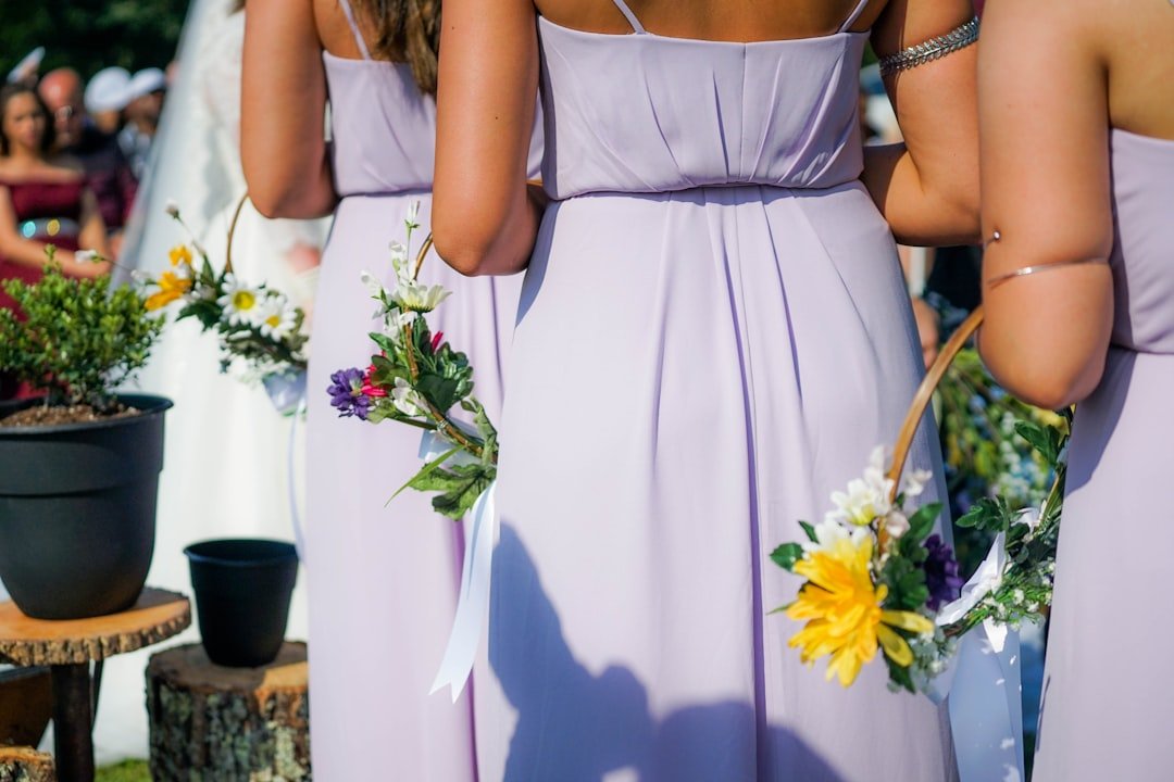
4. Lavender, Mauve, and Soft Gray
Why it works: These pastels are dreamy together and photograph beautifully in soft light.
- Use for: Lavender bridesmaids, mauve stationery, soft gray linens.
- Florals: Lavender sprigs, peonies, dusty miller.
- Vibe: Springtime garden or vineyard weddings, whimsical and light.
5. Coral, Champagne, and Olive
Why it works: Coral adds warmth and playfulness, olive keeps it natural, champagne keeps it classy.
- Use for: Coral florals and napkins, olive greenery garlands, champagne touches on signs.
- Florals: Coral peonies, ranunculus, olive branches.
- Vibe: Summer celebrations, outdoor receptions, joyful and bright.
6. Romantic Neutrals: Cream, Taupe, and Warm Gold
Why it works: Minimalist romance—textural rather than color-driven.
- Use for: Cream linens, taupe bridesmaid dresses, warm gold accents like signage or candle holders.
- Florals: Ivory roses, pampas grass, dried elements for texture.
- Vibe: Elegant, refined, great for historic ballrooms or modern minimal venues.
7. Plum, Rose, and Smoky Blue
Why it works: Deep jewel tones with a soft contrast, dramatic but romantic.
- Use for: Plum table runners, rose accents in florals and cake, smoky blue stationery or escort cards.
- Florals: Dark dahlias, dusty roses, blue-toned fillers.
- Vibe: Evening weddings, candlelit ceremonies, luxe and intimate.
If you want to shop curated items to try these looks in your real-world decor, check our customer favorites for popular, customizable options that photograph well.
Seasonal Romantic Color Combinations
Season matters. Colors behave differently in bright summer sun than under warm indoor lighting in winter. Here are season-specific palettes that keep romance front and center.
Spring
Palette ideas: Blush, lilac, sage; or dusty blue, pale peach, and ivory.
Tip: Lighter pastels work beautifully with softer blooms and outdoor venues. Use light fabrics and translucent signage to keep things airy.
Summer
Palette ideas: Coral, olive, and champagne; or dusty rose, soft aqua, and warm beige.
Tip: Go bold with one saturated accent color and balance it with neutrals to avoid visual fatigue in bright daylight.
Fall
Palette ideas: Burgundy, mustard, and deep green; or plum, rose, and warm taupe.
Tip: Add texture—velvet runners, heavy linens, and candlelight will enhance the romantic feel.
Winter
Palette ideas: Navy, blush, and metallic gold; or deep emerald, cream, and black.
Tip: Rich jewel tones and metallics read luxurious under indoor lighting; use uplighting and candles to highlight colors.
Using Neutrals and Metallics With Romantic Palettes
Neutrals and metallics are the secret glue. They let your main colors shine without competing for attention.
- Neutrals: Ivory, cream, warm gray, and taupe work as background canvas pieces like tablecloths and ceremony backdrops.
- Metallics: Gold and rose gold read romantic with blush and burgundy. Silver and pewter pair beautifully with dusty blue and gray palettes.
- Balance: If your palette has two saturated tones, use a neutral and a metallic to balance the look across flatware, signage, and linens.
Small metallic or neutral accents—like a gold-foil menu or ivory napkins—go a long way. You can find high-quality customizable pieces among our best sellers to add those finishing touches without fuss.
How to Apply Your Colors Across Wedding Elements
Your palette should touch all major elements so the day feels cohesive. Here's a practical checklist of where to apply color and how bold to be.
- Ceremony: Ceremony backdrop, aisle runner, bouquet, and groom's boutonniere. Keep ceremony palettes slightly softer for emotional photos.
- Reception: Table linens, runners, chairs, and centerpieces. Use your dominant color here.
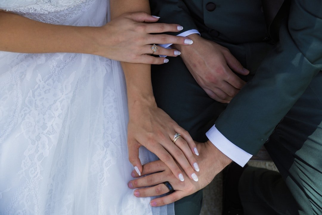
- Attire: Bridesmaid dresses and groomsmen accessories carry the palette through photos.
- Stationery: Save-the-dates, invitations, escort cards, and menus. These should preview your palette and set guest expectations.
- Signage & Small Details: Welcome signs, cocktail napkins, cups, favor tags, and place cards. These micro-moments are perfect for showing personality.
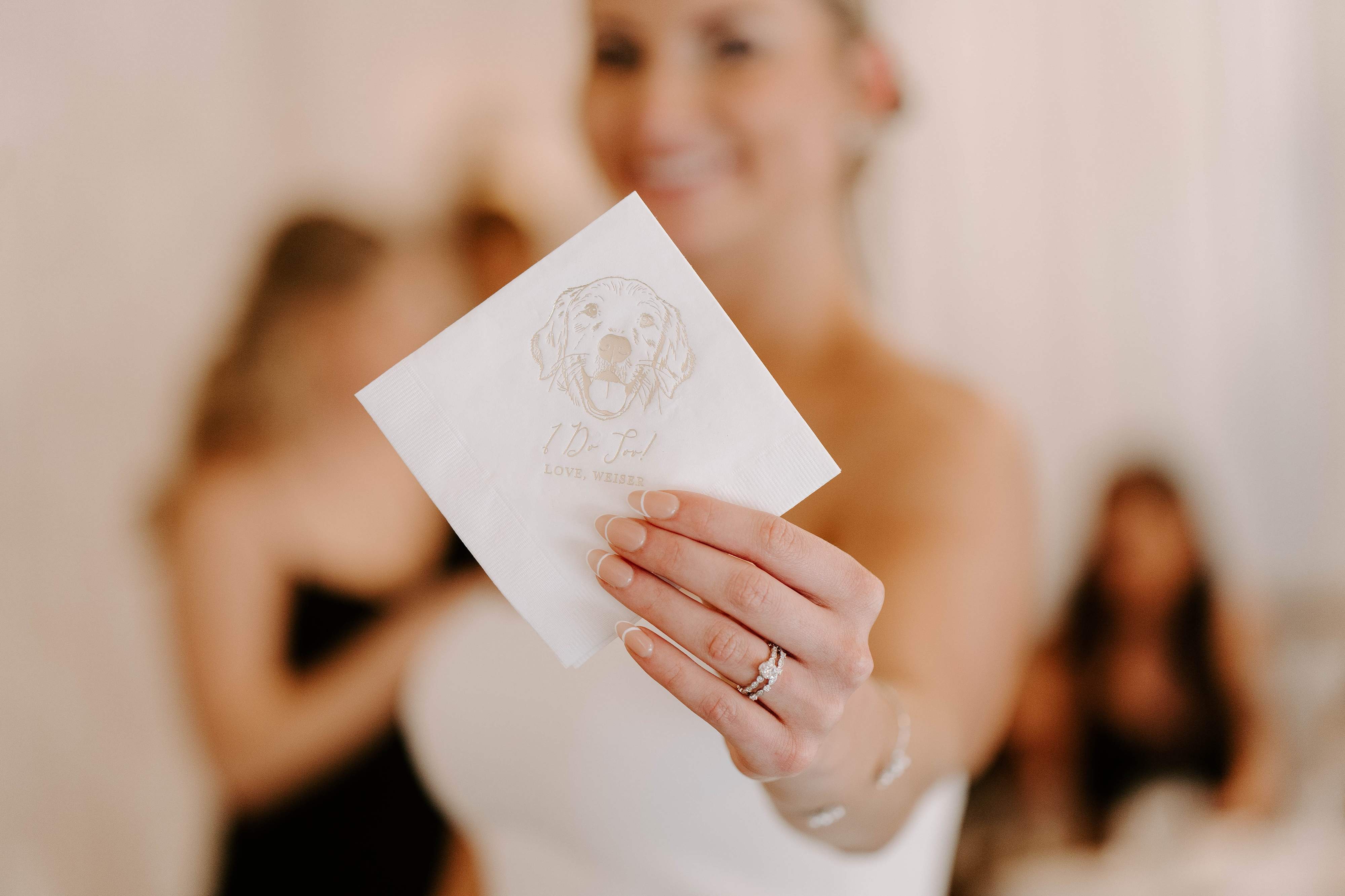
Personalized items like custom napkins or illustrated dog napkins add a unique story element. For example, pair blush napkins with gold foil text and a custom pet illustration to create a memorable tabletop moment. You can explore ready-to-personalize designs in our customer favorites.
Trendy Yet Romantic: Modern Twists on Classic Combinations
If you love classic romance but don't want overly predictable palettes, try these modern adjustments:
- Tone Down with Texture: Swap satin for matte linens, or add woven napkins to soften bold colors.
- Introduce an Unexpected Accent: Try a single pop of chartreuse in a blush-and-navy palette for a fresh edge.
- Mix Old and New: Pair heirloom lace with unexpected moody florals or neon signage for playful contrast.
For truly personalized touches, think beyond color: illustrated napkins, custom signage, and themed cocktail cups can echo your palette while telling your story. Browse our best sellers to see popular customizable items that add personality without clashing with your look.
Testing Colors and Creating a Cohesive Look
Colors can shift from screen to real life. Testing is essential. Here's a simple plan you can follow:
- Collect swatches for fabric, stationery, and florals. Bring them to the venue at the same time of day your ceremony will be held.
- Create a mood board in a physical folder or a digital board. Include photos of your venue, swatches, and sample decor.
- Order samples of key items: napkins, paper invitations, or cups. Seeing them in context helps avoid surprises.
- Test photography: Ask your photographer to take a few test shots with your samples in the venue light.
- Communicate with vendors: Share swatches and the mood board with florists, rental companies, and the planner so everyone is aligned.
If you want affordable, photo-friendly sample items, you can try a few customizable pieces from our customer favorites to see how colors read in your space.
Budget-Friendly Ways to Make Color Feel Luxurious
Luxury doesn't always equal cost. Thoughtful placement of color and small high-impact items create a premium look without breaking the bank.
- Focus on focal points: Invest in key areas—head table, bar, or ceremony backdrop—and use budget-friendly options for the rest.
- Use statement napkins and cups: A custom napkin with your palette and illustration elevates every place setting. This is a small cost for a big visual payoff.
- Rent larger decor: Rentals like specialty linens or chairs give a high-end feel without a permanent purchase.
- Mix real flowers with faux or dried: Combine fresh blooms for focal pieces and dried or faux stems for table installations to save money and add texture.
- Do small DIYs: Hand-lettered escort cards or simple floral cloches show care and keep costs down.
We design personalized napkins and cups that feel custom-made, so a small investment in these items often makes your whole reception look intentional. Check our curated pieces in the best sellers to find tasteful, budget-friendly options that align with your palette.
Practical Examples: Putting Palettes Into Real Plans
Here are two quick, realistic setups you can copy and adapt for your wedding.
Example 1: Garden Brunch, Blush + Sage + Champagne
- Ceremony: Simple arch draped in chiffon, eucalyptus garland, blush ribbon aisle markers.
- Reception: Round tables with champagne linens, sage napkins, blush florals in mismatched vintage vases.
- Attire: Blush bridesmaid dresses, groom in gray suit with sage tie.
- Details: Custom blush cocktail napkins with a gold-foil monogram and an illustrated pet portrait at the bar for a warm, personal touch. Browse ideas in our customer favorites.
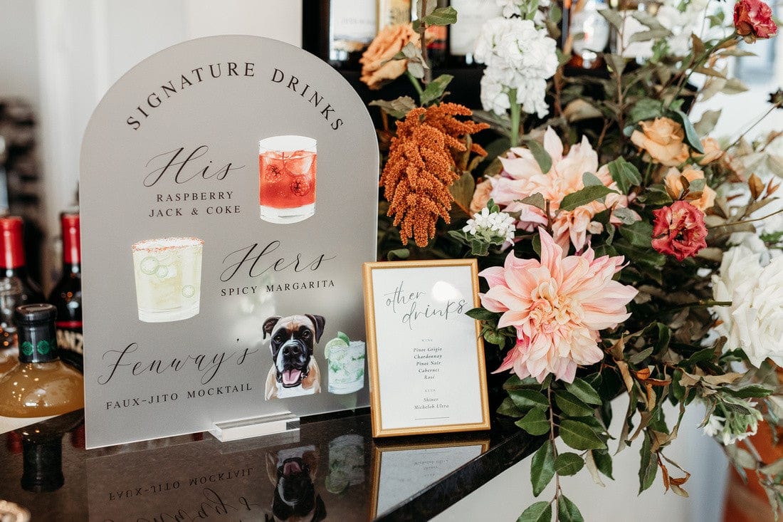
Example 2: Evening Ballroom, Navy + Rose + Gold
- Ceremony: Navy velvet runner, low rose centerpieces, warm candlelight.
- Reception: Gold chargers, navy napkins with rose-colored menus, mirrored signage with gold lettering.
- Attire: Navy suits and rose satin tie accents.
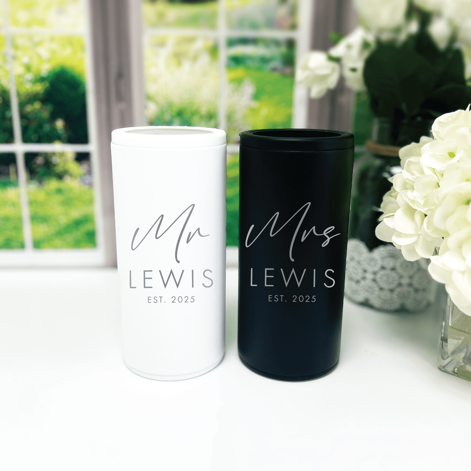
- Details: Personalized frosted plastic cups at the cocktail hour with a rose-gold logo to match the metallic accents; sample styles are available in our best sellers.
Checklist: Final Color-Decision Steps Before You Say "I Do"
- Finalize your three main palette colors and two neutrals/metallics.
- Order physical samples of linens, napkins, and stationery.
- Share swatches with your florist and rentals team.
- Test colors in venue lighting, then tweak as needed.
- Choose 2–3 customizable items (napkins, cups, signage) that will showcase your colors and personality.
If you want help narrowing down customizable items, our customer favorites are a good place to start—many of the pieces pair naturally with romantic palettes and can be personalized to match your wedding colors.
Frequently Asked Questions
How many colors should I include in a romantic wedding palette?
A good rule is 2–3 main colors plus 1–2 neutrals or metallics. That gives you enough variety without the look feeling busy. Two main colors create contrast; the third can be an accent to add richness.
Can I use bright colors and still keep a romantic look?
Yes—use a bright color as a single accent against softer tones and neutrals. Bright coral or magenta can be romantic if balanced with blush, cream, or warm metallics.
How do I make sure my colors photograph well?
Test with your photographer if possible. Bring fabric and paper swatches to the venue in the same light your wedding will be held. Soft, muted tones often photograph best in natural light, while jewel tones shine in candlelit, indoor settings.
Should my bridesmaids all wear the same color?
Not necessarily. You can keep cohesion by choosing dresses in the same tonal family (e.g., different shades of blush) or allowing mixed textures but one common color. That approach looks curated and modern while honoring your palette.
How do I incorporate personal touches without clashing with my color scheme?
Personalized items that match your palette—like custom napkins, illustrated favors, or a signature cocktail served in colored cups—integrate nicely. Choose one or two standout personalized elements so they feel intentional rather than cluttered.
What if I fall in love with a vendor's sample that doesn't exactly match my palette?
Consider whether the item is a focal point. If it's not central, you can still use it; tweak surrounding accents to harmonize the look. If it is a focal item, ask the vendor about slight color adjustments or find an alternative that aligns with your palette.
How far in advance should I finalize my color palette?
Finalize colors 6–9 months before the wedding, earlier if you're ordering custom pieces. That timeline gives your florist, stationery designer, and rentals company time to source matching materials.
Can I use my palette across multiple events, like the rehearsal dinner and shower?
Yes—that creates a cohesive celebration weekend. You can vary intensity across events: lighter for daytime showers and richer tones for evening events.
Conclusion
Choosing romantic wedding color combinations is more than picking pretty hues: it's about building an atmosphere that resonates with your story. Start with a mood, test samples in your venue, and anchor your palette with a neutral and a metallic. Small, personalized touches—custom napkins, illustrated cups, or a meaningful sign—turn a beautiful color scheme into a meaningful celebration.
If you keep the palette consistent and focus on a few high-impact items, you'll create a wedding that looks cohesive in photos and feels authentic to you. Trust your instincts, test before you commit, and let the colors tell the part of your story that words can't.
Ready to try a few sample pieces? Our best sellers include customizable napkins and cups that pair beautifully with romantic palettes, and our customer favorites are great inspiration for colors that photograph well.
Related Blog Posts
- Personalized Wedding Color Themes to Match Your Style
- Soft Wedding Color Palettes for a Dreamy Celebration
- Seasonal Wedding Color Choices for Every Time of Year
- Trending Wedding Color Schemes You Need to Know
- Wedding Color Palette Ideas to Inspire Your Big Day
- Neutral Wedding Color Palettes for Timeless Elegance
- Bold Wedding Color Choices That Make a Statement
- Wedding Cocktail Napkins to Elevate Your Reception
- How to Match Your Wedding Favors to Your Theme
- Your Complete Checklist for Wedding Decor
At Rubi and Lib, we specialize in helping you celebrate life's most memorable moments with personalized wedding and party decor designed to reflect your unique style. From custom cocktail napkins and frosted plastic cups to bar signs and party favors, our curated collections are created to elevate your celebration and leave a lasting impression on your guests.
Whether you're planning a wedding, bridal shower, bachelorette party, baby shower, or birthday bash, our products add a thoughtful, stylish touch that turns an ordinary gathering into an unforgettable event. Many of our designs feature custom illustrations—including pet portraits—so your decor feels as one-of-a-kind as your story.
As a women-owned small business, we're passionate about making the ordering process seamless and enjoyable. Every item is crafted with care and attention to detail, and most of our products are made in the USA. We believe celebrations should feel personal, joyful, and stress-free—that's why we're here to help you create meaningful moments, one custom detail at a time.
Explore our best sellers (https://rubiandlib.com/collections/best-sellers), discover customer favorites (https://rubiandlib.com/collections/best-sellers), or reach out (https://rubiandlib.com/pages/contact-us) for something truly unique. At Rubi and Lib, your celebration is our inspiration.

Written by Bethany Wysolmerski


