
How to Match Your Wedding Favors to Your Color Palette for a Cohesive Celebration
The Secret to a Picture-Perfect Wedding? Color-Coordinated Favors

You have spent months curating the perfect wedding color palette. Every ribbon, every floral arrangement, and every table runner has been chosen with intention. But what about the details your guests actually take home? Your wedding favors are the final keepsake of your celebration, and when they reflect your colors and overall aesthetic, they transform from simple gifts into a seamless extension of your vision.
Matching your wedding favors to your color palette might sound like a small detail, but it is one of those finishing touches that elevates the entire event. When guests pick up a custom can cooler, a printed cocktail napkin, or a frosted cup that perfectly echoes your wedding colors, it creates a sense of harmony that people notice and remember. In this guide, we will walk you through everything you need to know about building a wedding favors color palette strategy that feels polished, personal, and completely you.
Table of Contents
- Why Color Matching Your Wedding Favors Matters
- Start with Your Wedding Color Palette
- Choosing Favor Types That Showcase Color
- Custom Can Coolers: The Color-Coordinated Favorite
- Napkins and Cups That Tie Everything Together
- Using Accent Colors vs. Base Colors on Favors
- Coordinating Wedding Decor with Your Venue Aesthetic
- Seasonal Color Strategies for Personalized Favors
- Adding Pet Portraits and Illustrations in Your Colors
- Display Ideas That Highlight Your Color Story
- Common Mistakes When Matching Favors to Your Palette
- Frequently Asked Questions
- Related Blog Posts
Why Color Matching Your Wedding Favors Matters
There is a reason wedding planners and designers talk endlessly about cohesion. When every visual element of your celebration speaks the same language, the result is a feeling of effortless elegance that photographs beautifully and leaves a lasting impression. Your wedding favors color palette plays a bigger role in this cohesion than most couples realize.
Think about it from your guest's perspective. They walk into your reception and see dusty rose linens, gold accents, and ivory florals. The cocktail napkins at the bar echo those same tones. The frosted cups feature your names printed in blush and gold. And the can coolers waiting at the exit are wrapped in that same soft rose hue. Every touchpoint reinforces your theme without ever feeling forced.
Color-matched wedding accessories also serve a practical purpose in your photography. When your favors blend seamlessly with your decor, they become part of the styled tablescape rather than a visual interruption. Flat-lay detail shots, cocktail hour candids, and reception table photos all benefit from coordinating wedding decor that flows naturally.
Beyond aesthetics, matching your favors to your palette signals intentionality. It tells your guests that you thought about every detail, including the ones they get to bring home. That kind of thoughtfulness transforms a simple party favor into a meaningful memento. And when guests look at that custom can cooler on their kitchen counter weeks later, the colors instantly transport them back to your celebration.

Start with Your Wedding Color Palette
Before you can match your favors, you need a clearly defined color palette. Most wedding palettes include two to four core colors plus one or two neutrals. If you have not already locked yours down, this is the time to get specific. Saying "blue" is not enough. Are you working with dusty blue, navy, or cornflower? The distinction matters when you are ordering personalized favors by theme.
Define Your Primary, Secondary, and Accent Colors
Your primary color is the one that dominates your decor, often your linens, bridesmaid dresses, or floral arrangements. Your secondary color supports it and appears in smaller quantities, like napkins, ribbons, or signage. Accent colors are the pops of contrast that add visual interest, think metallics, deeper tones, or unexpected hues. When choosing favors, you will typically pull from your primary or secondary palette and use accents sparingly for text or design elements.
Create a Digital Mood Board
Gathering all your color references in one place makes ordering much easier. Use Pinterest, Canva, or even your phone's photo album to compile swatches, fabric photos, and inspiration images. When you are ready to select colors for your personalized wedding can coolers or custom cups, having that visual reference ensures consistency across every detail.
If you are exploring palette ideas, our guides on wedding decor collections can help you see how different colors work together across multiple product types.
Choosing Favor Types That Showcase Color
Not all wedding favors are created equal when it comes to color coordination. Some favor types offer more opportunities to showcase your palette than others, and choosing the right format can make all the difference in achieving that cohesive look.
High-Impact Color Favors
Custom can coolers, frosted cups, and printed napkins are among the best favor types for showcasing your wedding favors color palette. These items offer large surface areas for color, whether through the base material itself or through printed designs and text. A navy neoprene can cooler with white script, for example, immediately reads as part of a nautical or classic navy palette.
Subtle Color Favors
Some favors carry color in smaller doses, like ribbon-tied favor bags, custom tags, or small boxed treats. These work well as accent pieces but may not carry the same visual weight as drinkware or coolers. If your goal is coordinating wedding decor from top to bottom, prioritize at least one favor type with strong color presence.
The best approach? Mix high-impact and subtle color favors for layered depth. A bold custom can cooler paired with a color-coordinated cocktail napkin creates a favor moment that is both functional and beautiful. Your guests will use both throughout the reception, spreading your colors naturally across the space.
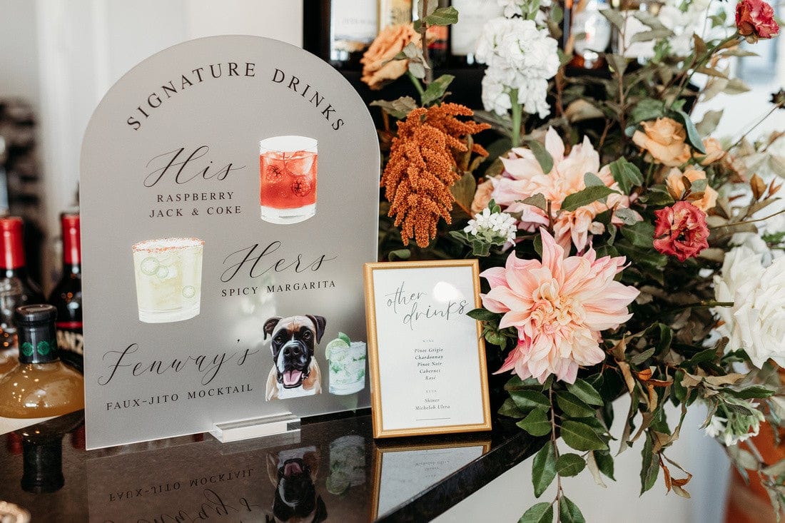
Custom Can Coolers: The Color-Coordinated Favorite

If there is one wedding favor that delivers exceptional color impact, it is the custom can cooler. Available in a wide range of base colors and print options, custom can coolers wedding guests love are also one of the easiest items to match to your palette. The cooler itself serves as a canvas, and you control both the background color and the design printed on it.
Choosing the Right Cooler Color
Foam and neoprene coolers come in dozens of shades, from classic white and black to soft pastels, vibrant jewel tones, and earthy neutrals. Start by matching the cooler base to your primary or secondary wedding color. If your palette is sage green and ivory, a sage cooler with ivory text creates instant harmony. For bolder palettes, a deep burgundy or royal blue base makes a striking impression.
Print Color and Design Considerations
The print color should complement rather than compete with the base. White or cream text on darker coolers reads beautifully, while gold or black ink pops on lighter shades. Many couples choose to print their names, wedding date, or a playful phrase alongside custom illustrations. You can explore a variety of design options in our personalized can cooler collection.
One trend we love: ordering coolers in two complementary colors, one for the ceremony or cocktail hour and another for the reception. This adds variety while keeping everything within your palette family. It also gives guests an extra reason to grab a second cooler as a keepsake.
Napkins and Cups That Tie Everything Together
While can coolers make a bold color statement, personalized napkins and frosted cups provide the perfect supporting cast. These items appear at nearly every touchpoint of your reception, from the bar to the dessert table, which means their color impact multiplies across the entire event.
Custom Cocktail Napkins
Cocktail napkins are one of the most versatile color-matched wedding accessories in your arsenal. Available in a rainbow of base shades with custom foil-stamped or printed designs, they can echo your primary color, introduce an accent tone, or feature a metallic finish that adds shimmer to your tablescape. Our wedding napkin collection offers styles that range from classic monograms to whimsical illustrations.
Frosted Plastic Cups
Frosted cups offer a slightly different approach to color coordination. The cup itself has a clean, translucent look, while the printed design carries your palette. This makes them incredibly versatile, as you can print in any ink color to match your theme. A dusty blue ink on a frosted cup, for instance, creates a soft, romantic effect that pairs beautifully with garden or coastal weddings. Browse our best-selling frosted cups for inspiration.
The key to making napkins and cups feel cohesive is consistency in your chosen fonts, design elements, and color application. When your cup design uses the same typography and color as your napkins and can coolers, the entire bar setup looks intentionally curated rather than pieced together.

Using Accent Colors vs. Base Colors on Favors
One of the most common questions couples ask about their wedding favors color palette is whether to use their primary color or an accent color on favors. The answer depends on the role you want your favors to play in the overall design.
When to Use Your Base Color
Your base or primary color is the safest choice for high-visibility favors like can coolers and cups. Since these items will be carried around and photographed throughout the event, having them match your dominant color creates visual consistency. If your bridesmaids are wearing dusty rose, for example, dusty rose coolers feel like a natural extension of the wedding party.
When to Use an Accent Color
Accent colors work beautifully on smaller or detail-oriented favors like napkins, favor tags, or printed ribbon. They add dimension to your color story without overwhelming it. Metallics, in particular, gold, rose gold, or silver, serve as excellent accent choices for printed text and design elements.
Mixing Both for Depth
The most polished approach often combines base and accent colors within a single favor. A white napkin with sage green foil lettering uses your base (white) and your accent (sage) together, creating a layered effect. The same logic applies to coolers: a cream base with gold text and a small floral illustration in your secondary color tells your full color story in one compact design.
If you want to see how monogram designs balance color beautifully, our monogram wedding napkins are a wonderful starting point.
Coordinating Wedding Decor with Your Venue Aesthetic
Your venue has its own personality, and your favors should work with it, not against it. A rustic barn venue calls for different color treatments than a sleek modern loft or a beachside pavilion. Coordinating wedding decor means considering the backdrop your favors will be seen against.
Warm-Toned Venues
Barns, vineyards, and spaces with lots of exposed wood naturally lean warm. Favors in earthy tones, terracotta, burgundy, sage, mustard, and warm ivory, feel right at home here. Avoid cool-toned bases like icy blue or bright white, which can look out of place against warm wood and ambient lighting.
Cool-Toned or Modern Venues
If your venue features concrete, marble, or industrial elements, cooler tones and high-contrast designs shine. Navy, black, and crisp white are excellent cooler and napkin choices for these spaces. Metallic accents in silver or chrome also complement modern architecture beautifully.
Outdoor and Garden Venues
Nature provides its own color palette, so your favors should feel like they belong in the landscape. Soft greens, blush tones, creamy whites, and lavender all harmonize with garden settings. Consider how your favor colors will look against lush greenery and natural light, which tends to warm everything slightly.
For venue-specific inspiration, our cocktail hour wedding decor collection features pieces that work across a variety of settings and styles.
Seasonal Color Strategies for Personalized Favors

Your wedding season naturally influences your color palette, and your personalized favors by theme should reflect that seasonal energy. Here is how to approach color matching for each time of year.
Spring Weddings
Spring palettes tend toward pastels and fresh greens. Think blush pink, lavender, soft yellow, and mint. These lighter shades translate beautifully onto foam can coolers and frosted cups, where the soft color feels inviting without being heavy. Pair pastel bases with white or gold text for a clean, romantic finish.
Summer Weddings
Summer opens the door to bolder, more saturated colors. Coral, turquoise, sunflower yellow, and tropical greens all feel seasonally appropriate. Personalized favors in these vivid shades double as cheerful photo props and look incredible in outdoor settings with bright natural light.
Fall Weddings
Rich, warm tones define fall celebrations. Burgundy, burnt orange, deep olive, mustard, and chocolate brown create a sophisticated seasonal palette. Neoprene coolers in these deeper shades pair gorgeously with metallic gold or copper text. Custom napkins in ivory with fall-toned foil stamping are another elegant choice.
Winter Weddings
Winter palettes range from icy and ethereal (silver, white, pale blue) to moody and dramatic (emerald, plum, midnight blue). For winter celebrations, darker cooler bases with metallic or white text create a formal, polished look. Frosted cups with deep-toned ink feel festive and sophisticated.
Whichever season you are celebrating in, our best-selling collection offers versatile designs that can be customized to match your exact seasonal vision.
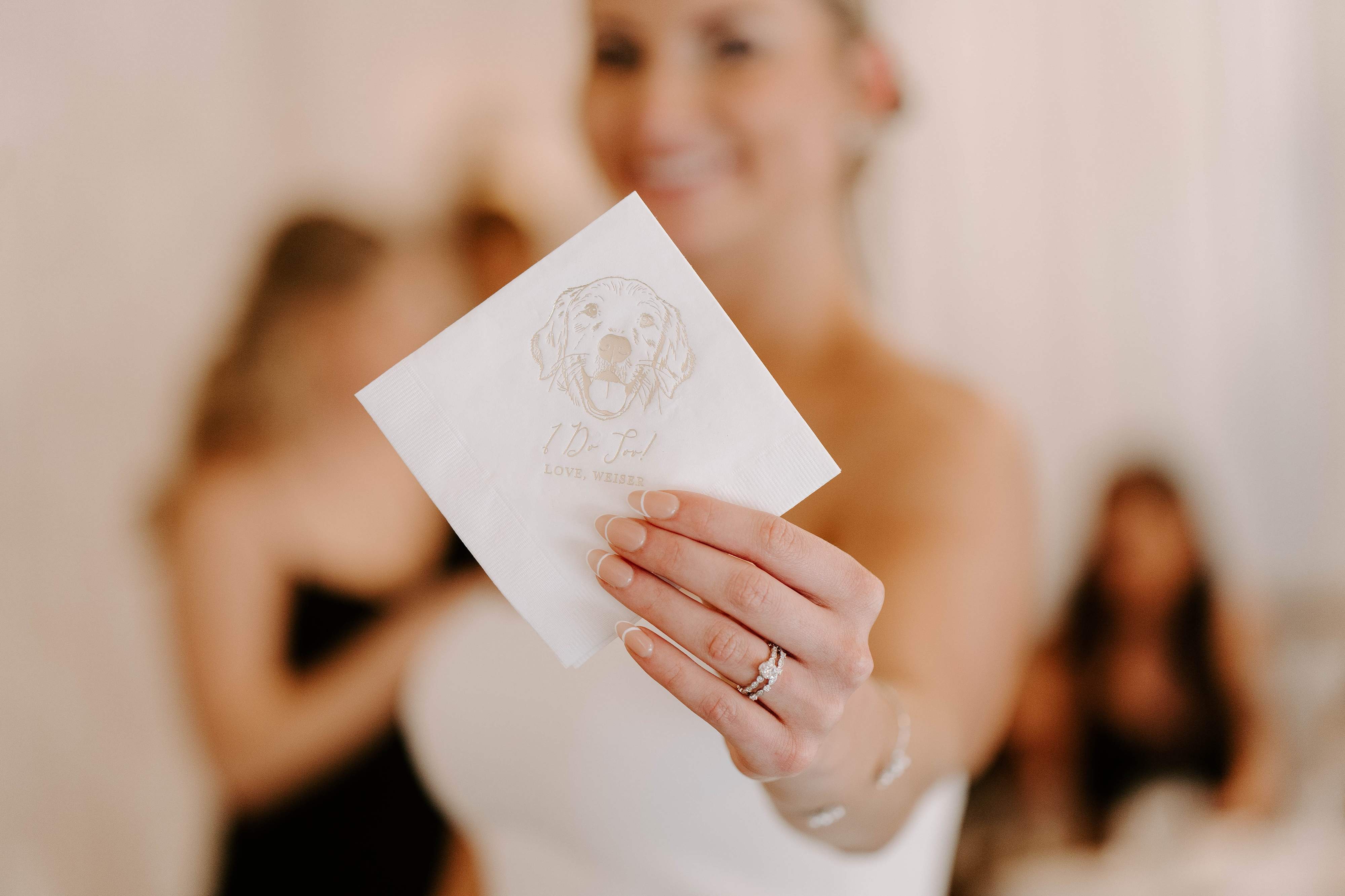
Adding Pet Portraits and Illustrations in Your Colors
One of the most personal ways to incorporate your wedding favors color palette is through custom illustrations, especially pet portraits. Including your furry family member on your wedding favors adds a heartfelt, memorable touch that guests always love, and when that illustration is designed to complement your color scheme, it becomes a true work of art.
How Color Plays into Custom Illustrations
When we create custom pet portrait designs for favors, the illustration style and ink colors can be tailored to fit your palette. A simple black line drawing on a white or cream cooler gives a timeless, elegant look that works with virtually any color scheme. For more colorful palettes, incorporating your wedding hues into the background, text, or decorative elements around the illustration creates a favor that is unmistakably yours.
Popular Pet Illustration Favor Ideas
Can coolers featuring your dog's portrait alongside your wedding date and a fun phrase like "To Have and To Hold, To Keep Your Beer Cold" are always a crowd favorite. These work wonderfully in your primary wedding color, making the pet element feel intentional rather than added as an afterthought. Explore our pet-inclusive wedding collection to see how couples have incorporated their four-legged friends into color-coordinated decor.
Illustrated napkins are another option, offering a more delicate canvas for pet artwork. The key is ensuring the illustration ink coordinates with the rest of your napkin and cup designs so every element at the bar tells the same visual story.
Display Ideas That Highlight Your Color Story
How you present your wedding favors is just as important as how they look individually. A thoughtful display arrangement amplifies your color story and turns your favors into a design feature guests will gravitate toward.
The Favor Station
Create a dedicated favor station near the exit or dance floor where guests can grab their keepsake on the way out. Arrange coolers in neat rows or stack them in baskets lined with fabric in a complementary color. Add a small custom sign that matches your palette and invites guests to take one. This station becomes a mini vignette that reinforces your theme from start to finish.
Integrated Bar Displays
Place custom can coolers alongside your bar menu signs and cocktail napkins for a fully coordinated bar experience. When every element at the bar echoes your colors, it creates a moment that feels designed and intentional. Guests will naturally use the coolers and napkins throughout the night, carrying your color story with them as they mingle.
Tablescape Integration
Instead of a separate favor station, place one custom favor at each place setting. A personalized napkin at each plate or a can cooler tucked into a folded napkin adds a personal touch while contributing to the overall table design. This approach ensures every guest receives their favor and that your color-matched wedding accessories are visible in every table photo.
Common Mistakes When Matching Favors to Your Palette

Even the most design-savvy couples can stumble when it comes to coordinating their favors. Here are the most common pitfalls to avoid when building your wedding favors color palette strategy.
Trying to Match Too Perfectly
Obsessing over an exact hex code match between your napkins, coolers, and linens can actually work against you. Slight variations in material and finish mean that "the same" color can look different across fabric, foam, and paper. Instead of aiming for an identical match, focus on staying within the same color family. A dusty rose cooler next to a blush linen looks harmonious, even if the shades are not pixel-perfect twins.
Ignoring Lighting Conditions
Colors shift under different lighting. A can cooler that looks perfect in daylight may appear warmer under Edison bulbs or cooler under fluorescent lights. Consider your reception lighting when choosing favor colors, and if possible, request a sample to view in similar conditions before placing a full order.
Overloading on One Color
Using your primary color on every single element can make the space feel flat or overwhelming. Balance is key. If your coolers are in your primary hue, consider napkins in a neutral with your accent color for the text. This push and pull between your palette colors creates visual interest and keeps things feeling dynamic rather than monotone.
Forgetting About Text Readability
Color coordination should never sacrifice legibility. Light text on a light cooler or dark ink on a dark napkin will be hard to read, no matter how well it matches your palette. Always ensure strong contrast between your base color and print color so your personalized details are easy to see and enjoy.
Frequently Asked Questions
How many colors should I use on my wedding favors?
Stick to two or three colors per favor item for the most polished look. Typically, this means a base color for the item itself, a primary print color for text, and optionally an accent color for a design element or illustration. This mirrors the structure of most wedding palettes and ensures your favors feel cohesive without looking cluttered.
Can I order custom can coolers in my exact wedding color?
Custom can coolers wedding suppliers offer come in a wide range of standard colors, and most couples can find a close match within available options. Rather than chasing an exact match, choose the closest shade and let the printed design tie it to your palette. The overall effect will be seamless when displayed alongside your other decor elements.
Should my favors match my bridesmaid dresses?
They do not need to be an exact match, but pulling from the same color family creates a beautiful connection. If your bridesmaids are in sage, favors in sage, ivory, or complementary earthy tones will feel intentional. The goal is harmony, not uniformity, so give yourself permission to play within your palette rather than replicate one specific shade.
What if my wedding palette has more than four colors?
Choose two or three of your palette colors for favors and let the rest appear in other decor elements. Not every color needs to show up on every item. Your favors will look more sophisticated with a focused color selection than if they try to represent your entire palette at once.
How do I coordinate favors across multiple events like the rehearsal dinner and reception?
Use your broader palette to create a connected but distinct look for each event. Your rehearsal dinner coolers might feature your secondary color, while your reception coolers showcase your primary hue. This creates variety across events while maintaining an overall sense of design continuity throughout the wedding weekend.
Do metallic colors count as part of my wedding palette?
Metallics like gold, rose gold, and silver are typically considered accent colors in a wedding palette. They work beautifully as print colors on favors, adding a touch of elegance to napkins, cups, and coolers. Metallic foil stamping on napkins, in particular, catches light and adds a luxe quality that elevates the entire table.
When should I order my favors to ensure color accuracy?
Order your personalized favors at least six to eight weeks before your wedding date. This gives you time to review proofs, request any color adjustments, and receive your items with a comfortable cushion before the event. Ordering early also ensures you have the widest selection of color options available.
Can I mix different favor types in different colors from my palette?
Mixing favor types and colors is one of the best ways to create a layered, designed look. A navy cooler, a white napkin with navy text, and a frosted cup with navy ink all work together beautifully because they share a common thread. The variety in format keeps things interesting while the shared color keeps everything cohesive.
Related Blog Posts
- How to Match Your Wedding Favors to Your Theme
- The Ultimate Guide to Custom Wedding Can Coolers
- Personalized Wedding Color Themes
- Wedding Favors Your Guests Will Love
- 10 Creative Ideas for Custom Can Coolers
- Wedding Color Palette Ideas and Inspiration
- Trending Wedding Color Schemes
- Personalized Wedding Favor Options
- Soft Wedding Color Palettes for a Romantic Celebration
- Best Custom Wedding Favors Guests Will Actually Keep
At Rubi and Lib, we specialize in helping you celebrate life's most memorable moments with personalized wedding and party decor designed to reflect your unique style. From custom cocktail napkins and frosted plastic cups to bar signs and party favors, our curated collections are created to elevate your celebration and leave a lasting impression on your guests.
Whether you're planning a wedding, bridal shower, bachelorette party, baby shower, or birthday bash, our products add a thoughtful, stylish touch that turns an ordinary gathering into an unforgettable event. Many of our designs feature custom illustrations, including pet portraits, so your decor feels as one-of-a-kind as your story.
As a women-owned small business, we're passionate about making the ordering process seamless and enjoyable. Every item is crafted with care and attention to detail, and most of our products are made in the USA. We believe celebrations should feel personal, joyful, and stress-free, that's why we're here to help you create meaningful moments, one custom detail at a time.
Explore our best sellers, or reach out for something truly unique.

Written by Bethany Wysolmerski


