
Popular Wedding Color Combinations
Find a Palette That Feels Like You: Popular Wedding Color Combinations With Personality
Color is the fastest way to tell guests what kind of celebration you’re planning. When you pick one of the popular wedding color combinations, you’re choosing tone, mood, and a visual story that runs from invitations to table settings. Whether you want romantic, modern, playful, or timeless, your palette does most of the heavy lifting.
If you’ve been searching for popular wedding color combinations, this guide will help you choose, mix, and apply palettes so your wedding feels cohesive and unforgettable. You’ll get practical tips, seasonal ideas, color pairings that actually work, and ways to use personalized decor—like custom napkins and signs—to make your colors pop.
How Color Sets the Mood
Color influences how people feel in the space you create. Picking the right combination helps everyone know whether they should relax, celebrate, or feel swept up in romance. Here’s a quick cheat sheet for emotions tied to color:
- Soft neutrals, like creams and greys, say elegant and calm.
- Warm tones, like blush, burgundy, and terracotta, feel intimate and romantic.
- Cool tones, like blues and greens, bring a serene, modern vibe.
- Bold brights, like coral and teal or mustard and navy, feel joyful and energetic.
- Metallics, such as gold and champagne, add glamour and polish.
Keep that mood in mind as you choose backgrounds (venue walls, linens), accents (flowers, signage), and small details (napkins, cups). The palette doesn’t need to be rigid; treat it like a recipe. You want one or two main colors, a supporting color, and a neutral or metallic to balance everything.
Timeless Classics: White, Ivory, and Green
If you want a look that never feels dated, you can’t go wrong with white or ivory paired with fresh greenery. This pairing feels clean, natural, and effortlessly elegant. It works for barn weddings, city lofts, and garden ceremonies.
Why it works
- It plays beautifully with textures: wood, linen, and rattan add warmth without competing with color.
- Greenery provides movement and depth without being overpowering.
- It’s an ideal backdrop for accent colors if you want a pop—think a single bold bouquet or colored napkin.
How to use it
- Main color: White or ivory linens and ceremony backdrop
- Accent: Lush eucalyptus, olive branches, or potted herbs
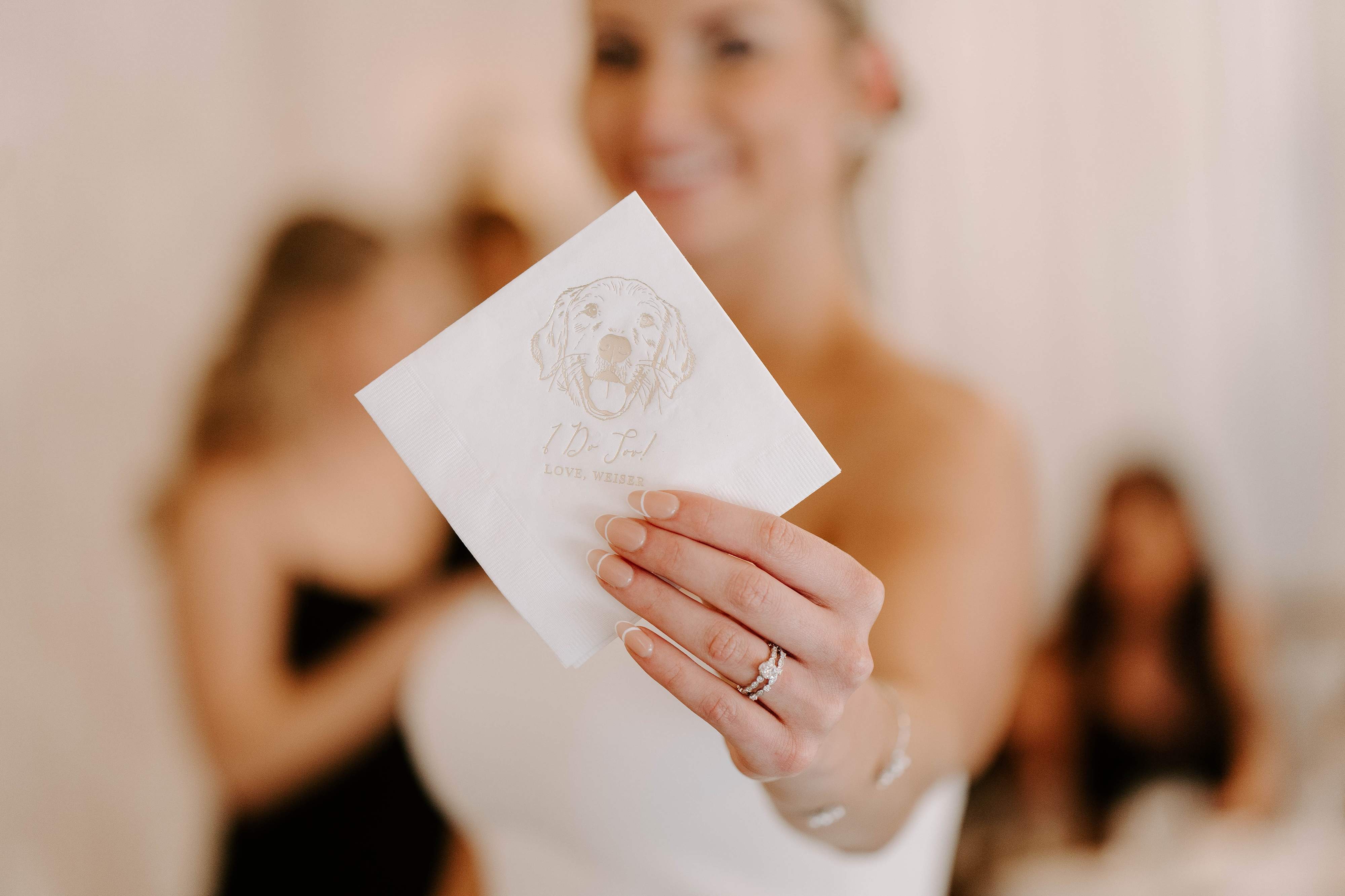
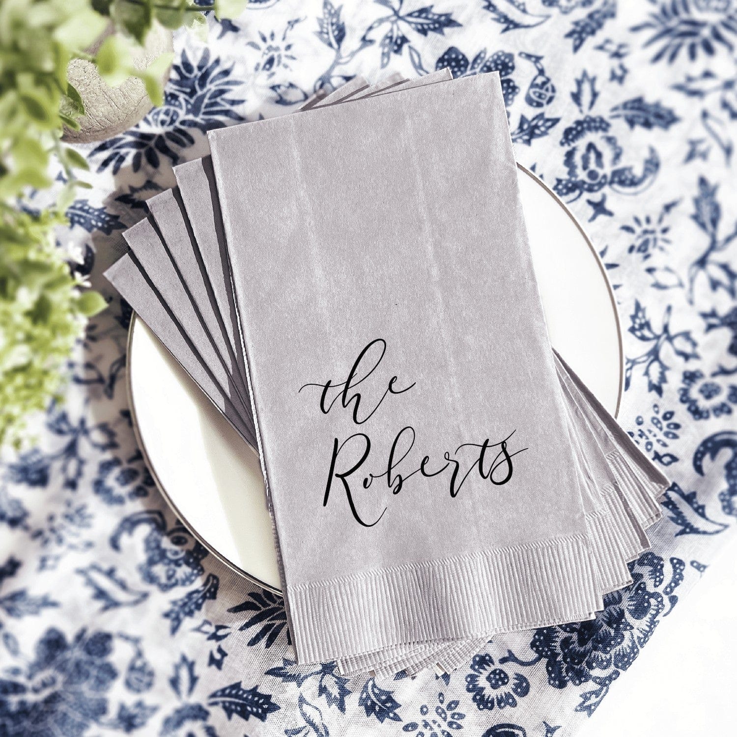
- Personalized touch: Simple, illustrated napkins that echo your palette for modern charm
Romantic Pairings: Blush and Burgundy
Blush and burgundy balance sweet and dramatic. Blush keeps the scene soft; burgundy adds depth and sophistication. This combo is especially beautiful for late summer to fall weddings, but it also reads timeless in a ballroom.
Styling tips
- Use blush for florals and bridesmaid dresses, burgundy for table runners or velvet accents.
- Bring in gold flatware or candlesticks to warm the palette.
- For invitations and signage, a hint of blush watercolour with burgundy lettering creates elegant contrast.
Modern Neutrals: Taupe, Blush, and Charcoal
Want something contemporary and chic? Combine warm taupe with soft blush and an anchoring charcoal. The result reads modern, muted, and intentional. It’s a favorite for city venues and minimalist aesthetics.
Where this shines
- Industrial-chic lofts, modern hotels, and intimate courthouse celebrations
- Photography benefits from the soft contrast—charcoal pops without being harsh.
- Works well with matte ceramics and textured stationery
Bold & Bright: Coral and Teal
Coral and teal make a joyful, energetic pairing. Use this combo if your wedding is colorful, tropical, or bursting with personality. It’s a natural fit for summer seaside weddings or backyard receptions with string lights and a lively playlist.
Tips for balance
- Anchor with a neutral like sand or white so colors don’t overwhelm.
- Stick to one bright as the primary accent, the other as a supporting color in florals or signage.
- For table settings, consider coral napkins with teal glassware, or vice versa.
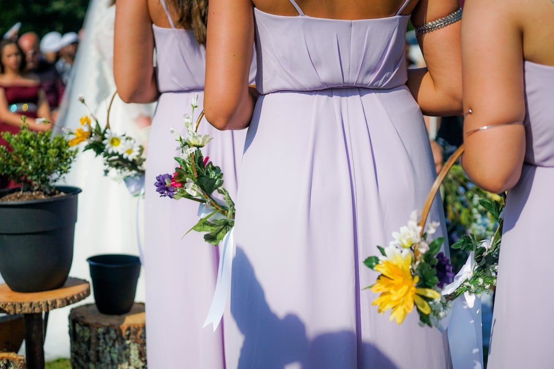
Soft Pastels: Lavender, Sage, and Dusty Blue
Pastels are a gentle, romantic choice. Lavender, sage, and dusty blue feel fresh and dreamy without being saccharine. These shades are popular for spring weddings and daytime affairs.
Practical pairings
- Lavender florals with sage greenery and dusty-blue bridesmaid dresses look cohesive on camera.
- Pastel linens can be paired with warm wood or rattan chargers for contrast.
- Use textured napkins and subtle metallics to add visual interest.
Seasonal Palettes: Choosing Colors That Match Your Date
Seasonal inspiration keeps your palette feeling natural and appropriate. Here are dependable palettes by season that incorporate popular wedding color combinations.
Spring
- Colors: Blush, sage, dusty blue
- Why: Soft, blooming, fresh
- Decor idea: Pastel napkins with simple greenery and ceramic vases
Summer
- Colors: Coral, teal, sand
- Why: Bright, lively, beach-friendly
- Decor idea: Bold cocktail napkins and frosted cups for outdoor bars, plus citrus centerpieces
Fall
- Colors: Burgundy, mustard, forest green
- Why: Rich, warm, cozy
- Decor idea: Velvet runners, matte signage, and illustrated napkins that match your palette
Winter
- Colors: Navy, champagne, deep plum
- Why: Elegant, dramatic, festive
- Decor idea: Metallic accents, candlelit tables, and luxe napkin rings
If you want a quick place to see popular decor options in context, take a look at our curated best sellers for inspiration here.
Metallics and Neutrals: Gold, Champagne, and Cream
Metallics elevate almost any palette. Gold and champagne are especially versatile, pairing with both warm and cool tones. Use metallics sparingly to create focal points and avoid feeling overdone.
Use cases
- Gold calligraphy on cream invitations
- Champagne-rimmed glassware or foil details on signage
- Neutral linens with metallic chargers for an upscale yet approachable look
Practical Tips for Applying Color Across Your Wedding
Picking colors is one thing. Applying them so your day feels cohesive is another. Follow these practical tips to make sure your colors carry through every detail.
- Start with your venue, then choose colors that complement it. A rustic barn calls for warmer tones; a modern gallery handles cooler, higher-contrast palettes.
- Create a mood board with photos of florals, linens, and tabletop items. Seeing everything together prevents surprises on the day.
- Limit main colors to two, add one supporting color and a neutral or metallic. Too many competing hues can feel chaotic.
- Repeat a recognizable accent—a napkin pattern, a ribbon, or a signature cocktail color—so your scheme ties together across tables, signage, and favors.
- Test swatches in real light. Digital colors often look different in natural light, especially blues and greys.
For decor items that carry color beautifully across your tablescape, consider browsing curated collections of customizable napkins and cups, like this selection of best sellers here.
Choosing a Palette in Five Easy Steps
Not sure where to start? Follow these five steps to pick a palette you’ll love for years.
- Identify your vibe. Is it romantic, modern, boho, or vintage? Pick words that describe the mood you want.
- Pin visual inspiration. Collect 10–15 photos that speak to you, then look for repeating colors.
- Choose one main color and one accent. Add a supporting color and a neutral to ground the palette.
- Test with samples. Ask vendors for fabric and paint swatches and view them in the venue light.
- Commit to three places to apply the color. Example: bouquets, napkins, and signage. Repetition builds a cohesive look.
If you’re feeling stuck, our customer favorites are full of real wedding examples you can use as a starting point here.
Mistakes to Avoid When Choosing Colors
Even with a great eye, a few common missteps can throw off the whole look. Avoid these pitfalls:
- Too many colors. It’s tempting to include every shade you love, but restraint often looks more intentional.
- Neglecting the venue. Bright florals can look muted in dim lighting, and pale linens can vanish in a sunlit garden.
- Ignoring undertones. Warm whites and cool whites are not interchangeable. Match undertones across linens, paper, and florals.
- Overusing metallics. They should highlight, not dominate.
If you want help testing ideas or need a second opinion, we’re happy to chat about how your chosen colors will translate across paper goods and tableware. Reach out any time here.
How Personalized Decor Makes Colors Feel Intentional
Personalized details are the finishing touch that make a wedding feel curated rather than generic. When your napkins, cups, and signs match your palette—or tell a tiny story—they elevate each moment.
Small items with big impact
- Personalized napkins in your accent color immediately tie tables together. Illustration-style designs, like engraved pet portraits or simple monograms, add personality without clutter.
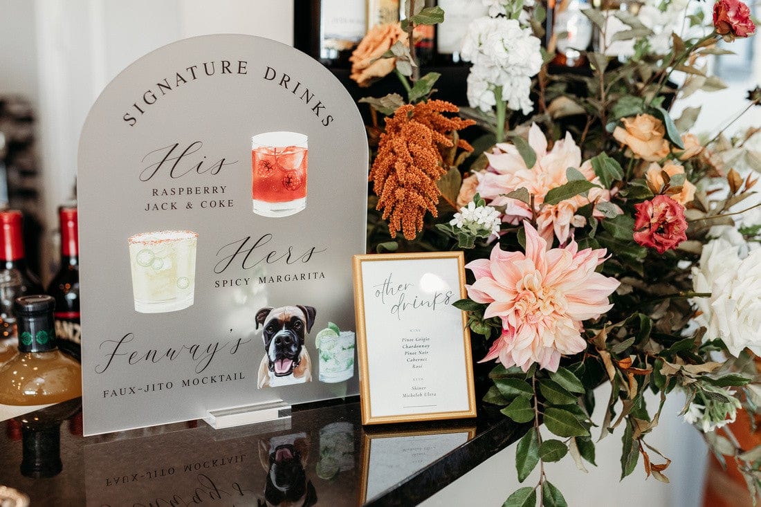
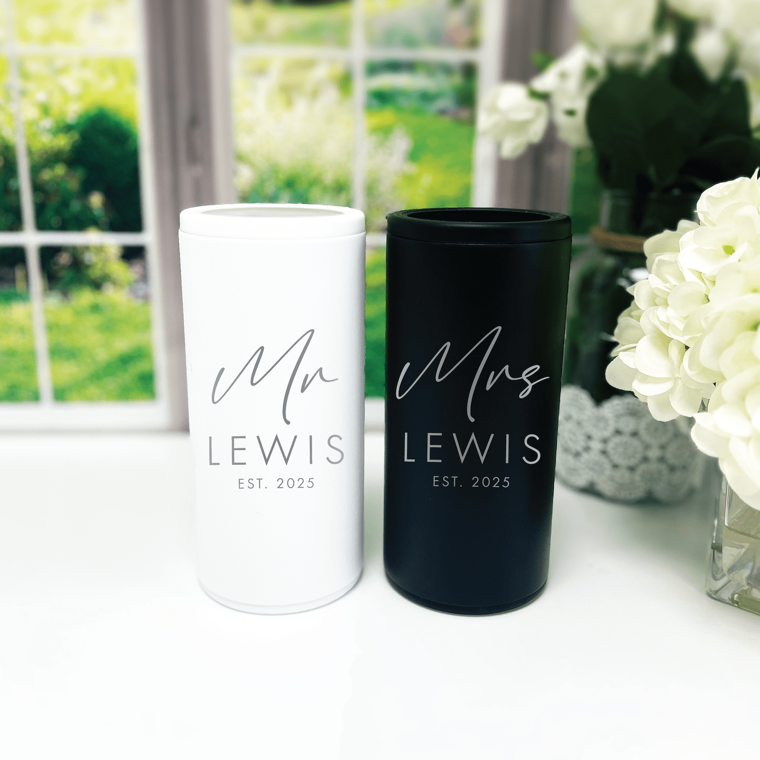
- Custom frosted cups with a single-color logo or initial keep bar service streamlined and stylish for outdoor receptions.
- Bar and seating signs that echo your palette feel polished and guide guests visually.
At Rubi and Lib, we specialize in personalized pieces that help your palette read like a design story, not a checklist. Explore curated decor that matches popular wedding color combinations, like our best-selling napkins and cups shown in real weddings here.
Real Examples You Can Steal
Seeing a palette applied in a real wedding helps you imagine it in your own space. Here are quick, copyable combos with ideas for where to use each color.
Example 1: Garden Romance
- Colors: Blush, sage, cream
- Use: Blush bridesmaid dresses, sage greenery, cream linen, delicate illustrated napkins
Example 2: Modern Minimal
- Colors: Charcoal, taupe, pearl
- Use: Charcoal table runners, taupe bridesmaid dresses, pearl stationery, matte signage
Example 3: Festive Summer
- Colors: Coral, teal, sand
- Use: Coral cocktails, teal glassware, sand napkins, playful illustrated bar cups
Example 4: Cozy Fall
- Colors: Burgundy, mustard, forest green
- Use: Burgundy linens, mustard napkins as an accent, forest-green foliage, gold flatware
Need physical examples to test? Our customer favorites collection features real color pairings used by couples for inspiration here.
Budget-Friendly Ways to Add Color
You don’t need a designer budget to have a cohesive palette. Small investments go a long way.
- Napkins and cups: These are affordable ways to introduce color without changing major rentals.
- Signage: A few well-placed signs in your palette guide the eye and make photos pop.
- Ribbon and table runners: Swap in colored ribbon on bouquets and favor boxes for an instant effect.
- Lighting: Colored up-lighting or a gel over a fixture can warm or cool a space subtly.
Personalized napkins are one of the easiest ways to add color and character to each table. Browse our best sellers for on-trend, budget-friendly options here.
How to Work with Vendors on Color
Clear communication is the difference between a palette you love and one that looks mismatched. Use these quick tips when you talk to florists, rental houses, and printers.
- Share a mood board. Include photos and swatches so vendors see the full picture.
- Request physical swatches. Ask florists for stem images and rental houses for fabric swatches in natural light.
- Confirm hex codes when possible. For signage and printed items, a hex or Pantone helps ensure consistency.
- Give lead time. Custom items, especially printed napkins and cups, need time to match and ship.
If you want help choosing items that match your palette, our team can show you pieces that routinely photograph well with popular wedding color combinations. Contact us anytime here.
Frequently Asked Questions
What are the most popular wedding color combinations right now?
Current favorites include blush and burgundy, sage and cream, navy and champagne, coral and teal, and charcoal with warm neutrals. These pairings are popular because they photograph well and adapt to many venue styles.
How many colors should I use for my wedding palette?
A simple rule is: two main colors, one supporting color, and one neutral or metallic. That keeps your look cohesive while giving you enough variation for depth.
How do I pick colors that photograph well?
Avoid tiny color patterns and neon tones. Opt for solid hues with clear contrast and test swatches in your venue lighting. Mid-tones like dusty blue, blush, and burgundy usually photograph beautifully.
Can I mix warm and cool tones?
Yes, but balance is key. Use a neutral or metallic to bridge warm and cool tones. For example, pair navy with a warm blush and add a gold accent to harmonize the palette.
Should I match my bridesmaids’ dresses to the flowers?
They don’t need to be a perfect match. Choose dresses that flatter your party, then ask the florist to include a few blooms or ribbons that echo the dress color for cohesion.
How far in advance should I order custom items like napkins and cups?
Order customized items at least 8–12 weeks before your wedding, earlier if you need proofs or if it’s a busy season. This gives wiggle room for proofs, printing, and shipping.
Can I change my palette slightly if something I ordered looks different than expected?
Yes. Add a small unifying element—like a ribbon color, napkin shade, or signage—to bring everything together. That small change often resolves inconsistencies.
Where can I find examples of palettes used in real weddings?
Look for curated collections and best-seller galleries from vendors who specialize in personalized decor. They often show real setups that can spark ideas and help you visualize colors in context.
Conclusion
Choosing one of the popular wedding color combinations is about more than trends; it’s about choosing a mood and repeating it thoughtfully. Keep your palette simple, test swatches in your venue, and use personalized accents to make those colors feel like your own. Small details—custom napkins, frosted cups, and cohesive signage—bring the look together and make your wedding feel intentional and memorable.
When you’re ready to translate color into carefully crafted details, explore pieces that make your palette sing and reflect your story. For real wedding inspiration and on-trend decor picks that photograph beautifully, check out our customer favorites here.
Rubi and Lib Brand Message
At Rubi and Lib, we specialize in helping you celebrate life's most memorable moments with personalized wedding and party decor designed to reflect your unique style. From custom cocktail napkins and frosted plastic cups to bar signs and party favors, our curated collections are created to elevate your celebration and leave a lasting impression on your guests.
Whether you're planning a wedding, bridal shower, bachelorette party, baby shower, or birthday bash, our products add a thoughtful, stylish touch that turns an ordinary gathering into an unforgettable event. Many of our designs feature custom illustrations—including pet portraits—so your decor feels as one-of-a-kind as your story.
As a women-owned small business, we're passionate about making the ordering process seamless and enjoyable. Every item is crafted with care and attention to detail, and most of our products are made in the USA. We believe celebrations should feel personal, joyful, and stress-free—that's why we're here to help you create meaningful moments, one custom detail at a time.
Explore our best sellers (https://rubiandlib.com/collections/best-sellers), discover customer favorites (https://rubiandlib.com/collections/best-sellers), or reach out (https://rubiandlib.com/pages/contact-us) for something truly unique. At Rubi and Lib, your celebration is our inspiration.

Written by Bethany Wysolmerski


